Hi All
Some months ago I received a chart from a friend that showed a rough analysis of toe-in with Constant Directivity (CD) loudspeakers showing how this could be used to improve the stereo imaging at a wider array of seating locations. I found this chart interesting and it motivated me to do something that I have thought about for awhile.
I have written a simulation of the sound field in front of a pair of loudspeakers that can be placed at various locations and toed-in at various angles. The software works, but is still a little rough. My intent is to post this software to my web site so that others can "play" with it. It uses the database of polar responses that are available on my web site - in other words it uses real measured data and not simulated frequency response and polar response.
Thus far the software is enlightening, but several questions have come to mind. First, what is the easiest way to post screen captures of the running software? It would take a lot of captures to highlight a "story" about how and why toe-in and CD works so well.
The software simulation is very simplistic, as all good starts have to be. There are no room reflections, for now, this is easily added later. Its also non-modal so it makes no sense to display < 200 Hz. There will only ever be a first and maybe second sidewall reflection as beyond this is just getting too complicated. The left and right ear signals are assumed to be unconnected, i.e. there is no cross-talk between the speaker signals and the ear signals. This is also why it makes no sense to consider multiple reflections as this assumption is far too limiting for any detailed analysis.
I have programed Fig. 3.5 from Blauert which describes the phantom source location as a function of the delay difference and the level difference at the two ears. The software uses this figure to map the "image" in the room for the particular speaker and its setup. The "image" is defined as a metric from zero (image completely pulled to one speaker) to one (image completely central). I have found that this map is extremely instructive.
The listener can be placed at various locations around the room and the specific frequency response at the two ears is shown on a plot at the bottom. This is also very enlightening because it shows that even though the image may be central in many cases, it is also very colored because of the speakers polar response. Getting good imaging with uncolored (neutral)sound is pretty difficult and very few of the speakers in my database can achieve it.
I would also like to map out the "coloration", but I am at a loss as to how to do that. Basically each point in the room can have four variables - Red, Green, Blue and Alpha (alpha is the transparency or intensity of the color). How does one "map" a frequency response - some 100 variables - into four variables? I had thought of using each base color (RGB) to show the level in each of three bands, i.e. a perfectly flat signal would then be white. But a highly colored sound could still be shown as white if the average within each band were the same. Then I thought about using the Standard deviation within each band to set the color, but this then ignores level differences between the bands. What about a single color to show the mean slope of the frequency response with the alpha channel to show the standard deviation - a bright color is colored and the color signifies "bright" (more HFs) or "dull" (more lows). there are lots of possibilities but none seems to be ideal.
Any ideas?
Sounds interesting. Results will be free field only? Not sure I understand what "left and right ear signals are assumed to be unconnected" means?
Check out MJK's matchcad worksheets for ideas if you haven't allready done this.
No fancy 3D but it does have a fairly clean interface to handle room interaction and listening position.
No fancy 3D but it does have a fairly clean interface to handle room interaction and listening position.
Sounds interesting. Results will be free field only? Not sure I understand what "left and right ear signals are assumed to be unconnected" means?
The right speaker feeds the right ear only and the left speaker feeds the left ear only. There is no head diffraction model. That is not impossible of course and I've actually done that before, but the calculations are extensive and would inhibit the real-time aspect of the map updates.
They are "free field" for now. I will later add a few side wall reflections but I still need to figure out how to show the effect of those on a "map".
Check out MJK's matchcad worksheets for ideas if you haven't allready done this.
No fancy 3D but it does have a fairly clean interface to handle room interaction and listening position.
I have no idea where to find those. Does his program use real data or "assumed" directivities? If the directivity is assumed then I would not be too interested because I know all too well how accurate those models are (not).
I would post screen shots if I knew how to do that simply. Any ideas? "Insert image" is pretty limiting in file size right?
I can't give you anything about details but he does all the programming himself and he seems like a pretty openminded guy and would probably enjoy the discussion if you tracked him down. 🙂
quarter-wave.com is his site. 🙂
quarter-wave.com is his site. 🙂
I would post screen shots if I knew how to do that simply. Any ideas? "Insert image" is pretty limiting in file size right?
How large are the screenshots in pixels? Resize them, save as JPGs and add them as an attachment to your post.
You can link those attached files in your post by clicking on the "Insert Image" button:
Attachments
I have programed Fig. 3.5 from Blauert which describes the phantom source location as a function of the delay difference and the level difference at the two ears.
The right speaker feeds the right ear only and the left speaker feeds the left ear only. There is no head diffraction model.
Without a proper head diffraction model all this is pretty useless and would produce nothing much but a bunch of "pretty pictures".
How large are the screenshots in pixels? Resize them, save as JPGs and add them as an attachment to your post.
You can link those attached files in your post by clicking on the "Insert Image" button:
What size image files can be loaded? So to get jpg's you use Photoshop?
I can't give you anything about details but he does all the programming himself and he seems like a pretty openminded guy and would probably enjoy the discussion if you tracked him down. 🙂
quarter-wave.com is his site. 🙂
I could not find anything on rooms there.
I use MathCAD a lot, I am very good at it, but its graphics are borderline terrible. Over the years I have developed a failry good set of graphics in VB.NET from which I can ssemble just about anything that I want done exactly the way I want it. PolarMap is a good example. I'll post some screen shots later today.
I have Photoshop - what else is "easier"? My screen is four or five times more than 800 x 600 and then into jpg and the shots might be hard to read.
I have Photoshop - what else is "easier"? My screen is four or five times more than 800 x 600 and then into jpg and the shots might be hard to read.
You don't want to post the content of multiple screens do you? I guess only a single window is of interest, no?
If you have PS there's no harm in using it.
Last edited:
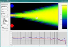
Hey it works. Still some bugs, the listener location shown there is in pixels and needs to be converted into meters based on the room size.
I'll start posting some examples when I get the bugs out.
Everything you see updates immediately so you can actually see how the imaging and frequency response changes as you change the toe-in. "dipole" is to normaize at a higher frequency to keep the plots on scale.
Note that total range of the frequency response is only 18 dB - this will become evident with some other speakers.
I'm not sure if this is directly related, but Wayne Parham of PiSpeakers has often advised to cross speakers (uniform directivity) a foot or two in front of the listeners to "widen the sweet spot."
The reasoning I believe is that, because of off-axis falling response, as a listen moves to the right they are actually moving more on-axis for the left speaker. More on-axis, more 'volume.' This pulls the image back to the centre.
Here's a link to his FAQ where he discusses it:
AudioRoundTable.com: Pi Speakers => Imaging, placement and orientation
There's some great graphics: (Wayne) "One enthusiast that posts under the pseudonym publius took time to illustrate the orientation and the pattern that results."
Cheers,
Jeff
Last edited:
I'm not sure if this is directly related, but Wayne Parham of PiSpeakers has often advised to cross speakers (uniform directivity) a foot or two in front of the listeners to "widen the sweet spot."
The technique is actually pretty old. I think Bauer was the first to describe it a couple of decades ago. Problem is that it doesn't work (for me, in my room).
Here's how I post pics:
Screenshot:
hit 'print screen' button
open MS Paint (universal!)
hit 'paste'
use 'crop' to zoom-in on area of interest
(to change view to crop large areas, click on 'view' tab (Win7) and 'zoom out')
[I tend to leave them as big as possible so people can zoom in for details...but if you want to change the size ...]
hit 'resize' and click the 'pixel' button and enter '800' in the horizontal field
Do a 'save as', name it, choose .png or .jpg and put it on your desktop (or where ever). Put it in yer post!
Pic:
Get it to your desktop, open it in paint and follow the same process.
Cheers,
Jeff
- Status
- Not open for further replies.
- Home
- Loudspeakers
- Multi-Way
- New study on loudspeaker placement