That would make a nice visual scale of intensity, I agree.... the displayed gamut should range from bright yellow to dark indigo.
And even monochrome can do well if used well.
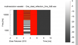
There are the same number of steps in each gray section as in the color version.
Attachments
Just spoke to Gary Dahl on the phone; he's making good progress on the system integration, and is pleased with what he's hearing so far. More to come.
Looks terrible with the red.That would make a nice visual scale of intensity, I agree.
And even monochrome can do well if used well.
There are the same number of steps in each gray section as in the color version.

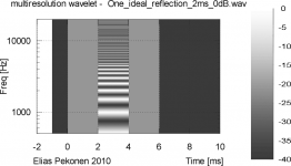
That looks like a video test screen for black and white TV.😉Yes it does.
You like this better?
Hope he's faster than I. I have one that I was pleased with over a year ago.🙂 But it just kept getting better that Kept me wondering how good will it get.😀Hit the G spot when I zeroed in on the interconnect.Just spoke to Gary Dahl on the phone; he's making good progress on the system integration, and is pleased with what he's hearing so far. More to come.

My point, which I must not have made well, is that the color scheme in Elias's graph is visually misleading. As yellow appears brighter to the eye then any of the other colors, the yellow areas appear to have a "higher" value. They do not. In fact it's the dark red color that represents the highest values. Unfortunately for the sake of visual clarity they don't look "higher".
That's why I suggested that another color scheme might better represent the levels to the eye.
You made your point quite well, I undertood it immediately. I use the "JET" scheme (or close) because it was easy to program and uses the whole range of colors - thats why it is done. But your point is completely correct.
So using the standard RGB scale of a PC what should the color range be that identifies the levels by brightness? I'd like to use the whole range of colors and I don't like grey scale because it definately is not ideal (been there done that).
And this is not a trvial point IMO.
There is more than one answer to that. The luminance (greyscale equivalent) of a given RGB colour is Y = 0.3R + 0.59G + 0.11B (for typical RGB primaries), achieving a uniform range of Y is possible using many RGB combinations.So using the standard RGB scale of a PC what should the color range be that identifies the levels by brightness? I'd like to use the whole range of colors and I don't like grey scale because it definately is not ideal (been there done that).
Please Pano, leave it in color - you know - *a bunch of gray pictures* simply would not "sound right"...
LOL
I really love you guys approaching the issue from a simple side !!
🙂
Michael
LOL
I really love you guys approaching the issue from a simple side !!
🙂
Michael
Last edited:
There is more than one answer to that. The luminance (greyscale equivalent) of a given RGB colour is Y = 0.3R + 0.59G + 0.11B (for typical RGB primaries), achieving a uniform range of Y is possible using many RGB combinations.
OK, then it should be easy since I am only asking for one solution!
Let's say we start with yellow at the top, which is 255 red and 255 green in RGB. Should I assume that it should end in red?, no probably blue by what you say above. My point to Pano would simply be that it is no simple matter to come up with a color algorithm that would produce a continuos array of colors such that the luminance would be a continuos slope. In fact, it may not even be poossible.
What about yellow -> green -> blue -> purple -> Red ? What you want is a scheme like "Jet" which only varies one color at a time, then another one and so on. Otherwise its a complex mess.
Just spoke to Gary Dahl on the phone; he's making good progress on the system integration, and is pleased with what he's hearing so far. More to come.
To amplify a bit further, Gary is a classical musician who plays in orchestras around the Puget Sound area, and has perfect pitch. He's owned Altec A7-828, Exemplars, the Ariels, Von Schweikart, and currently has Audio Note speakers. He's been doing a bit of listening in mono, and reports that the sound has the Altec-like midrange qualities of effortless ease and immediacy, but with much smoother response than the old-school Altec. Bass and treble are also good, from what he tells me. Rather surprisingly, even in mono, it has depth.
Anyway, it sounds like a promising start.
Anyway, it sounds like a promising start.
Glad to see it all coming together.
Rob🙂
To amplify a bit further, Gary is a classical musician who plays in orchestras around the Puget Sound area, and has perfect pitch. He's owned Altec A7-828, Exemplars, the Ariels, Von Schweikart, and currently has Audio Note speakers. He's been doing a bit of listening in mono, and reports that the sound has the Altec-like midrange qualities of effortless ease and immediacy, but with much smoother response than the old-school Altec. Bass and treble are also good, from what he tells me. Rather surprisingly, even in mono, it has depth.
Anyway, it sounds like a promising start.
It would be a amazing to me if this system would sound the least bit coherent.
Carry on...
Hi,
I like the color scale I choose because it represents the most natural colors for human eye, the electromagnetic spectrum. Anything else is gimmickery.

It's made in nature in rainbows, halos, glories etc.

- Elias
I like the color scale I choose because it represents the most natural colors for human eye, the electromagnetic spectrum. Anything else is gimmickery.
It's made in nature in rainbows, halos, glories etc.
An externally hosted image should be here but it was not working when we last tested it.
- Elias
Rather surprisingly, even in mono, it has depth.
Hi,
I don't find mono depth surprising since I experience it conctantly with my dipole line array (in one speaker mono). Depth is perceived if there is enough 'ambiance' in the recording. High speaker directivity allows it to be heared and not be spoiled by the listening room.
- Elias
Normally this quality would be associated with good CSD and low distortion. Very good....Bass and treble are also good, from what he tells me. Rather surprisingly, even in mono, it has depth.
Anyway, it sounds like a promising start.
It would be a amazing to me if this system would sound the least bit coherent.
Carry on...
Well, the diameter of the AH425 is 16.5", and it is matched to a 15" widerange woofer. The measured acoustical crossover is around 700~750 Hz, and the drivers are about a wavelength apart. The AH425 presents a resistive air-load for the compression driver down to about 500 Hz.
The measured (not calculated) phase match between the drivers at crossover is 5 degrees or better; the null with the drivers reversed-phased is 25 dB deep, and the slopes of both sides of the null are symmetric. When put in-phase, response is flat through the crossover region, and off-axis response is smooth as well.
The data Gary has sent me looks looks good for a system using large-format woofers and compression drivers, and the subjective reports are matching the objective data. Definitely in a different class than an Altec A5, more like a JBL Everest system, but with a simpler crossover. The woofer only needed one modest notch filter, and the horn did not require shelf equalization or a notch filter, rather impressive for a 1.4" format driver. Response ripples predictably start above 8~10 kHz, although they are smaller in magnitude than I expected, probably thanks to the damping of the Mylar diaphragm surround of the Radian 745P.
It would be interesting if the TrueExtent beryllium diaphragms were available for the Altec 288 or Radian 745P drivers; this would offer response beyond 15 kHz without a supertweeter. Considering the not-insignificant cost of a beryllium diaphragm, a high-efficiency ribbon supertweeter offers more extended response (beyond 50 kHz for the RAAL) and better horizontal dispersion.
Last edited:
The upper-mid horn is a little startling - surely the dispersion couldn't be more than 10 degrees? With a conical profile, it would drop like a rock outside the dispersion window, so there would be an on-off impression as you moved laterally (or vertically). The directivity indexes of the 4 drivers look wildly different; designing the crossover wouldn't have been any fun.
Cast bronze looks classy, I have to give it that, and the wood midrange horn is a work of art. Would have been nice if there were some measurements instead all the pictures taken from weird angles.
Last edited:
Good news on Gary's system, Lynn. Can't wait ot hear more progress reports. Too bad I'm no longer in the neighborhood, I'd pop over to hear it.
I would leave out red altogether as a pure color - probably. But yes, I do like starting with yellow as the highest level because it looks the brightest. Then down into green, aqua, blue and maybe black at the lowest point. The idea is to have what looks brightest to the eye represent the high levels and the dark colors the low levels. Unfortunately that does not follow the visual spectrum - the eye does not work that way. I'll try some color gradients and present them for our amusement. =)
What about yellow -> green -> blue -> purple -> Red ? What you want is a scheme like "Jet" which only varies one color at a time, then another one and so on. Otherwise its a complex mess.
I would leave out red altogether as a pure color - probably. But yes, I do like starting with yellow as the highest level because it looks the brightest. Then down into green, aqua, blue and maybe black at the lowest point. The idea is to have what looks brightest to the eye represent the high levels and the dark colors the low levels. Unfortunately that does not follow the visual spectrum - the eye does not work that way. I'll try some color gradients and present them for our amusement. =)
- Home
- Loudspeakers
- Multi-Way
- Beyond the Ariel