When you are reading a thread of several pages and you are on, say page 3 of 10, and then you reply to a post on that page 3, your reply appears for you at the bottom of the page you're on (page 3 in this example) along with a note like what you're seeing. It means in effect "I'm showing you the page you're on, plus your reply which is actually on the last page, and there are other posts in the thread between those that you should be aware of, possibly many pages, and that's what other people will see".What is this "There are more posts to display. View them?" insert I see occasionally? And it is not always on-screen unless I am scrolling up/down to find where I have lost my mind/the thread. Related, new posts appear on apge 16 of a 20 page thread, like Time is looped. Time is looped. Time is looped. Time is looped. Time is looped.
Please link me to a specific post? Never mid I have some here: https://www.diyaudio.com/community/threads/the-ba-3-as-preamp-build-guide.258022/seems to be quite a few threads where photo attachments aren't working, for example "The BA-3 as preamp build guide" is one
https://www.diyaudio.com/community/threads/the-ba-3-as-preamp-build-guide.258022/Please link me to a specific post?
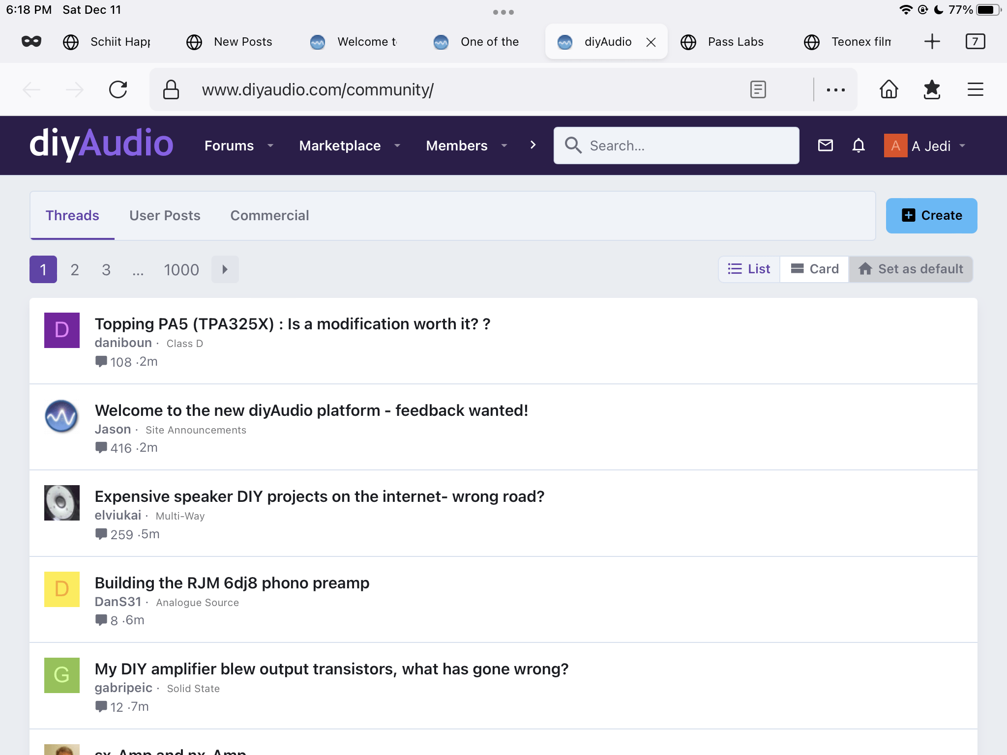
Mmm, I'll be blunt. It sucks. Too many larger graphics, less info visible on page and I miss the old forum landing page with the updated threads list. I read all new threads daily, this new layout makes that a massive pita.
in the opening post by 6L6, only 3 out of the 15 photo attachments are working
I'm probably just too accustomed to the old style, but I still prefer old site after 2 days. Thread list is hard to read on computer, maybe it's good for tablet and phones, though.
The default Classic font is "same as before" within a few percent. What is odd, what you may understand better than us (being both a designer and an illusionist) is why is Dreamth "sure" the font has got smaller when it measures larger for me?
It is not exactly one font. It is a font string of several options for the browser to choose based on what is installed/available on the particular PC and OS the user is on. This is a universal but annoying 8feature* of the modern internet. The different font options, Verdana, Tahoma, Helvetica, system sans etc. all render at slightly different sizes and weights on different platforms too. So it is entirely possible that you are both right.
You should have 2 lines available - please double check for me and let me know.I had many lines. 1 now. Not even an issue i have raised yet… more important things for the crew to do.
dave
I'll second these comments. Pages seem difficult to visually take in, the old format was way easier to read.Mmm, I'll be blunt. It sucks. Too many larger graphics, less info visible on page and I miss the old forum landing page with the updated threads list. I read all new threads daily, this new layout makes that a massive pita.
It seems to me there's less info on the screen now.. I tried reducing my computers resolution but it didnt appear to help
I'm an old curmudgeon, I don't like change. I dislike trying to figure out what I knew before. I also realize there are reasons things need to change, but that doesn't mean I like it, or am willing to spend as much time.
JT
EDIT: In all honesty I hate it. 🙂
JT
EDIT: In all honesty I hate it. 🙂
Sort out the css there's way too much padding between posts, the dead space and scrolling is killing me on mobile. Therrs more space between my last word and the reply button than in all my text.
That has changed on the new forum, one of the reasons we couldn't import people's signatures.Yes, I know, but until now I had two lines 🤔
You are indeed correct - this is a good idea.It would be useful to have the page selector on the top AND on the bottom, just like it is on the desktop mode.
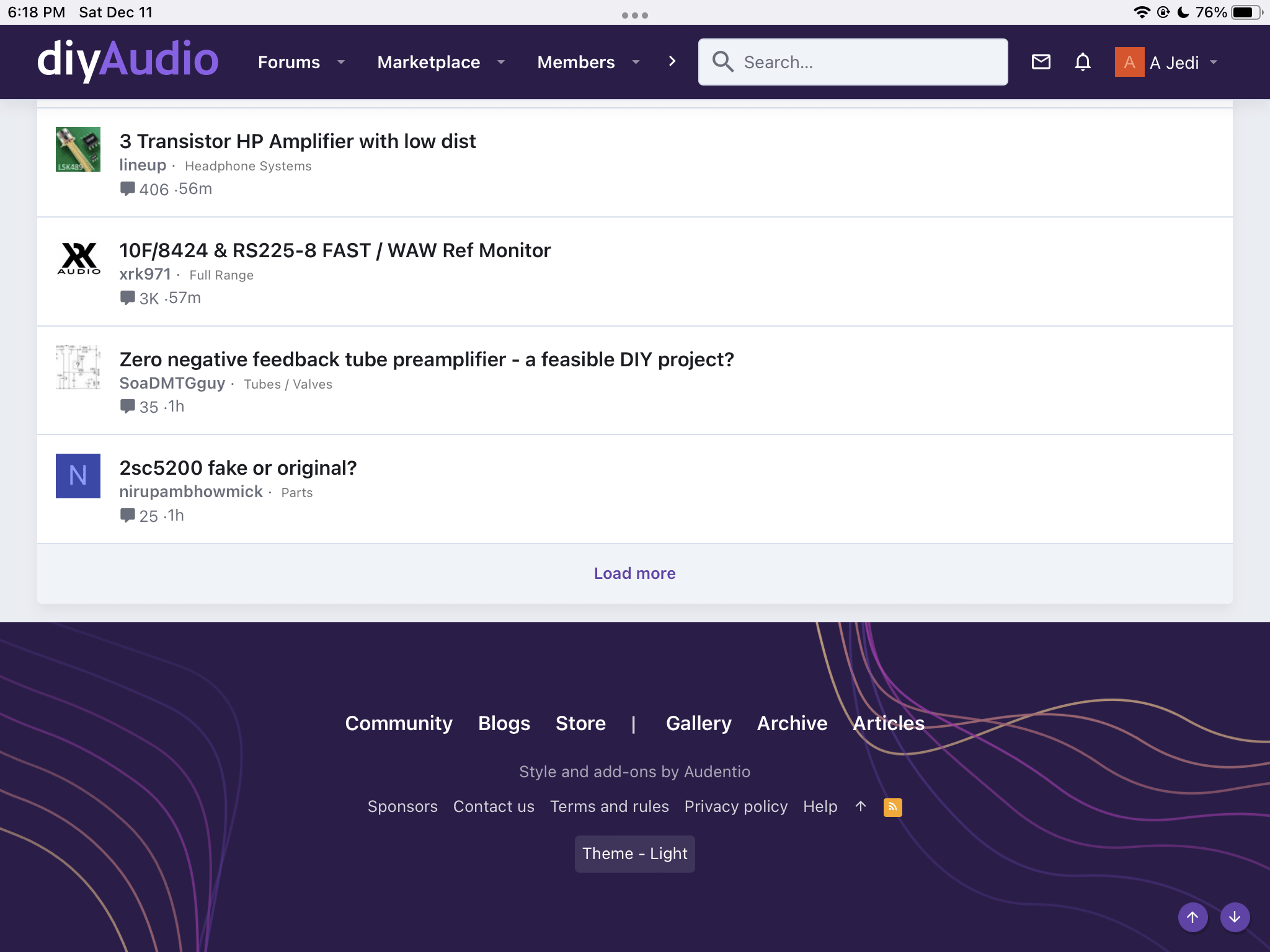
I find 20 posts on the Home Screen somewhat annoying. I was used to 100 posts. While the see more button on the post brings in more threads, it doesn’t keep them if you go into a thread and hit the back button to get back to the Home Screen. Adds a lot of extra scrolling, either back to the bottom and the see more button or up to the top to select the next page.
Can you be more specific? I know it will be difficult to do now that you can't see the old format, but it is a common complaint of the new layout. I've gone to full width and am using classic or lite themes and don't see a big difference between old and new. But maybe the new format simply has all in the info my poor brain can handle, so it would be good to know in more precise terms what is missing/lacking on the new landing page.It seems to me there's less info on the screen now.. I tried reducing my computers resolution but it didnt appear to help
Agree. This was noted in beta testing and it seems to be a "feature" of the new software. It will take a custom plugin to fix it. The transition team working on that, AFAIK.I find 20 posts on the Home Screen somewhat annoying. I was used to 100 posts
One thing I really liked about the old layout was that I could look at the latest 100 threads that have new posts in them. The top 100 basically would cover everything new and I could scroll down and look at whatever was interesting for me. The new layout sort of allows that but it requires the click of "load more" at the bottom after 20 or so threads. So far so good.... But, when I click into one of those threads and then go back to the page with the "latest", it's back to just 20 (I haven't actually counted the number) and I have to now keep loading more until I get down to wherever I was before. Is it possible to have the top 100 already preloaded?


- Status
- Not open for further replies.
- Home
- Site
- Forum Problems & Feedback
- Welcome to the new diyAudio platform - feedback wanted!