I would agree. Moving targets and background live update is a strict no-go in my book.2) The front page is frenetic....it keeps adding, changing, in a live way before I can read and select.
As for the Forum/Store thing, I'd prefer them to be totally seperated with zero overlap, different URL's actually (diyaudio.com and diyaudiostore.com). Less bloaty = better.
Not sure what you mean - please elaborate or screen shot an example (or counter example) for us to look at.
Voilá.
Attachments
I want to thank the administrator and those involved in the move. I understand it's a lot of ongoing work, so please take my comments as being constructive and from a friend.
I never had an issue navigating the old desktop site using a notebook or even on a mobile device w/a 4.1" screen. It was just excellent and spreading my fingers to enlarge the page was easy. On that old website, the content density was there and it was easy to get into the meat of the topics or categories with no more than a single click or tap.
With the new desktop template, there is a lot of dead space that reduces the on-screen information density. Many online startup stores look that way and it takes too much scrolling to read. The classic setting helps, but the front page is still a lot of scrolling.
Regarding the mobile site, it's everything I feared - one or two posts on the screen at a time; mountains of dead space; endless scrolling, tiring to navigate and I don't see a "desktop version" button. It actually feels less like a technical hobby forum and more like a social media site. I hate saying that.
IT seems supernatural to me, I can only be grateful to all of you for your efforts! I access the internet exclusively via my old desktop and I never exhausted all customizing options in the old version of this site. So now the classic theme and forum list page makes me feel at home already! It would be nice if I could set this as home page and not have to click to that button every time, but not really important. I do need to ask about youtube links. It seems that the whole video is inserted now, some times big enough. Is this OK?
PS: I forgot to say that I can't see adds since yesterday. I'm not complaining...
PS: I forgot to say that I can't see adds since yesterday. I'm not complaining...
Attachments

First of all, thanks to everyone involved maintaining this amazing forum. Everything looks good, and for some things, just need to get used to it.
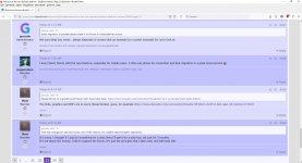
The one real issue I see, images not being displayed in posts, just file names are seen, not sure if it is like this is everywhere, but at least in some of the older ones, for example:

The one real issue I see, images not being displayed in posts, just file names are seen, not sure if it is like this is everywhere, but at least in some of the older ones, for example:
First Impressions:
1. It's new.
2. The landing page is not half as useful as the old.
3. Image manipulation looks far better.
4. I hate the Win8 style avatar and general simplification of everything (as if we all use mobiles or have serious myopia)
5. Classic or Dark themes are nice, but potentially pointless on mobile devices (my standard is dark theme for everything, and it does not work here...Still have to set it manually rather than the page conforming with what seems standard across mobile devices now (I.e. the auto capability and conversion of all pages to a dark theme)
6. User profile edit and stuff like that doesn't seem so intuitive, is it there?
I must admit I get lost on mobile, with 5 threads per screen and no thread preview
Next I should check out kn my regular computer win10, and see what it looks like on a decent sized screen, and outside Android.
What is changing and adding? I don't see that on my view and not on a test account or not logged in (non-moderator). Pages appear static to me. Is anyone else seeing "frenetic"? Is it browser specific?2) The front page is frenetic....it keeps adding, changing, in a live way before I can read and select.
3) Can't find 'last post' to follow a thread...
To find the last post, simply click on the highest page number at the bottom, it will take you there. Once you've read a thread on the new software, you should automatically be taken to the first unread post in that thread.
I think he means the live updates. I echo the sentiment. Feels live-blog-ey, like an entry with "ponies!!!" is going to happen and gives the user experience of "all your control are belong to us", etc. I think live updates are welcome once you're in a thread, but not at higher altitudes.
Last edited:
You mean that the list updates as new posts come in? It's been quiet this morning so I'm not seeing much happening.
Would work better static and you would need to refresh to see new posts?
Would work better static and you would need to refresh to see new posts?
Got it, thanks!Click the search, in the popup click the advanced - the tab bar at the top of advanced search allows you the search in thread option.
Congratulations with the transition.
I get the impression that not all new posts appear in the list on the first page. At this moment I'm missing the three newest postings made in the Power Supplies section.
At first I also didn't see the post I made myself in the power supply section (on the list of postings in the Power Supplies section itself) but clearing all cookies fixed that one. But clearing cookies didn't change that I miss the three latets postings in the list of the first page.
If this was already reported/known, my apologies (I didn't read all the postings in this thread).
I also don't see the post list updating when there are new post. Threads actually updates more often, which is odd.
Yes, this auto update is not what we are used to see. Probably one could get used to it and adapt. Still, a toggle switch beside the list to turn auto update on or off would be a nice feature.You mean that the list updates as new posts come in? It's been quiet this morning so I'm not seeing much happening.
Would work better static and you would need to refresh to see new posts?
//
No. This place can have a lot of stuff happening at the top two levels sometimes. Static there is good so nothing moves by the time we try to select it. Now having spent some Android-time, too, the impact there is even larger/more painful. Probably an either/or for code, but just expressing the preference if easy/doable. Static up-high, live-updates at thread-level only would be my personal pref. If that's unwieldy, static gets my vote.
Refresh. User controls their display, user controls their bandwidth. Fundamental. It's a forum, not a chat-room. My 2c. I may be shouted-down by the zillions, but that's the perspective and the implicit contract with the user. That-said, the live-updates remain welcome once viewing a thread. Those are useful. That distinction is more chatty...I know, nebulous. Tossing it out there.
@grindstone This is interesting because I can't see the fast refresh of the front page. I'm getting one new thread about every 3 minutes, and the post list is stuck at the same place for over 5 hours. 
I've tried with my account, a test user account, not logged in, a mobile phone, a different browser and all cookies cleared. Why are some people seeing a distracting update while I can't see it at all?
I've tried with my account, a test user account, not logged in, a mobile phone, a different browser and all cookies cleared. Why are some people seeing a distracting update while I can't see it at all?
- Status
- Not open for further replies.
- Home
- Site
- Forum Problems & Feedback
- Welcome to the new diyAudio platform - feedback wanted!