My sight is getting worse, too.As my sight began to degrade, I kept getting more and more powerful glasses made for computer use (a bit longer prime focus than reading glasses). I also kept getting larger screens. A large "computer monitor" is real expensive since most are optimized for gaming (fast response time). Today you can get a 4K TV cheap. They make pretty good monitors if you don't get a real big one. As the screen size gets bigger, so does the pixel size so that small font text becomes hare do read. I got this Hisense 43 inch 4K TV about 4 years ago on a Sams Club Black Friday sale for $229. It is my primary monitor. 3 years ago I got a 40 inch Samsung HDR 4K TV for video editing on a different PC. It was $279 at the time and does have a better picture with slightly sharper text.
I bought a 32" 4K Samsung monitor for the computer. I can't find a 4K TV that small and the picture would be crap anyway. I sit about 12 inches from it. The only annoying thing is craning my neck around to look at it. From my POV, the left to right angle is almost 30 degrees.
Last year, I splurged on an 85 inch TV. I can read text from 18 feet away 🙂
On the new site, I'm using the dark theme, medium font, and full width. It's not bad at all.
I keep using bigger and bigger monitors. It helps a little.
Forget surfing on my cell phone. I do stream music though. I bought a new cellphone a couple years ago and hated it so much. I couldn't use it. I went back to using my old cell phone.
I can use stuff if I know where it is. I helped my buddy change coils and spark plugs on his Infiniti truck. If I can feel the bolt with my fingers, I can get it out. I have all the fastener sizes memorized on many vehicles. My buddy insisted I install the plugs because he doesn't want them stripped. He over tightens everything.
I learned to type without looking at the keyboard 50 years ago. Good thing.
I don't want the mods to think I'm ungrateful. This website brought me up to speed after decades of not using my engineering and design skills. I got laid off in 2009 and decided it was time to try to catch up in the world of engineering. DIY Audio has been a prime tool in making that happen. I was way behind. The industry has changed lot.
So thanks for all the effort. I try to pass it along whenever I can.
So thanks for all the effort. I try to pass it along whenever I can.
Then you see "Reply". Do that, and your snip is quote-formatted.
What happened
Ok, the reply thing makes much more sense now, but the old version was better for when you where tagging contents from posts over several pages in a thread. Every time I'm thrown down to the post edit instead of being able to keep tagging posts.thanks to Jason
I just bought a large monitor at a pawn shop for 30 dollars.
I only view the site on desktop
2 years of large crystal clear service so far.
Its likely considered very old to some, works great for me.
Back in the day I would run dual monitors.
monitors over the last 10 years are so big no need for that anymore.
People want 20 comments on a screen and wonder why its hard to read.
5 comments on the screen makes it easier to read.
Hence larger.
Once your done reading the comments you just click the button.
Then read those comments...etc etc.
People dont like change, but then once you adjust.
looking back on previous tech few weeks/ months/ years later.
you eventually realize how comical old tech can be.
And the new improvements were actually rather good.
I remember being enraged when windows XP came out.
loved good old 98. Its comical now since I have not dealt with
either for 20 to 30 years now. And dont miss either.
Back then...ohhhh end of the world LOL
I got it a long time before anyone else since I was in the beta tester program. Windows XP at launch was absolutely horrible, it was not until SP2 that it became "less awful". Windows 2000 OTOH was really good.
Gents and ladies (not currently here) I said it in a very early post on the old forum software - I work at a university in IT (network specialist) and have seen and experienced first-hand the migration to not only a new interface but also new platforms. Server technology changes, and with it the software technology.
Excuse the expression, but there is always a lot of "bitching" in these migrations. I too asked in the one thread if it was not possible to keep the old format. No answer yet; but Jason and the team is busy - with us, life, Xmas, crotchety "olde" users harping on etc. Time and patience lads, time and patience. This is after all a private, self supporting forum. We definitely do not want some corporate to take over and push their shite down our throats - aka Microxxxx et al. To quote from my late wife "Life's too short to stuff a mushroom"
Just BTW I prefer to spend a little extra cash on a decent screen card. I have three 20" screens (more affordable here in SA) so that I can separate the apps I'm using. CAD to the left, Forum to the right and file explorer centre. Once the 20" screens start packing up I'll replace them with 24" ones.
Last edited:
I have the same feelings as MrKinky about new layout, really bad format - reminds me of Windows 8 try to force customers on NEW-Improved look that everybody hated...Shocked and saddened by the new 'Child Friendly' web page design showing about a tenth of the information per page as the old one. Another site ruined for us desktop surfers. Unlikely to use any more...
Ok, so I tried the Classic mode, but it is not same as before, too big font, too little information, no overview of entire site on the left side as before, why even calling it classic mode if it is not the same?
Really shame, but I'm saying goodbye to the present design...
Sorry to hear that tubemax, and many agree with you that the information does need to be better condensed, and that is in the pipeline.
The software needed changing for technical reasons, not to force a new look. It just so happens that it's a big job and will take time.
The software needed changing for technical reasons, not to force a new look. It just so happens that it's a big job and will take time.
Agree. This is being fixed, appears to be a bug when you are on mobile and not logged in. Made worse by the fact the software keeps trying to send you to the first post not the last in many situations (another bug). They are compounding to make life on mobile when not logged in not very pleasant.Hi another disgrunted mobile user here. The fact that i have to scroll all the way to the bottom in order to get to the beginning of the thread, by having to use the page flip arrow, is ridiculous.
Google will catch up eventually.And to add insult to the injury none of the google search result on this website takes me to the right page. Meaning ill search for a term, click on the thread link and im taken to a page where not the term is. This is on android chrome btw.
We shifted from 10 posts-per-page to 20 PPP as a default. I think 20 is nicer. 10 was to little. I used to use 50 myself. Now the software only has one setting, and we've settled on 20. A bit more information on each page. Less page views, of course 🙂
But yeah, Google will reindex. This is a once in 20 years change.
Not sure exactly what you mean.What happened to the personal visitor stat information ?
That's a good point. I won't say that wasn't a little easier for multi quoting.Ok, the reply thing makes much more sense now, but the old version was better for when you where tagging contents from posts over several pages in a thread. Every time I'm thrown down to the post edit instead of being able to keep tagging posts.
However on the plus side you can now quote bits of text easier, and your edit box survives moving across pages, and if you quote someone they get an email about you quoting them which will allow better engagement.
Yes, queuing up for COVID tests for border-passes, Xmas travel and events, and now spending time with my mum and dad for Xmas... Dev team is away until some time in Jan. We'll get there.Gents and ladies (not currently here) I said it in a very early post on the old forum software - I work at a university in IT (network specialist) and have seen and experienced first-hand the migration to not only a new interface but also new platforms. Server technology changes, and with it the software technology.
Excuse the expression, but there is always a lot of "bitching" in these migrations. I too asked in the one thread if it was not possible to keep the old format. No answer yet; but Jason and the team is busy - with us, life, Xmas, crotchety "olde" users harping on etc. Time and patience lads, time and patience.
I must have missed your other post - keep the old format? As in classic theme? Yes it will stick around. And over time get closer to the original. Go back, un-migrate? Impossible. We can migrate again (to IPB, Discourse, or something else), yes. But we can't go back to the dumpster fire that comprised our vB3 stack.
Give it two months to see some meaningful improvements. Remember this is a new start, not a final destination. We launched before I was happy with the design. All the negative feedbacks about the new design are things I myself put to the development team, but now (a) we can focus on getting to where we need to be and (b) there is a bucket load of user feedback to support my arguments for a better design that is more suitable for and tailored to the needs of our community.I have the same feelings as MrKinky about new layout, really bad format - reminds me of Windows 8 try to force customers on NEW-Improved look that everybody hated...
Ok, so I tried the Classic mode, but it is not same as before, too big font, too little information, no overview of entire site on the left side as before, why even calling it classic mode if it is not the same?
Really shame, but I'm saying goodbye to the present design...
Lastly, sorry for not replying sooner. I'm still used to having all my "watched posts" reset every time I come back to the forum. Now they only reset when you actually visit them. I think it is debatable if this is an improvement.
Whatever the explanation... I liked the old forum way better. Maybe it is the fonts or the font size I don't know. It sure makes me post less so that is good 🙂
I think it looks great, am in particular pleased with how the dark theme came out, sure it takes some time to get used to the new graphical user interface, but the only hindrance is once own cognitive limitation adapting to the new environment.
But there's one exception and it is that the layout is a bit too spacious and spread out, so I have been redesigning the forum's looks locally with help of a web browser extension called Stylus which is available for both Firefox and Chrome type of browsers, but I'm not really good at it so the layout is limited to the dark theme because the forum software uses so match Javascript and stuff.
Link to Stylus browser extension.
https://chrome.google.com/webstore/detail/stylus/clngdbkpkpeebahjckkjfobafhncgmne?hl=enhttps://addons.mozilla.org/en-US/firefox/addon/styl-us/
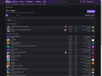
Here are some pics.
But there's one exception and it is that the layout is a bit too spacious and spread out, so I have been redesigning the forum's looks locally with help of a web browser extension called Stylus which is available for both Firefox and Chrome type of browsers, but I'm not really good at it so the layout is limited to the dark theme because the forum software uses so match Javascript and stuff.
Link to Stylus browser extension.
https://chrome.google.com/webstore/detail/stylus/clngdbkpkpeebahjckkjfobafhncgmne?hl=enhttps://addons.mozilla.org/en-US/firefox/addon/styl-us/
Here are some pics.
Attachments
-
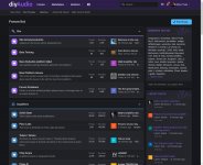 DiyA forum list original look.jpeg231.5 KB · Views: 122
 -
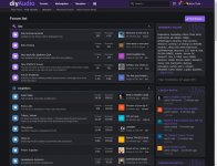 DiyA forum list compact look.jpeg247.2 KB · Views: 131
 -
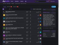 DiyA community original look.jpeg195.7 KB · Views: 114
 -
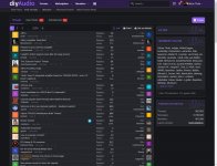 DiyA community compact look.jpeg241.4 KB · Views: 115
 -
 DiyA attachments original look.jpeg177.1 KB · Views: 107
 -
 DiyA attachments compact look.jpeg160.7 KB · Views: 112
 -
 DiyA lounge original look.jpeg144.7 KB · Views: 97
Last edited:
Come on, every new thing is uncomfortable at the beginning but its done for a purpose. Yes, int the long run we`re all dead but until then - the new design might prove a step forward. First cars were not comfortable to drive either but we`re not traveling by horse today, arent` we.

I think it's pretty good, really.
Big up 2 JaMan 'an de Kru 😀
I consider the transition a success, most functions are vastly improved, the graphical bits is a "incremental progress over time" thing.
Only remains to see if I can set aside enough to support the forum in time to get a t-shirt in the deal.
Big up 2 JaMan 'an de Kru 😀
I consider the transition a success, most functions are vastly improved, the graphical bits is a "incremental progress over time" thing.
Only remains to see if I can set aside enough to support the forum in time to get a t-shirt in the deal.
I'm sure you're all over it, but have you requested a site reindex via the Google Search Console?...But yeah, Google will reindex. This is a once in 20 years change.<snip>
(Sorry to go OT)
Shocked with this new look, plain, un-motivating, unfriendly....why change something that was good, just for the sake of change...or someone gets more pay. I use Commonwealth internet banking, they did the same awful change on their site, from good to bad and worse.
- Home
- Member Areas
- The Lounge
- New page design