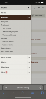
Yes, the only new thing there is "Watched" which could be on the old layer to save space.It looks like this was changed by adding an additional "menu layer"
But what about when you are in a thread? Is the new white menue bar useful there?
Yes, the only new thing there is "Watched" which could be on the old layer to save space.It looks like this was changed by adding an additional "menu layer"
I suppose it's different mindsets. I find the new layout much easier to navigate than the old one, and fewer clicks needed to find what I want to see. Well except for the moderator tools, which are in strange places, but that's a mod problem. Working out something for everyone will be fun to watch.
The new front page could be denser, for sure. The old layout was marvelously compact, it would be hard to get it any denser. There will need to be a lot of work to get the new layout near where it was.
Please post any broken links in the dedicated broken link thread, ta.
New is this XF forum. I can find my content and other things of interest much easier here than on the old VBulletin software.If mine, when you say new and old, what is the new, and what is the old?
You didn't quote so I don't know if you're addressing my post, or the one above mine. If mine, when you say new and old, what is the new, and what is the old?
I suppose it's different mindsets. I find the new layout much easier to navigate than the old one, and fewer clicks needed to find what I want to see. Well except for the moderator tools, which are in strange places, but that's a mod problem. Working out something for everyone will be fun to watch.
The new front page could be denser, for sure. The old layout was marvelously compact, it would be hard to get it any denser. There will need to be a lot of work to get the new layout near where it was.
New is this XF forum. I can find my content and other things of interest much easier here than on the old VBulletin software.
On my phone in portrait mode there is the drop down on the upper left that takes me were i need to go. In landscape mode I see the same nav bar as on the desktop

Audentio said:Hey, this is Will from Audentio! I was one of the team of people who worked on the platform and migration.
Should it be a permanent column on the left?
EDIT: I’m having trouble with quotes on mobile
Where do you envision that menu? Not the current fly-in right?
Yes, this has been reported half a dozen times now - there is no need to mention it again unless you enjoy typing, but I will continue to let you know I have read your comments about this and let you know the issue is being looked into and will be resolved.Jason, XRK is writing about broken images (hundreds of them), not from broken links. I posted a broken "image-link" (of an internal hosted image) in the other thread, but the answer was "Thanks, but that's a broken image - I have a few of those to look into." In fact, there must be thousands of such broken images. I think this is a much bigger problem than the issue with the broken links.
Change is hard. If you are using desktop, there is a "Forums" dropdown mega menu in the top of the screen. It's always visible so you can navigate to every section of the site with two clicks at any time. Try using that.Totally lost the plot, can't find my way around the new site.
I'm happy to see if there is something that can be done about that - I'm surprised it used to work differently.@Jason: Thank you for the reply. I only reported this because it is a step back compared to the old site. It works fine if I click on the forum-link, top or bottom, but then I have to scroll down to where I was at. Are there still people connected to the internet via modems? A refresh should only take a few ms.
😆
Please give the new design some time, it may grow on you. Be sure to check out the classic theme if you liked the old look and know that it will be modified slowly over the next 2 months to get even closer to the original.Disaster! End of diyAudio for me...
Will there be a way to get to choose the number of posts per page? I was getting used to 50 posts per page...
Otherwise, great improvement overall! I'm using the classic style and I'm slowly getting used to the new look and functionality.
So some where only here for the looks? How about the content? Try to be a bit flexible and positive to change?
Its a forum with threads and posts.
The only thing we can be certian on is that everyting is going to change.
//
