Who cares if it is mark I or mark n of a product when it hits the market for the first time?
BTW. I also worked couple of years as ID in serious company..
BTW. I also worked couple of years as ID in serious company..
Last edited:
Well then, what about a solid /embossed "block" on 1/3 from the left side, that would hide the sensor nicely?
(You may fit an OLED in there as well.. (Which would require milling from the inside to have a mounting pocket)
(You may fit an OLED in there as well.. (Which would require milling from the inside to have a mounting pocket)
You have my retouch in the attachment. It's for you. Nice product.
I like this much more. If you could remove all the roman characters and replace the brand name with a brand icon...
 There comes a point in a brand's development when it no longer needs its name to be recognised - imagine that already happened for your product. Something fibonacci?
Last edited:
Windforce85, I think I know the source of my anti-minimalistic nature. I was born in USSR where military-minimalism was everywhere. I hated that and I borrowed some german OTTO catalogs to dream about HiFi, it was like a porn for many soviet boys like me )) Of course I liked ampli-receivers Pioneer, and remember my feeling when they changed the logo. This is why I call it HiFiTOY because my toys were military-minimalistic and I didn't play enough. Windforce85, if you can help me about ID, you are welcome and I ready to pay for in case if the result will be nice. Let's talk?
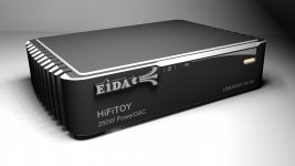
doctormord, the logo width is 39mm (with 1.7+.3 = 2mm of thickness), if I'll make it 50% less that will look ugly fat. I had the idea to place there 1.5" IPS display with VU meter surrogate but finally I gave it up. I don't like OLED, at least what is available, always something greenish and low resolution.
doctormord, sorry I still can't catch you about the "solid block", could you please mark that on my pics?

Whilst you mention that it is not necessary to touch the panel would the interface, volume and on/off be or feel more comfortable and also less cramped if it were placed on the top panel. It would also free up more front panel space for squiggles.
Probably it is maximal minimalism what I could accept 😉 Any opinion are welcome
Freehand..

Attachments

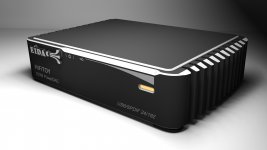
Ohh, doc! That reminds me something from my soviet past as well(please don't forget about extrusion process limitations!) 😉 I think I need more symmetry in front. Actually I had the variant with deeper chamfer in the center and on the top also, however too deep bevel looked ugly and I gave it up.
If that on/off switch is as "touch" as the Volume I reckon its to close to low volume. One might turn the thing off unwillingly?
//
//
Just moved light-pipe and turn it 90dg, I think looks better, isn't it? 😕
jop...i like this version more...😀
- Status
- Not open for further replies.
- Home
- Amplifiers
- Class D
- Tiny TAS5558 +TAS5624 "Power_DAC"+SMPS