I waded through to page 37 before hitting the "last" button. Ill just assume nothing after page 37 was worth seeing.
geewhizbang has enlightened me. I now see graphic design as an art and a process that requires great skill. Previously, i had assumed it was all about using the fancy effects in photoshop and making things 'tastefully' blurry.
In my opinion, #180 and #162 are the most promising. The imperfect waves are a great touch, and GWB seems to have put a lot of thought into the t-shirt printing side of things. Its interesting seeing a design progress like this. He should come up with some more.
Personally, i dont see the need for a mascot. Will it affect me, as a user? Unlikely. The resolution of my screen is so pathetic that I cant even see the top of the page when im reading a post. Will it influence people to become members/take an interest in diy audio? Unlikely. People will join because of the content, not because of a soldering iron with a face.
So theres my €0.02 worth. But what does it matter? I cant even figure out how to make things 'tastefully' blurry.
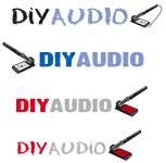
Thanks for the nice words about my logos. The new short list looks like people, for the most part, rejected the really busy ones.
Of my logos, I like the #181 logo the best. I don't like my #140 logo much any more (it looks ok, but it reminds me more of target practice than audio, which is why I abandoned it and moved on.
Other than mine, I like #467 and #234, but only the swirl on #234; I don't like the associated typography; the fonts are a bit bland and they could be better related in size and position to the really kewl swirl.
I had a quite morning...
An externally hosted image should be here but it was not working when we last tested it.
 I want some of what you're smoking when you come up with these wonderful creations
 The Best Batch Yet
An externally hosted image should be here but it was not working when we last tested it.
More Organic
An externally hosted image should be here but it was not working when we last tested it.
Re: The Best Batch Yet
")
For some reason it also reminds me of scrap heap challenge.
"here's a junk pile of old audio equipment, and a soldering iron. You have 30 minutes to build a gainclone - your time starts...now!"
"and at the end of the show we'll race 'em"
This has a very industious feel. Looks like so many things going on, working together for end result. Could be a Honda advertRopie said:An externally hosted image should be here but it was not working when we last tested it.
For some reason it also reminds me of scrap heap challenge.
"here's a junk pile of old audio equipment, and a soldering iron. You have 30 minutes to build a gainclone - your time starts...now!"
"and at the end of the show we'll race 'em"


Thanks for the kind words. I don't really expect them to be seriously considered as logo contenders (though it would be nice) - I just do them anyway.
Thanks ajju, I have thought about this but have yet to get anywhere. Anybody want a logo for the front of their new amp??
I seriously think that you can make a few quid selling them....
Thanks ajju, I have thought about this but have yet to get anywhere. Anybody want a logo for the front of their new amp??
- Status
- Not open for further replies.
- Home
- Site
- Site Announcements
- diyAudio Logo Competition Draft Entries