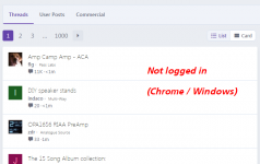
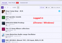
Before logging in, the display of newest posts uses a very thin font that's quite hard to read. I've seen this behavior (images below) on Brave, Chrome, and Firefox. After logging in, it gets much better. I think visitors to the site might be a little put off when the content is so difficult to read. People who haven't become members yet.
edit- oops! This seems to be the "default style theme" while I have chosen the "classic theme" when logged in. Sorry for my confusion.
_
edit- oops! This seems to be the "default style theme" while I have chosen the "classic theme" when logged in. Sorry for my confusion.
_
Attachments
Last edited:
This shouldn't have ever looked like that on any screen (I see in your screenshot some letters are actually missing darker sections of the letters like they have been eaten out, but I'm not sure if that is just the image compression algorithm).
We made some changes to address this: https://www.diyaudio.com/community/threads/difference-between-bold-and-normal-is-too-subtlee.381305/ but looks like something must have gone wrong, and we'll be reverting the change in the next hour or two. Let me know if things look better tomorrow.
We made some changes to address this: https://www.diyaudio.com/community/threads/difference-between-bold-and-normal-is-too-subtlee.381305/ but looks like something must have gone wrong, and we'll be reverting the change in the next hour or two. Let me know if things look better tomorrow.