if you have a single pole, the phase shift is 90degrees. That difference only occurs right out at the infinitely far away frequencies from the midband.
If you cascade two single pole filters the total phase shift is 180degrees. Again the full 180 degrees is way out at infinite frequencies.
To save me typing and you reading, I'm jumping straight to 5 cascaded single pole filters.
The total phase shift is 450degrees.
If the phase starts at 0degrees and increases to 180 degrees part way along the passband you will see the plot (without any wrapping) showing 180°.
Continue farther out and the phase goes on past 270° and on to 360°.
The vertical scale will have to be compressed to get all the degrees to fit on the page.
Now go out to infinite frequency and you will see the phase at 450°.
To get all that shown at a readable vertical scale and fit a conventional page shape, you can ask the plotter (either a person or the software) to wrap the vertical scale at prescribed intervals. 0 to 360° is quite common. -180° to +180° is possibly slightly less common. But the wrapping to fit the page can be any value. 0 to 100° could be used if you had a need.
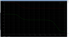
The plot in post1 has a wrap set to +180° to -180° (top to bottom) simply to allow a short vertical page height AND be readable.
You could unwrap it, but the vertical axis would be twice as high. You would need very tall paper to plot that.
If you cascade two single pole filters the total phase shift is 180degrees. Again the full 180 degrees is way out at infinite frequencies.
To save me typing and you reading, I'm jumping straight to 5 cascaded single pole filters.
The total phase shift is 450degrees.
If the phase starts at 0degrees and increases to 180 degrees part way along the passband you will see the plot (without any wrapping) showing 180°.
Continue farther out and the phase goes on past 270° and on to 360°.
The vertical scale will have to be compressed to get all the degrees to fit on the page.
Now go out to infinite frequency and you will see the phase at 450°.
To get all that shown at a readable vertical scale and fit a conventional page shape, you can ask the plotter (either a person or the software) to wrap the vertical scale at prescribed intervals. 0 to 360° is quite common. -180° to +180° is possibly slightly less common. But the wrapping to fit the page can be any value. 0 to 100° could be used if you had a need.
The plot in post1 has a wrap set to +180° to -180° (top to bottom) simply to allow a short vertical page height AND be readable.
You could unwrap it, but the vertical axis would be twice as high. You would need very tall paper to plot that.
In some software you can show the phase with(out) this display artefact with a check box called "Wrap phase" or some similar option.
Nice to read you sorted it out.I did some research and you guys were right, it was wraping 😱 nice call guys.
there is a way to turn it off in ngspice, the result is attached.
Was it a check box called "Wrap phase"?😉
Best wishes
David
Last edited:
When your clock on the wall moves from 11:59 to 12:01, there is an instantaneous 24-hour change. The time line instantly switches from the positive end of one day to the exact opposite end of the next day. This is the same idea.
Most logical and humorous explanation. Absolutely right 😉
And solution was so simple ...
In ngspice just use cph() function instead ph() (see current documentation, page 265)
In ngspice just use cph() function instead ph() (see current documentation, page 265)
Last edited:
In ngspice just use cph() function instead ph() (see current documentation, page 265)
Thats exactly what I did 🙂
- Status
- Not open for further replies.