Iwata is much like JMLC but allows closer spacing. Rather choice of look. EJMLC has twice as much HF dispersion. Sonically? Haven't tried myself.
Twice the dispersion of the regular JMLC horn, or the Iwata?
Iwata and E-JMLC has about the same horisontal dispersion, while the regular JMLC is more narrow?
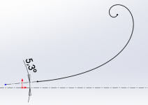
Twice the dispersion of JMLC horn. Iwata is closer to JMLC. Higher the dispersion in V plane and difference between H and V plane - more irregularities in frequency response.
Of course - we will make as close as 0deg as possible 🙂
How's the SEOS18 1,4" for Radian 951 coming along?

Seos 18 for 951 not yet ready - mold has not been started yet.
OK, thanks for the quick reply. When do you think it will be ready?
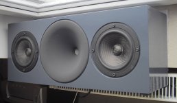
An OS-8 would be great for surrounds and economical fronts.OS-8 test enclosure. Waveguide painted in Nextel coating. Mid woofer with very stiff carbon membrane.
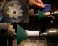
Caprolactam plastics are very useful for making phase plugs and adapters - below is plastic insert for LCY ribbon forming 25mm throat. It takes 10 minutes to do - put in hot water and press into the housing.
Attachments
What is the throat angle on the JMLC 400. I am looking at it as a alternative to the azurahorn 425. Also, how can we have it painted in other colors than those offered. I would really like to match the grey of my Altec 416's. It is like a charcoal grey.
The Nextel grey look great. I ask about throat angle because it will match up with Altec 288/Radian 745, and I think theirs is 7-8degrees. Is it possible to get the 400 in 1.4" mount and that throat angle?
Yes 5 degrees is at 1.4". Ask Autotech for availability with grey Nextel, send PM to info@autotech.pl or better to diysoundgroup.com
jzagaja,
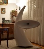
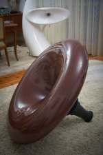
I saw the design published in stereolplay You send in pdf here
it is huge handy work, effort and precise finished elements
But the total design is not good. it is little of the amateur outfit.
the main elements are OK horns ets
BUT
the connecting parts are not designed well
and their outfit is opposite of the rest, sore of the design issue.
they are forced curved putting into global look to many curved lines.
mainly this black round barrel line carring the central horn and top little horn is
biggest alien. shape, material possition and kraft.
dont get me wrong but maybe consulting of a pro-designer is not bad idea?
second it is so huge contrast. Should be but not that much
horns are white so this black parts should be not total black but some grey variant,
or natural metal color
dont take me wrong but theese things is somehow can underestimate the main idea
and good based concept. Dont You think?
I post this not to underestimate acheivement, but rather to implicit the not so good points in generaly good design, please dont get me wrong
🙂
keep good work
Thanks for thoughts. As you may know - I'm a friend of Autotech just helping keep everything alive - hobby work. AT doesn't use any external designer - this is a family business. They just trying do good job with passion - not everyone like it that's for sure 🙂
- Home
- Group Buys
- Waveguides and horns