Per: https://www.diyaudio.com/community/...-platform-feedback-wanted.380360/post-6875704
Feel free to comment on any other issues specifically to do with whitespace and the appearance of posts.
Please note that all of this will be gone over with the fine tooth comb next month when we review all the styles and their appearance on desktop and mobile. Obviously the appearance of the posts themselves is the most critical thing to get right on the whole site.
Jason, I really like the new layout, easy on the eyes (and the mind). But I do miss seeing up to 100 posts in one scrolling list, of which maybe 30, 40 can be seen on one screen.
With the new system, if I go through new posts (which I normally do), I have to click the next page again and again.
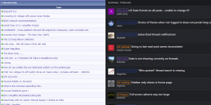
I believe a large part of the white space between posts could be eliminated to show more content at a glance without making it unreadable.
But let me take this opportunity to compliment you and your team with a job extremely well done. All functionality we need is there, and no crashes. No small feat.
Jan
With the new system, if I go through new posts (which I normally do), I have to click the next page again and again.
I believe a large part of the white space between posts could be eliminated to show more content at a glance without making it unreadable.
But let me take this opportunity to compliment you and your team with a job extremely well done. All functionality we need is there, and no crashes. No small feat.
Jan
Thanks Jan! Yes, I think this is the takeaway - the migration was successful, and we are now on a solid new platform, and there wasn't a week or month long disaster as has been experienced by other forums as they tackled this challenge.
On the flip side, we've launched a little premature, but thanks to the generous feedback from members we can attend to the most important issues first.
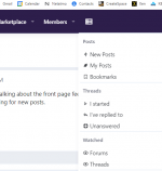
I'll leave this year even through it talks about whitespace, it's to do with the front page not viewing a post itself. Thanks for the feedback. We'll attend to the front page as well as the posts themselves.
On the flip side, we've launched a little premature, but thanks to the generous feedback from members we can attend to the most important issues first.
I'll leave this year even through it talks about whitespace, it's to do with the front page not viewing a post itself. Thanks for the feedback. We'll attend to the front page as well as the posts themselves.
We changed it to a list of 80 yesterday. So far, not many have noticed. 🙂
It works well on desktop, and 100+ probably would too. But we don't want to blast the mobile users so we are going slowly.
It works well on desktop, and 100+ probably would too. But we don't want to blast the mobile users so we are going slowly.
I really miss the gone list using just one line per post - it was my entry point to the forum...
Yes, I still use my good old pc - for me, a mobile phone is a kind of emergency aid...
What about giving the user a choice on how many posts he or she wants to be displayed?
Thx Ulli
Yes, I still use my good old pc - for me, a mobile phone is a kind of emergency aid...
What about giving the user a choice on how many posts he or she wants to be displayed?
Thx Ulli
Hi Pano, not sure we talk about the same thing. When I click 'new posts' on the top dropdown, I get about 20, and some page numbers on the bottom left I can click.We changed it to a list of 80 yesterday. So far, not many have noticed. 🙂
It works well on desktop, and 100+ probably would too. But we don't want to blast the mobile users so we are going slowly.
Where's the 80, or do I have to set it somewhere?
Jan
@jan.didden I'm talking about the front page feed where you can see new activity by thread, post or commercial. It did list 25, but now lists 80.
Where are you going for new posts.
Where are you going for new posts.
@jan.didden Ah, thanks. Seems a lot of folks would like 50 per page. Some maybe 100. In this software it's a global setting, so will be the same for everyone.
Perhaps 80 would work there like it does on the front page.
Perhaps 80 would work there like it does on the front page.
Posts in threads aren’t bad. The generic icons could be lost, and room for the flags made.
The issue with inadequate formetting is on the front page(s) that list the threads.
Lose the icons, make all the fonys the same size (or a lot closer), and from there there is no more information on the listings now than in the past.
dave
The issue with inadequate formetting is on the front page(s) that list the threads.
Lose the icons, make all the fonys the same size (or a lot closer), and from there there is no more information on the listings now than in the past.
dave
it looks ok on my phone, but on a 24" monitor I can only see 10 posts at a time on the home page. The font is GIGANTIC. I also miss very much the little icon that allows you to open at new posts, instead of page 1, and then clicking 'new'
TNT thanks for the tip. If I zoom to 67% the title fonts on home page are better and I can see 14 at a time. However all the smaller fonts become too small, and this includes posts in threads.
Seems odd - either you have a very old screen with low resolution or you run it in a non native one?
//
//


Well for what this is it looks good on IE6 (MyIE2) Jason,its about the same speed as the VBB site was....
I dont see too much empty space but then im only at 800x600 so I dont have a really big display..
Overall I think its good.... (tapeheads.net/forums.php is about to goto this also)
I dont see too much empty space but then im only at 800x600 so I dont have a really big display..
Overall I think its good.... (tapeheads.net/forums.php is about to goto this also)
- Home
- Site
- Forum Problems & Feedback
- Scheduled for resolution Too much dead space in posts