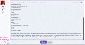
1) I tend to use paren asterisk paren to tag internal footnotes in a post. This evening on a moderately long much-edited post these kept being interpreted as Italic code.
() (*)
2) As the message got longer the bottom got hidden behind a cloud of fog. I have very-very-very little use for "transparent interface", especially when the interface takes priority over my jabbering.
FireFox 95.0.2 on Win7

() (*)
2) As the message got longer the bottom got hidden behind a cloud of fog. I have very-very-very little use for "transparent interface", especially when the interface takes priority over my jabbering.
FireFox 95.0.2 on Win7

I can't reproduce the italics bug at all on Chrome or Firefox.
The cloudy "save" button overlay that covers the bottom of the edit area when you add a lot of text is resolved by scrolling.
The way the save button starts off "not overlay" and then pushes down as you type more and then sticks to the bottom of the screen so it's always visible, seems like a logical UI choice.
Whether it overlaid or not, you'd have had to scroll down. The only difference is that the save button in this design is always visible, which could be argued as a plus.
As someone who prefers things not to be too fancy and stuff to just stay put on screen I totally understand where you're coming from. I think it's debatable if it's a net positive or net negative though. When in doubt, the best philosophy is to stick with the standard behaviour of the platform. Often there are reasons for these things to exist that as users of a previous platform we are not aware of until later.
Happy for further debate.