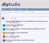
The new border around the sub-forum on Home hurt my eyes and brain. It is an unnecessary detail.
I suggest a clean interface. It was good as it was. Dont make it like an internet first years home pages...
Its the content that should shine, not the GUI...
//
I suggest a clean interface. It was good as it was. Dont make it like an internet first years home pages...
Its the content that should shine, not the GUI...
//
Last edited by a moderator:

That box is a very powerful GUI construct that attracts focus so it makes for a competition between the Topic Title and the sub-forum when just looking at the page. This is tiresome and I would say that the Title is far more important than the sub-forum. So the focus becomes backwards in some sense...
//
//
And due to the different length of the sub-forums, one have to move ones eyes sideways down the page. Excuse me but this is really bad usability and bad UI design.
A Thread is the biggest asset of the forum - please don't make it hard and tiresome to find it.
//
A Thread is the biggest asset of the forum - please don't make it hard and tiresome to find it.
//
Fully agree. It hurts my eyes too.The new border around the sub-forum on Home hurt my eyes and brain. It is an unnecessary detail.
I suggest a clean interface. It was good as it was. Dont make it like an internet first years home pages...
Its the content that should shine, not the GUI...
//
AAArrGHH ! aliens have captured the coders and forced them to use crayons.... 🙂 Everywhere !!
'Classic' theme is borked ! :-(
'Classic' theme is borked ! :-(
Last edited:
It makes the poor layout of the front page worse.
I suspect that the engine room guys are pushing buttons to see what they can do as they work towards one more reminisint of the old one.
Don’t stop complaining thou ;^)
dave
I suspect that the engine room guys are pushing buttons to see what they can do as they work towards one more reminisint of the old one.
Don’t stop complaining thou ;^)
dave
Yes, by all means offer a Christmas tree but please leave a "Classic" choice really clean.
Pretty please?
//
Pretty please?
//
Many problems with this - the graphics resemble a button - i.e. something to push. Pushing this button leads to a sub-forum. To navigate to a(ny) sub-forum is much better done by other provided means in the head of the page - the drop down menu marked "Forums".
Don't test "new things" in the wild - create a user group and run them there first - but maybe it is what you do!?
//
Don't test "new things" in the wild - create a user group and run them there first - but maybe it is what you do!?
//
Hey guys.
I freaking hate those borders. I removed them before we did the migration. It seems our developers have unfortunately reverted many if not all of the changes we made since they pushed the migration live. I'm going to have to now go back and try to work out what they all were and revert them... sigh.
I freaking hate those borders. I removed them before we did the migration. It seems our developers have unfortunately reverted many if not all of the changes we made since they pushed the migration live. I'm going to have to now go back and try to work out what they all were and revert them... sigh.
- Home
- Site
- Forum Problems & Feedback
- Resolved - Bug Squashed GUI clutter...