
Terry,
I see something interesting here. There is a big difference from your chart to the commercial chart in the Phi 3 to 4 region. Look at Phi of 3.5 were it intersects the layers at .5, 1, 1.5, BIG difference. Is it possible MathCad has a bug and did not plot this area correctly.
I have many points to verify the region from Phi 1 to 2 and they look real good.. But i have no numbers to check Phi .3 to 1, can you give me an assortment to spot check that area.
rikkitikkitavi, I do not have access to MatLab. If you figure out how to work Terry’s equations can you try to enter it in one of these free open source MatLab clones. Then any of us can try it.
GNU Octave
FreeMat
Home - Scilab WebSite
very commercial website.
GNU Octave
FreeMat
Home - Scilab WebSite
very commercial website.
Terry,
I see something interesting here. There is a big difference from your chart to the commercial chart in the Phi 3 to 4 region. Look at Phi of 3.5 were it intersects the layers at .5, 1, 1.5, BIG difference. Is it possible MathCad has a bug and did not plot this area correctly.
I have many points to verify the region from Phi 1 to 2 and they look real good.. But i have no numbers to check Phi .3 to 1, can you give me an assortment to spot check that area.
Powerbob,
MathCAD might have a plotting bug that affects only this curve - but its about as likely that your monitor is displaying the image wrong.
I had a quick look for phi = 3.5 and p = {0.5,1,1.5} and get what looks like the same answer from both graphs. note that throughout this tedious process I havent changed the graph or the expression - all of the issues you raised so far have been dealt with by you looking harder.
you have the analytic expression for Fr(phi,p). you have a computer. enter the expression yourself and plug your own numbers in.
and now that I'm irritated, how about you cough up some providence on your chart. so what that its "commercially available" - so are fake transistors. where does it come from and what expression was used to generate the plot.
Terry i do not understand why you are angry. You posted the Dowell graph and talked about how you verified the equations and declared it open source for DiyAudio. I thought this was a good idea and a useful chart. I saw there was no tick marks and when i learned you could not do them i offered my help.
I thought we were working together to make the best, most accurate Dowell chart available. As you know calculating the tick mark positions is very hard, I worked on that chart for over 40 hours to figure it out. As an engineer you know when the going gets rough you have to question everything and reverify everything and that is what i had to do to be successful. I m not apologizing for the process i embrace it. Many times in my career i have succeeded were others have failed by following that process.
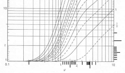
Now, when i said there was a big difference in those two charts i meant it. I never told you to compare Phi values, i told you to look at the intersection of .5, 1, 1.5 at Phi 1.5. To eliminate any fault of the tick marks lets just use the nearby log lines. On the commercial chart at Phi 4.0, go up to layer .5, notice it crosses Phi 4.0 at Fr 2.5. Now look at your chart, Layer .5 crosses the Phi 4.0 at FR 1.9....Now wouldn’t you say that is a big difference? The same is true for layers 1 and 1.5. I thought you would be interested in seeing this since you made such a great effort to make a flawless chart. It is an anomaly we have to deal with to make sure we have an accurate chart.
BTW i call the other dowell graph a commercial chart because i got it out of a transformer book by colonel Wm. T. Mclyman. I have to call it something and the name i gave it is descriptive enough to remember, not like Dowell graph #2 black.
I thought we were working together to make the best, most accurate Dowell chart available. As you know calculating the tick mark positions is very hard, I worked on that chart for over 40 hours to figure it out. As an engineer you know when the going gets rough you have to question everything and reverify everything and that is what i had to do to be successful. I m not apologizing for the process i embrace it. Many times in my career i have succeeded were others have failed by following that process.
Now, when i said there was a big difference in those two charts i meant it. I never told you to compare Phi values, i told you to look at the intersection of .5, 1, 1.5 at Phi 1.5. To eliminate any fault of the tick marks lets just use the nearby log lines. On the commercial chart at Phi 4.0, go up to layer .5, notice it crosses Phi 4.0 at Fr 2.5. Now look at your chart, Layer .5 crosses the Phi 4.0 at FR 1.9....Now wouldn’t you say that is a big difference? The same is true for layers 1 and 1.5. I thought you would be interested in seeing this since you made such a great effort to make a flawless chart. It is an anomaly we have to deal with to make sure we have an accurate chart.
BTW i call the other dowell graph a commercial chart because i got it out of a transformer book by colonel Wm. T. Mclyman. I have to call it something and the name i gave it is descriptive enough to remember, not like Dowell graph #2 black.
Powerbob,
I apologise for my last post - it was unnecessarily harsh, and undeserved. I was having a bad day and took it out on you, for which I am sorry.
you are correct re. the Fr chart, and I do appreciate the work you have put into figuring out those tick marks. you're also right re. chasing down the differences - aka "measuring the amount of funny". every time I haven't done that, its come back to bite me......
OK, I think I've figured out whats going on re. Phi = 4, p = 0.5. on your (the McLyman) chart, you've made the same mistake I did (more than once): Phi = 4 is the vertical line of dashes, with circles at the intersection of p=1.0 & p=2.0.
but in the above post, you read off Fr = 2.5(ish) for p = 0.5 - this is actually at Phi = 5
you can confirm this by counting vertical lines back from Phi = 10.
I suspect this might explain the other differences too.
And finally, I think I've figured out how to calculate the tick lines on a log axis - using log(10) = 1. Measure the length of one decade on the graph - call it M. then the position of any given point k, measured from the beginning of the decade, is M*log(k).
I got this wrong repeatedly by trying to work within a portion of a decade, and its just plain wrong. but doing it across a decade works perfectly. I printed out your chart, and for the decade Phi = 1...10 i get:
M = 71.5mm
k = 1 => Mlog(k) = 0 - not too surprising
k = 3 => Mlog(k) = 34.1mm, measured 34.0mm
k = 5 => Mlog(k) = 50.0mm, measured 50.0mm
k = 8 => Mlog(k) = 64.6mm, measured 64.5mm
and for the tick marks,
k = 1.2 => Mlog(k) = 5.7mm, measured 5.5mm
k = 1.5 => Mlog(k) = 12.6mm, measured 12.5mm
k = 1.8 => Mlog(k) = 18.3mm, measured 18.0mm
k = 2.5 => Mlog(k) = 28.5mm, measured 28.0mm
k = 3.5 => Mlog(k) = 38.9mm, measured 38.5mm
k = 4.5 => Mlog(k) = 46.7mm, measured 47.0mm
I think thats pretty close to perfect, given line width, ruler precision and my blurry vision.
Finally, which of McLymans books did you get the Fr chart from?
Last edited:
“OK, I think I've figured out whats going on re. Phi = 4, p = 0.5. on your (the McLyman) chart, you've made the same mistake I did (more than once): Phi = 4 is the vertical line of dashes, with circles at the intersection of p=1.0 & p=2.0.”
Good catch. You are right i was using the wrong line.
“And finally, I think I've figured out how to calculate the tick lines on a log axis - using log(10) = 1. Measure the length of one decade on the graph - call it M. then the position of any given point k, measured from the beginning of the decade, is M*log(k).
I got this wrong repeatedly by trying to work within a portion of a decade, and its just plain wrong. but doing it across a decade works perfectly. I printed out your chart, and for the decade Phi = 1...10 i get:
M = 71.5mm
k = 1 => Mlog(k) = 0 - not too surprising
k = 3 => Mlog(k) = 34.1mm, measured 34.0mm
k = 5 => Mlog(k) = 50.0mm, measured 50.0mm
k = 8 => Mlog(k) = 64.6mm, measured 64.5mm
and for the tick marks,
k = 1.2 => Mlog(k) = 5.7mm, measured 5.5mm
k = 1.5 => Mlog(k) = 12.6mm, measured 12.5mm
k = 1.8 => Mlog(k) = 18.3mm, measured 18.0mm
k = 2.5 => Mlog(k) = 28.5mm, measured 28.0mm
k = 3.5 => Mlog(k) = 38.9mm, measured 38.5mm
k = 4.5 => Mlog(k) = 46.7mm, measured 47.0mm
I think thats pretty close to perfect, given line width, ruler precision and my blurry vision.”
This gets a little long winded here but i had to collect my thoughts and compare calculations to see what was going on.
You did it differently than i did. I will compare your results and mine. My method calculates the percentage of a position for a decade. I was unsure if my method is decade specific. I was focused on Phi 1 to 2.
I took the log of 2 = .30102999
Then tried to make a ratio out of it for 1 decade. 1 / .30102999 = 3.321928
Then did the math as follows for a percentage of location.
3.321928 x log 1.1 = .1375
3.321928 x log 1.2 = .2630
3.321928 x log 1.3 = .3785
3.321928 x log 1.4 = .4854
3.321928 x log 1.5 = .5849
3.321928 x log 1.6 = .6781
3.321928 x log 1.7 = .7655
3.321928 x log 1.8 = .8480
3.321928 x log 1.9 = .9260
3.321928 x log 2 = 1
I then used those percentage’s for all of the decades. I measured all the decade lengths after i zoomed in with Microsoft paint.
I did my best to check my work with the calculated numbers you provided but all of the numbers except one was within the Phi 1 to 2 range. The graph i made with these numbers came out fairly well but the one calculated value outside of Phi 1 to 2 was off.
This is were i was thinking there was some error in the McLyman graph since my tick marks lined up so well in the Phi 1 to 2 range.
Now in hind site after seeing your method to calculate position, i think my method was decade specific. This explains the error when i compare my tick marks with the chart from Snelling. See jpg, i added my tick marks to Snelling’s chart to compare. Notice that the Phi 1 to 2 positions are an exact match. But there is a slight but noticeable difference on the other decades.
I calculated the rest of the tick mark positions using your method so i could compare to mine for the Phi 1 to 2 area.
For the tick marks,
M = 71.5mm
k = 1.1 => Mlog(k) = 2.959mm
k = 1.2 => Mlog(k) = 5.7mm, measured 5.5mm
k = 1.3 => Mlog(k) = 8.146mm
k = 1.4 => Mlog(k) = 10.448mm
k = 1.5 => Mlog(k) = 12.6mm, measured 12.5mm
k = 1.6 => Mlog(k) = 14.594mm
k = 1.7 => Mlog(k) =16.477mm
k = 1.8 => Mlog(k) = 18.3mm, measured 18.0mm
k = 1.9 => Mlog(k) = 19.930mm
k = 2.0 => Mlog(k) = 21.523mm
k = 2.5 => Mlog(k) = 28.5mm, measured 28.0mm
k = 3.5 => Mlog(k) = 38.9mm, measured 38.5mm
k = 4.5 => Mlog(k) = 46.7mm, measured 47.0mm
Then did the math as follows for a percentage of location, using the distance 21.52mm from Phi 1 to 2.
3.321928 x log 1.1 = .1375 x 21.52mm = 2.959mm
3.321928 x log 1.2 = .2630 x 21.52mm = 5.659mm
3.321928 x log 1.3 = .3785 x 21.52mm = 8.145mm
3.321928 x log 1.4 = .4854 x 21.52mm = 10.445mm
3.321928 x log 1.5 = .5849 x 21.52mm = 12.587mm
3.321928 x log 1.6 = .6781 x 21.52mm = 14.592mm
3.321928 x log 1.7 = .7655 x 21.52mm = 16.473mm
3.321928 x log 1.8 = .8480 x 21.52mm = 18.248mm
3.321928 x log 1.9 = .9260 x 21.52mm = 19.927mm
3.321928 x log 2.0 = 1 x 21.52mm = 21.52mm
Both of our numbers for the Phi 1 to 2 area compare well.
Next i calculate a few more decade positions using your method
M = 71.5mm
k = 1 => Mlog(k) = 0 - not too surprising
k = 2 => Mlog(k) = 21.52mm
k = 3 => Mlog(k) = 34.11mm, measured 34.0mm
k = 5 => Mlog(k) = 50.0mm, measured 50.0mm
k = 8 => Mlog(k) = 64.6mm, measured 64.5mm
For Phi 2 to 3, distance M = 34.11mm - 21.52mm = 12.59mm
My method says.
3.321928 x log 1.5 = .5849 x 12.59mm = 7.3638mm
Your method.
k = 2.5 => Mlog(k) = 28.45mm, measured 28.0mm
Subtract for starting with Phi 2.0 position.
28.45mm - 21.52mm = 6.93mm
The difference between both methods is.
7.36mm - 6.93mm = .43mm
And in actual practice my tick mark is a little farther than Snelling’s
So with your method the math works out for the whole graph, and in this one post i think you have eliminated every question of error. Good job.
“Finally, which of McLymans books did you get the Fr chart from? “
Transformer and Inductor Design Handbook
Attachments
Powerbob,
yeah, it just sort of leapt out at me that we needed to do a ratiometric measurement across an entire decade. I literally thought "log(10) = 1". I have to confess though - I've had more than one crack at this. three or five more like, and unlike you given up in disgust each time. And now I cant understand how it wasn't obvious before...
I found the dashed line thing by getting it wrong too 🙂
I haven't dug up Petkovs paper yet, but I briefly considered if McLyman had used an approximation - but the curves have the right characteristic shape (exponential rise up to steep slope, then levelling off to shallow slope), unlike any of the approximations. So I then assumed McLyman used the right formula.
alas in a fit of pique, when I read what looked like the correct values from the McLyman chart, I had a ranty tanty instead of looking harder. Your well deserved slap to the face dealt with the tanty, and refocussed me enough to notice whats been staring us both in the face the whole time.
In celebration of us finally getting there, I cracked a beer. then had one for you too 😉
as far as the two methods for calculating ticks: you've figured out how to calculate the portion of an interval - nicely done! I took the lazy way, and calculated the portion of a decade. its the same maths though.
the difference between the two methods is due to the (accumulation of) errors relating to finite line width - you use a shorter distance, so the effect of line width is greater. I would expect the mismatch to get worse as you move along the decade, because the integer line spacing decreases but the width remains constant.
regardless, the differences are small enough to declare them "exact" from an engineering perspective. These are bang on, unlike my previous attempts, which were, um, crap.
and now can I say: Aaaargh, when I think of all the work I put into duplicating that graph, I could have achieved the same result by getting the tick marks right! *sigh*
I guess its true - "easy" problems are those you know how to solve; "hard" are those you dont.
Ah, you must have a newer edition of McLyman than I (2nd ed). just as well he updated it - ignoring Fr like in the earlier editions isnt a good strategy.
Terry said’
“and now can I say: Aaaargh, when I think of all the work I put into duplicating that graph, I could have achieved the same result by getting the tick marks right! *sigh*”
It was your graph that made this whole project worthwhile. The graph in the books are squashed down, black and white and have 10 layers were you show 13. I can use your graph the full width of my 24 inch monitor, and due to the colored lines i do not loose my place were all the lines start to converge.
- Status
- Not open for further replies.
- Home
- Amplifiers
- Power Supplies
- Ferrite core for Boost PFC inductor.