


Geek said:I think this post meant entry deadline was cutoff. But I dunno 😕
No, i'm actually hoping the narrowing down will inspire some more... we want a LARGE amount of quality work...
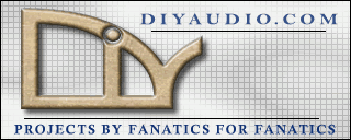
Thunau
I like the DIY symbol, but i'm not sure about how well the rest works with it... try letting the symbol be free on the page
dave
I will have a more minimalistic version by tomorrow night if that's OK. Still tweaking and not quite ready to post. Getting tired of looking at it, plus Monday Night Football is on.
Thunau said:Less than 7k and fairly minimalistic. Still working on it though.
Try san serif fonts...
dave
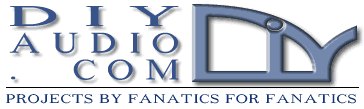
You know, I've tried 200 different fonts in this particular layout and I keep coming back to the serif ones. There is something classy about them that I like. But I'll find something acceptable sans serif and post it shortly.
San Serif (or semi-sans) is smaller in file size, prints better on t-shirts and are generally more suitable to logotypes.
dave
dave
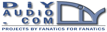

I've been down that route a few days back. I would have to stylize the audio.com part to flow with the DIY part and that was getting a bit too dificult. I have a very particular taste in graphics (not necessary what others like), plus I'm limited in my graphic skills. I'll be happy to give it one more shot this evening.
Just a sketch idea, Thanau..
An externally hosted image should be here but it was not working when we last tested it.
- Status
- Not open for further replies.
- Home
- Site
- Site Announcements
- diyAudio Logo Competition Draft Entries