Many of the logos posted by various people fail to understand the fundamental purpose of this redesign, which is to create a design that can be used on t-shirts and perhaps things like coffee-cups.
So I have been trying to remind people of this.
In your case, I think you are on to something with the waveform. I just think it needs some more work.
I think it does look better without the shadow.
When you displayed the logo larger, it does look like the type is on the same baseline, but when it was smaller it didn't. This could have been an anti-aliasing artifact.
I could politely suggest a few more things for you to try, if you are willing.

Hi,
Geewizzbang: I was not being entirely serious about encouraging people to dip their soldering irons into water it is a clear logo but the combination of graphics doesn't quite add up.
Sorry Vikash, the wave-form logo is stylish also but far too broad in its application - it could be a logo for a doctors' surgery or a science lab!
How about a few comments on my designs? I have posted loads but never get any comments - good or bad 🙄
Geewizzbang: I was not being entirely serious about encouraging people to dip their soldering irons into water
it is a clear logo but the combination of graphics doesn't quite add up.Sorry Vikash, the wave-form logo is stylish also but far too broad in its application - it could be a logo for a doctors' surgery or a science lab!
How about a few comments on my designs? I have posted loads but never get any comments - good or bad 🙄
Shpoop, yes your logo would work fine for a cup or t-shirt.
Its actually a pretty good logo; not just my particular taste.
Its actually a pretty good logo; not just my particular taste.
Ropie, your #301 (and the other, earlier version of the same idea) is one of the more interesting versions of all the logos here.
However, I would like to see what you can do to give it a bit more impact, such as slightly bolder type. I like the somewhat old-fashioned 50's font you're using btw.
The really thin lines would be hard to do on a silk screen, on embroidery they would be probably ok. If you go with a dark grey on the lines, you may be able to make them thicker without overwhelming the typography.
By all means. Constructive criticism is always welcome 😉geewhizbang said:I could politely suggest a few more things for you to try, if you are willing.
Shpoop, I think your design is excellent.
Thanks, GWB. I will have a fresh look at #301 when I get a chance.
1950s typeface - you're almost right, it's Bauhaus (1930s) 🙂
1950s typeface - you're almost right, it's Bauhaus (1930s) 🙂
My "official" entry...
A couple of things about the following logo(s) and many thanks for input given so far by board members:
1.) Multiple similar options given – let me know which (if any) you like the most.
2.) Stays close enough to the original to capitalize on existing brand recognition and existing positive sentiment of board members
3.) Is free of culturally biased issues or images that may pigeon-hole or detract from the meaning
4.) Reads quickly and well at different sizes from business card to coffee mug to print ad to billboard
5.) Can be represented in color or Black & White to increase media flexibility
6.) Horizontal design integrates well into multiple medias but is optimized for web.
7.) Detaches *Visual Voice* for greater media flexibility and improved readability at small sizes
* A note on visual voice and why I removed it from the logo: The current logo contains the "projects by fanatics, for fanatics" statement. That is a product communication strategy known as visual voice. The visual voice is the statement of the thought a company wants you to have when you see their logo – it is used to focus the customer’s thought process and boost memory retention. However, visual voice is rarely made part of the logo because it’s too much information to grasp instantly, it presents readability issues, and visual voices go out of date as society moves forward. Even when a logo is textual, it is a stylized version of a very brief section of text and is considered to be a picture and is used differently than text (like Microsoft and Intel who use stylized text versions of their names as logos) Other examples of visual voice include: Microsoft’s "Where do you want to go today" or Nike’s "Just Do It" and Coca-Cola’s "Have a Coke and a Smile" etc... Visual voices change to reflect changes in market sentiment and to re-interpret the logo’s meaning in light of those changes. For instance: Coca-Cola was initially a Cocaine-based medicinal product which became a popularized drink when Coke figured out that people liked the boost they got from ingesting the product. Coke put their (medicine) in a form that could be socially ingested without stigma. Coke’s first visual voice blatantly alluded to the fact that Coke contained Coca (Cocaine) as a stimulant. When Cocaine became a controlled substance and Coke switched their stimulant from Cocaine to Caffeine, Coca-Cola’s visual voice softened and began focusing less on the product’s ingredients and more on the social concepts that the company wanted people to think of when they saw Coke... happiness... togetherness... etc. My favorite Coca-Cola visual voice was: “I’d like to buy the world a Coke.” which they combined with a jingle that became very popular. it embodied goodwill & friendliness on a global scale and at the same time advocated a purchase decision. In my humble opinion, Coca Cola may well be the best marketing company in the world – anyone who can sell 2cents worth of sugar and water for a premium price in a commoditized market to the vast majority of the earth’s population for the better part of a century... wow... from a dietary standpoint it’s not very ethical, but from a pure marketing standpoint – that’s about as good as it gets. At any rate – visual voices in general should not be part of the logo.
Attachments
Oh...hw did i miss them..!!
I like Vikash's idea better..
yes the orange one is pretty...!! neat uncluttered and flowing...
I like the choice of the font too...complements the dying wave very wellll..!!
ajju
I like Vikash's idea better..
yes the orange one is pretty...!! neat uncluttered and flowing...
I like the choice of the font too...complements the dying wave very wellll..!!
ajju
Keep them coming guys... once i have the roof fixed (& renos) done on my house & i'm moved back in, i'll update the gallery, th eprize list, and we can have a 1st run at picking the best to go on to another round...

dave
dave

Ugliest offering so far …
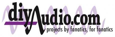
I quite like the idea of an abstract 'something' as a background as I think electronic components etc are far too specific to one branch of audio or another. I suggest using a sin(x)/x function.
I am shamed by the poor quality of my offering but it is only a very rough draft (all of 2 minutes work) 😀 😀 - the background image has been high-jacked from 'mathword' and serves only to illustrate a sin(x)/x function (the blue trace). Also I have dropped the word ‘project’ as, again, I think this is too specific.
I guess I don't win with this one
Attachments

your last one ajju is the best you've done so far.
Keep on trying other fonts. I'm not particulary fond of avante garde myself, but your current arrangement of elements is simple yet spot on.
Keep on trying other fonts. I'm not particulary fond of avante garde myself, but your current arrangement of elements is simple yet spot on.
OK guys, I had an idea, but don't have the time or skills to do it, so if someone else want's to..... 😉.
Think of a CRO with some waveform, which changes into diyAudio.com, around the center of the trace. On the second trace you could have another waveform, changing into the slogan.
Probably not really practical because the line wheights would most likely be too light, but thought I'd mention it anyway 🙂
Tony.
Hm... have someone design and build a microcontroller that's programmed to output an AC waveform which traces that. 😀 It's been done one better, ever seen the CRT clock before?
Tim
Tim
 nahhhhhhhh
 - Status
- Not open for further replies.
- Home
- Site
- Site Announcements
- diyAudio Logo Competition Draft Entries