
Another shot of the background alone.
The first from the left is an image of a rock concert with the sun rising in the background, the 2nd image is of jimi hendrix and a mercury arc rectifier on the left (blue) aswell as a 845 on the right glowing cheerfully.
I had to invert the colour of the text to fit the profile of the black background.
I am thinking about re-doing a copy with a white background theme as the black one may force diyAudio.com to use wholly-black for their user interface preference, which isn't good ;P
Of course that's even if I get selected, which is highly unlikely..
I would say this will turn out far too complex for diyAudio.com and I'd be set back to drawing a couple of squiggly lines that barely resemble the original letters of the diyAudio.com logo.
I /might/ be able to scratch up a white background preference.
My luck may have changed 🙂
Cheers.
The first from the left is an image of a rock concert with the sun rising in the background, the 2nd image is of jimi hendrix and a mercury arc rectifier on the left (blue) aswell as a 845 on the right glowing cheerfully.
I had to invert the colour of the text to fit the profile of the black background.
I am thinking about re-doing a copy with a white background theme as the black one may force diyAudio.com to use wholly-black for their user interface preference, which isn't good ;P
Of course that's even if I get selected, which is highly unlikely..
I would say this will turn out far too complex for diyAudio.com and I'd be set back to drawing a couple of squiggly lines that barely resemble the original letters of the diyAudio.com logo.
I /might/ be able to scratch up a white background preference.
We are looking at doing a complete make over so no real need to keep with the current colours.
My luck may have changed 🙂
Cheers.
Attachments


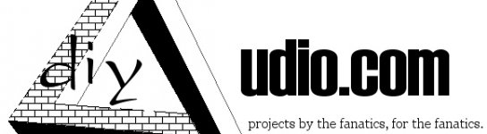
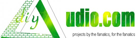
A more colourful version...
You could always scale up or down with this one as there is no images to resize and warp the perspective.
Change the colour, add a metal triangle for a symbol of audio prescision along with being a functional character of the name!
You could always scale up or down with this one as there is no images to resize and warp the perspective.
Change the colour, add a metal triangle for a symbol of audio prescision along with being a functional character of the name!
Attachments


Doesn't this look smart:
Too bad it aint my work..
Text copyright of Wardsweb, permission was not solicited.
Too bad it aint my work..
Text copyright of Wardsweb, permission was not solicited.


I couldn't help but laugh at that robot 😛
I'll talk with a fellow I know in NYC tonight and see what he has to say about making a scalable logo for free with his l33t graphics skills.
hehe 😀
I'll talk with a fellow I know in NYC tonight and see what he has to say about making a scalable logo for free with his l33t graphics skills.
hehe 😀
Did you ever see a cartoon called Mighty Mouse? He sang " Here I come to save the day." So a cross between Mighty Mouse and the Iron Giant. 😀


How about something like this?
Here is the bigger version:
An externally hosted image should be here but it was not working when we last tested it.
Here is the bigger version:
An externally hosted image should be here but it was not working when we last tested it.
Just to give you all some idea of what standard of art we are looking for, Jan's entry is the only thing so far that would even be considered and we are looking for alot better than that before we are gonna part with the prizes.
- Status
- Not open for further replies.
- Home
- Site
- Site Announcements
- diyAudio Logo Competition Draft Entries