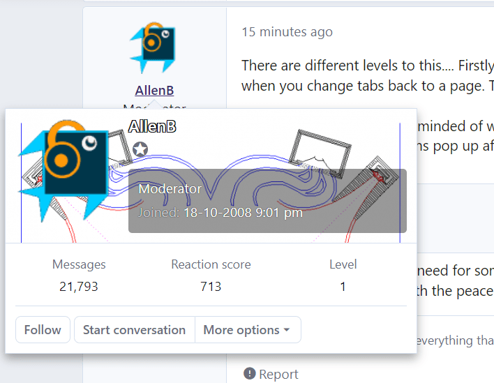
I find these "mouse over" triggered, automated username infocard pop-ups to be most annoying - and DIYAudio isnt the only site to have taken on this fad. Is there a way to disable this automatic action? That works?
IF I want to see an expanded informational placard off someone's avatar, I'll simply right click on it. I know, so 90's - but otherwise my time is taken by waiting for the automatic assumptive action to go away, as it covers up what I want to click on.
Thanks for any info on how to accomplish this!
IF I want to see an expanded informational placard off someone's avatar, I'll simply right click on it. I know, so 90's - but otherwise my time is taken by waiting for the automatic assumptive action to go away, as it covers up what I want to click on.
Thanks for any info on how to accomplish this!
There are different levels to this.... Firstly there is a minor bug where cursor focus issues cause these "tooltips" to pop up when not called for, especially when you change tabs back to a page. They get in the way and ironically require deliberate clicking away from them.
Secondly, I agree and am reminded of windows95. The menus all had 400ms delays by default. This later developed into a "no-click" substitute for navigation where menu items pop up after a delay. This style doesn't give a person time to think.
Unfortunately such a change may not simply exist as a setting.
Secondly, I agree and am reminded of windows95. The menus all had 400ms delays by default. This later developed into a "no-click" substitute for navigation where menu items pop up after a delay. This style doesn't give a person time to think.
I'll make allowances for the need for some to navigate on phones, as well as freedom of choice.. but what you're asking just seems like a case of wanting control, with the peace of mind that brings.I know, so 90's
Unfortunately such a change may not simply exist as a setting.
Last edited:
How about having the trigger set to when hovering over the username rather than the username and avatar? That would reduce the target for accidental activation of the panel.
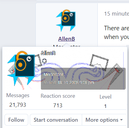
Also, does the pop up panel really need to be so big? There seems to be a lot of 'white space' that could be condensed down without affecting the functionality. For example, between the datasets; to the right of the option buttons. It could easily be 2/3 - 1/2 the size it is now:

Something like that:

Also, there is a left hand margin on the page. Can the popout be confined to that side without infringing on the text area. And be positioned below the drop down arrow? That way even if it is an accidental trigger, the box doesn't get in the way and you can continue on your merry way without the delay.
Also, does the pop up panel really need to be so big? There seems to be a lot of 'white space' that could be condensed down without affecting the functionality. For example, between the datasets; to the right of the option buttons. It could easily be 2/3 - 1/2 the size it is now:
Something like that:
Also, there is a left hand margin on the page. Can the popout be confined to that side without infringing on the text area. And be positioned below the drop down arrow? That way even if it is an accidental trigger, the box doesn't get in the way and you can continue on your merry way without the delay.
Last edited: