I find this sonogram from Dibirama site very useful. Very informative and understandable how the driver sounds.

What program can export flat sonogram like this?
What program can export flat sonogram like this?
Last edited:
Do you have a URL?
If a waterfall has periods as the time axis (sometimes called burst decay) is much more useful.
dave
If a waterfall has periods as the time axis (sometimes called burst decay) is much more useful.
dave
Sorry. My mistake. Didn't add a photo from the start. Now corrected. How i understand this is waterfall but 2D and colored. Really can see time, db level in colors. Very useful, understandable from my opinion.
Like exaple there is the link for driver i have
https://www.dibirama.altervista.org...-seas-22taf-g-tweeter-3-4-6-ohm-180-wmax.html
Like exaple there is the link for driver i have
https://www.dibirama.altervista.org...-seas-22taf-g-tweeter-3-4-6-ohm-180-wmax.html
With standard waterfall hard too understand the db level... I Am using REW but how i understand this option unavailable in this programm?
Those images are a waterfall seen from the top. Somewhat similar to a sonogram. There is another version of charts looking like those that illustrate disperion vrs frequency.
I would really like to see software providers do this chart, and impedance, as a rotatable 3D graph. And a switch for periods vrs time. Switching to periods means that the Q and magnitude of any ringing becomes directly comparable and one can quickly see how a driver rings by whther or not the lines are parallel.
dave
They are made with Clio.What program can export flat sonogram like this?

Clio program works without interface? If I use my microphone? I don't know why but this sonogram looks much more understandable for me ower other waterfall methods. Maybe because I'm new bee to DIY audio.They are made with Clio.
Nope: Clio, by Audiomatica, it's a hardware+software measuring device.Clio program works without interface? If I use my microphone? I don't know why but this sonogram looks much more understandable for me ower other waterfall methods. Maybe because I'm new bee to DIY audio.
Cumulative spectral decay (CSD) can be visualized through different plots: the waterfall or the color map (the one you like more). It's main use is for anechoic loudspeaker measurements.
Energy time frequency (ETF) can be visualized as well with waterfall or color map plots. It is mainly used for room acoustic measurements.
Then there is the wavelet analysis........
But really possible to hear resonances?Nope: Clio, by Audiomatica, it's a hardware+software measuring device.
Cumulative spectral decay (CSD) can be visualized through different plots: the waterfall or the color map (the one you like more). It's main use is for anechoic loudspeaker measurements.
Energy time frequency (ETF) can be visualized as well with waterfall or color map plots. It is mainly used for room acoustic measurements.
Then there is the wavelet analysis........
Like on graphs before on the right side for example.
The length of 700 hz is 1.42857143 ms. This means this resonant hits all the time at -30 db? But realy posible to hear -30db? Overal look like at -10db level all the time is some little resonance with a higher frequency. 10 000 Hz is 0.1 ms. Hmm... this is interesting... Sorry, these are just newbie thoughts.
Yes it's possible to hear a 4 ms decay, depending on frequency of the resonance: check Fletcher&Munson curves.But really possible to hear resonances?
Like on graphs before on the right side for example.
The length of 700 hz is 1.42857143 ms. This means this resonant hits all the time at -30 db? But realy posible to hear -30db? Overal look like at -10db level all the time is some little resonance with a higher frequency. 10 000 Hz is 0.1 ms. Hmm... this is interesting... Sorry, these are just newbie thoughts.
Look at the sonogram on the right: at 1KHz, it's telling you that the sound takes 4 ms to decay completely or that it takes an attenuation of 50dB to disappear (assuming the 0dB response as the starting level).
Very useful, understandable from my opinion.Look at the sonogram on the right: at 1KHz, it's telling you that the sound takes 4 ms to decay completely or that it takes an attenuation of 50dB to disappear (assuming the 0dB response as the starting level).
I found "fattest" red line from them.
This is R2904/700000 fro SS.
The higher prise, more resonances?
This is T29CF002 from Seas
I am mistaken? I thought the ending of the color legend at -50dB is a display/graphic choice (IIRC similarly, you can change the height of the 'lake surface' in the REW waterfall to hide or uncover ridges out to the resolution of the measuring device). I thought the audibility threshold varies with the frequency (and person), so it isn't as simple as looking at the black boundary.... Look at the sonogram on the right: at 1KHz, it's telling you that the sound takes 4 ms to decay completely or that it takes an attenuation of 50dB to disappear (assuming the 0dB response as the starting level).
Unless I have completely missed the graph, it might be better to pick a different frequency for the example, since at 1k Hz the data color/black transition, the axis label of 4.00 ms and the bottom of the color legend bar all appear at the same height on the chart, so it would be easier to confuse the color legend with being associated with the axis labels on the left.
REW offers Fourier, wavelet and burst decay spectrograms.It would be great if REW did the same sonogram. I don't think it's a problem for them.
For sure.The higher prise, more resonances?
I see like this: the measurement where taken at 90dB, as stated in the graph posted, which is the 0 dB in the CSD. The decay, expressed in time or dB, is what you can read in the two vertical axes of the graph.I am mistaken? I thought the ending of the color legend at -50dB is a display/graphic choice (IIRC similarly, you can change the height of the 'lake surface' in the REW waterfall to hide or uncover ridges out to the resolution of the measuring device). I thought the audibility threshold varies with the frequency (and person), so it isn't as simple as looking at the black boundary.
Unless I have completely missed the graph, it might be better to pick a different frequency for the example, since at 1k Hz the data color/black transition, the axis label of 4.00 ms and the bottom of the color legend bar all appear at the same height on the chart, so it would be easier to confuse the color legend with being associated with the axis labels on the left.
For sure the audibility depends on frequency: that's why I suggested the F&M chart.
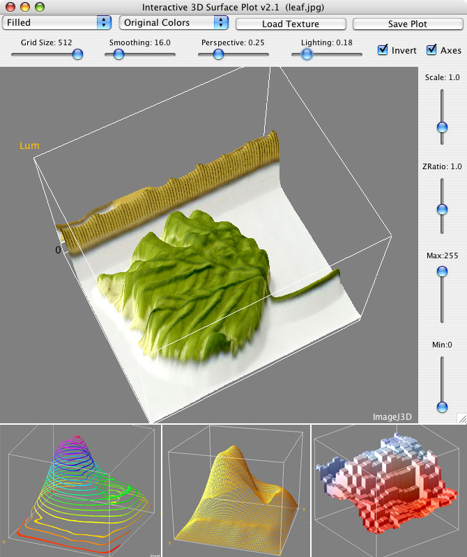
You might get part of the way there with this plugin to ImageJ that takes a flat colormapped image (I believe the sonogram would work) and turns it into a 3-d image. From the picture, seems to work in iOS:Those images are a waterfall seen from the top. Somewhat similar to a sonogram. There is another version of charts looking like those that illustrate disperion vrs frequency.
I would really like to see software providers do this chart, and impedance, as a rotatable 3D graph. And a switch for periods vrs time. Switching to periods means that the Q and magnitude of any ringing becomes directly comparable and one can quickly see how a driver rings by whther or not the lines are parallel.
dave
https://imagej.nih.gov/ij/plugins/surface-plot-3d.html
https://imagej.net/ij/index.html
Thanx, work looking at. A jar should work everywhere if you have the right Java. The screen shot looks like it is from my PowerMac Pro running macOS 10.4.
dave
dave
- Home
- Design & Build
- Software Tools
- Comparing drivers with waterfall, not so easy to understand speakers difference. Sonogram is very good. What program can export flat sonogram?