All of these things, but this was also a good call.Grey post time and link/bookmark/postNumber links darkened
count me as naive and peasant, but slightly more Bold of unread/unvisited will do wonders
I don't care for slight color changes, don't care for overall change of letter weight .... I mean - I'm okay with that
now, I'm not against new and modern, but my eyes/brain are pretty good ( even if finicky) differentiating easy vs. not-so-easy
I don't care for slight color changes, don't care for overall change of letter weight .... I mean - I'm okay with that
now, I'm not against new and modern, but my eyes/brain are pretty good ( even if finicky) differentiating easy vs. not-so-easy

Thanks for the feedback. As mentioned, it is now as is was pre-migration and the classic theme should now make those who opine for the old website happier. Unfortunately as best as I understand it, there is no "slightly more bold" for Verdana. There is an easy to read regular, and there is a very heavy bold. The feedback is noted. There are a few different ways to skin this cat.


Verdana doesn't have a nice "bolder" version
Can you just make the difference in colours more dramatic?
I know you said you did just that, just checked, still could be more dramatic. Black or dark blue for unlisted?
dave
Last edited:
I should mention that the color change is actioned from XF, not from the browser visited link style. It will only change if XF considers the thread read, which might mean having read the last page. Also, I have a feeling the setting is not stored in the database, but in a session, which is accessed via a session cookie, which might get nuked if you do a hard refresh or close your browser. This is how it has been for the last year so no big change, but worth noting. To doubt check go to the last page of a thread then come back to the front page.
I've made the original purple title link font a bit darker, further highlighting the difference.
Also tidied up a few whitespace issues in actual thread view titles and the breadcrumb.
Also tidied up a few whitespace issues in actual thread view titles and the breadcrumb.
I don't know how that became a goal? And clearly most of us could not say eXactly how "it used to be".What I'm hearing is that people don't want the classic theme to actually be true to the original.
You come at this as a Visual Designer. Most of us grew up with the Allied Radio Catalog. Fine distinctions are lost on us. We see landmarks, not Verdana versus (other functional font). Debating 11pt to 10pt, a 1dB diff, means something is wrong underneath. (Agree, a lot of fonts get starved around the 11/10 border; a reason to avoid those fonts and sizes.)
What did the church fathers say about the crap JS Bach was writing? Divers unpleasant notes? Also "too many notes, Mozart". KISS. Many (not all!) audio fans have lesser visual appreciation.
I still like Simple Machines Forum for all its 1999 aesthetic.
How the classic theme being true to the original became a goal? If it wasn’t a goal it wouldn’t exist today in the first place, we’d just have the “new and improved” light and dark themes and nothing else. The old theme pre migration was tables based, XF uses a different responsive structure. It’s almost impossible to get XF to replicate that (ie: very costly). Best to move onwards and upwards, but the classic theme was created specifically to make migration to the new and improved themes easier. People can move when they are ready.I don't know how that became a goal?
Fine distinctions are lost on us. We see landmarks, not Verdana versus (other functional font).
I think it's looking pretty solid now.
The classic theme is just a stop gap measure at this point in time. Right now we have 3 themes, one is just a simple darker version of the primary light theme. Every new theme adds more baggage and maintenance. Less is more, and I'd like to be able to focus on one great primary theme and get that dialed right in.
I’d like to revamp the new light and dark themes in a considerable way. Your idea of a new icon, or other bigger changes, might well be implemented when that happens. But there are more important fish to fry first. Right now I’m just smoothing out the rough edges of the classic theme which was never properly finished IMO. And trying to keep the forum afloat financially.
There are no more major visual changes planned for now. Next up is primarily back-end stuff forum, and then over to focusing on the store for a while.
But keep the feedback coming in, it's all appreciated and many things will be actioned or at the least taken into consideration as things are done in the future. In general, sticking as much to the stock default options and not getting ourselves into upgrade hell with complicated custom bells and whistles is the path we'll take.
Last edited:
I can put it back to bold/unbold instead of using different colors, but it sure is ugly and painful to look at (in my opinion, and judging from the feedback from some others, they are also too happy with this recent change).
This style was made for you regulars. If you're not happy with the change, then the change was pointless.
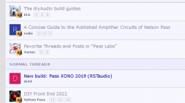
From the first days of the world wide web, visited links were styled a different color to denote their visitation. That is the distinction. It has worked well for 30 years. And it is what the pre-migration site had, and this is the classic theme.
The classic font (verdana) is IMO really not meant to be used in its bold form in an information dense environment like a long list of thread titles. But if you are used to it, I can put it back. It's your theme, but it is most definitely no longer "classic" 🙂
I expect now to see a raft of other members coming to complain that they rather liked the elimination of the over-the-top bold.
This style was made for you regulars. If you're not happy with the change, then the change was pointless.
From the first days of the world wide web, visited links were styled a different color to denote their visitation. That is the distinction. It has worked well for 30 years. And it is what the pre-migration site had, and this is the classic theme.
The classic font (verdana) is IMO really not meant to be used in its bold form in an information dense environment like a long list of thread titles. But if you are used to it, I can put it back. It's your theme, but it is most definitely no longer "classic" 🙂
I expect now to see a raft of other members coming to complain that they rather liked the elimination of the over-the-top bold.
I plan to leave it as it is now with the now much demanded bold titles for unread, but to give us all a laugh, I have created a non-binding poll which only the passionate will participate in! 🙂
https://www.diyaudio.com/community/...o-you-like-your-thread-titles-to-look.395248/
https://www.diyaudio.com/community/...o-you-like-your-thread-titles-to-look.395248/
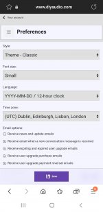
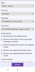
Isn't the difference between small and extralarge font too small or downscaled? To me as a shortsighted guy wearing glasses, on the phone, the small font looks too small, the extralarge font looks medium.Is there any other setting that could move the scale up a bit? The small font looks like too close to the readability treshold.
Attachments
Last edited:
.....
I expect now to see.......
I'm happy now, as I found the way to set it to my mindset

most likely not a problem if you choose new theme for your R2D2
I can't even imagine how painful is to accommodate old theme for small screen
I mean, programming and Mighty ZM, 3 different worlds
I can't even imagine how painful is to accommodate old theme for small screen
I mean, programming and Mighty ZM, 3 different worlds
This should now be resolved, I have tested it using a virtual android simulator.At an Android device, the box with data about the poster, overlapes to post text making it difficult to read.
- Popup should now float above other elements
- Width of popup should expand automatically to fit the full location
- Home
- Site
- Forum Problems & Feedback
- Classic view, visited/unvisited