The first measurement is flux density in the gap as you move the measuring point up and down. It is marked in Tesla which is equal to 10,000 Gauss so the measurement implies a top plate of about 6mm thick (the top plateau). Note that 10,000 Gauss is a lot so a structure that gets to 14,000 Gauss is really very strong. This type of graph would be measured by using a flux probe of very tiny area and some sort of micrometer setup to draw the probe from below the gap to above the gap. (Or more likely is a simulatiopn)
The second graph is similar but indicates more the effect of having a voice coil in the gap. Tm is Tesla Meter, so it is the combination of the previous graph (magnetic strength of the motor versus height) and a coil of a particular length. BL is, of course, motor strength but it needs both factors of average gap strength when viewed relative to a coil of a given length.
Since you can see that the BL plateaus for about 12mm before falling off, it infers that the coil length (winding length is 12mm or maybe 12mm - the 6mm gap length. L, of course is not the winding length but how many meters of copper are in the coil. As an aside, since we assume that coil windings are uniform then the second curve is essentially an integration of the first curve with an integration interval equal to the coil winding length.
Make sense?

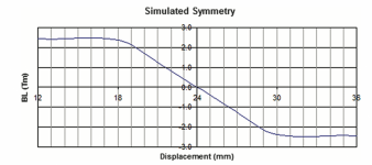
Finally, the red and blue curves are mirror flips of each other. That is one color is as measured and the other is the same data with the displacement numbers reversed. This is a feature that lets you see symmetry. If the red and blue curves lie exactly on top of each other then they are perfectly symmetric. Here the Bl has some asymmetry in its skirts as is typically seen. Usually, the drop off is slower as you go below the gap center since there is more metal (the core pole) within the coil when going downwards.
First of all, thank you very very much for the detailed and helpful answer. The one who created the graph wrote that he tried to achieve 25 mm Xmax but according to the graph he could not achieve it that way. How do you recognize that exactly? is it because like you said the bl curve at 12 falling down?Finally, the red and blue curves are mirror flips of each other. That is one color is as measured and the other is the same data with the displacement numbers reversed. This is a feature that lets you see symmetry. If the red and blue curves lie exactly on top of each other then they are perfectly symmetric. Here the Bl has some asymmetry in its skirts as is typically seen. Usually, the drop off is slower as you go below the gap center since there is more metal (the core pole) within the coil when going downwards.
Glad you find the answers useful.
Yes, the simulated Bl graph really tells everything here about motor linearity. Although expressed as Tesla meters it will translate directly into Newtons per Amp which is strength of the motor as evaluated across its full range of motion. We can see a couple of things in the graphs, First, it is not totally linear across the mid section. Even though the first graph shows a nice flat top in B for the length of the gap (6mm top plate thickness) the fact that the side skirts are significantly different contributes a noticeable slope in the 18 to 30 mm range. (Note that it might have been better to set 24mm excursion as the zero point of this graph as this is likely the rest position of the voice coil.) This amount of slope is not bad but would give the coil some element of even order distortion: 2nd and 4th harmonics, etc. Secondly we see that the strength falls off significantly below 18 and above 30mm. These lead to a measure of xMax of about 6mm (most people use a fall off of 30 or 50%, I believe, and a zero to peak measure).
Although this is a fairly well designed motor you would expect bass harmonic distortion to rise with excursions greater than 6mm peak. In full range applications bass to mid intermodulation would also be a factor beyond 6mm peak excursion. One way to understand this is to imagine a very low frequency sine wave driving the unit to, say, + and - 10mm excursion. On top of this LF excursion we add a small value mid tone of 1kHz. The amplitude of this mid tone would directly follow the Bl strength seen in the plotted "Simulated Bl" curve. That is, the volume of the midrange tone would go up and down (twice) every bass cycle as the BL passed over or moved away from the mid point. This is a perfect example of amplitude modulation distortion and you would hear voices turned muddy by bass excursion due to this factor.
At Bose we did fairly complete models of woofer box systems with non-linearity well modelled by adding the simulated Bl curve, similar to this, and also a nonlinear suspension stiffness curve. Those are the big 2 for distortion.
Hope that makes sense.
For some reason the powers-that-be defined xmax as max excursion from the mid point so the xmax for this unit would be 6mm.
But, yes, the graph tells us that a unit with this coil and magnet should give 12 mm (peak to peak) excursion with relatively low distortion.
But, yes, the graph tells us that a unit with this coil and magnet should give 12 mm (peak to peak) excursion with relatively low distortion.
Do you know how I can create such graphs? I created a FEMM model but I don't quite know how to get to the graphsFor some reason the powers-that-be defined xmax as max excursion from the mid point so the xmax for this unit would be 6mm.
But, yes, the graph tells us that a unit with this coil and magnet should give 12 mm (peak to peak) excursion with relatively low distortion.
If you want more X max you need a longer coil, as simple as that.
That´s why many woofers have bumped back plates and car speakers stack 2/3/4 magnets.
EDIT: in the other thread I suggested exploring/measuring the B curve with precision using a one turn coil and some assembly to move it up/down (or in/out).
That´s why many woofers have bumped back plates and car speakers stack 2/3/4 magnets.
EDIT: in the other thread I suggested exploring/measuring the B curve with precision using a one turn coil and some assembly to move it up/down (or in/out).
If you want more X max you need a longer coil, as simple as that.
That´s why many woofers have bumped back plates and car speakers stack 2/3/4 magnets.
EDIT: in the other thread I suggested exploring/measuring the B curve with precision using a one turn coil and some assembly to move it up/down (or in/out).
For some reason the powers-that-be defined xmax as max excursion from the mid point so the xmax for this unit would be 6mm.
But, yes, the graph tells us that a unit with this coil and magnet should give 12 mm (peak to peak) excursion with relatively low distortion.
Hello again,
Does anyone understand why I get such strange graphs as the result? It's one thing that I don't get the desired result, but the numerical values still seem quite strange to me.
I saved and pasted the measured values from - to + in the Backward file. And from + to - in the file Forward. It would be great if you could take a quick look at it
Attachments
if you could provide a little more context you probably get useful answers.Does anyone understand why I get such strange graphs as the result?
did you measure the values?
how did you measure the values?
what is it you are looking for?
do you know the fundamental principle of a loudspeaker driver?
have a look at my rough Bl/Xmax test here:
https://www.diyaudio.com/community/...-the-bl-curve-of-a-woofer.386167/post-7034578
and
https://www.diyaudio.com/community/...-the-bl-curve-of-a-woofer.386167/post-7036746
Yes, I measured the values. The measured values are in the Forward and Backward.txt files, which I also posted. I made a femme model and measured the line from -44 to +44. This corresponds to the length of the gap in the model. That would be the values in Backward.txt and then from +44 to -44 again in Forward.txt.if you could provide a little more context you probably get useful answers.
did you measure the values?
how did you measure the values?
what is it you are looking for?
do you know the fundamental principle of a loudspeaker driver?
have a look at my rough Bl/Xmax test here:
https://www.diyaudio.com/community/...-the-bl-curve-of-a-woofer.386167/post-7034578
and
https://www.diyaudio.com/community/...-the-bl-curve-of-a-woofer.386167/post-7036746
I'm doing something wrong because if I build the same model as I described at the very beginning of the post, I also get strange graphs.
First of all, I try to get useful values out and then change my model according to my wishes. The graphs seem completely wrong to me now.
so are you actually designing a loudspeaker driver motor? I'm afraid that is beyound my knowledge;First of all, I try to get useful values out and then change my model according to my wishes.
also modelling FEM... or is it actually a "femme model" - that would make sense for a weiberheld ;-)
and it's still not clear for me: did you measure physically or take values from a simulation?
Not sure what you call "strange" .... WHAT did you expect?
I look at them and find them perfectly normal and descriptive of what´s happening.
First one exactly shows flux density along the speaker axis: strong and uniform for about 6mm, so that is the gap height/top plate thickness, and then dropping like a stone outside it.
It doesn´t instantly drop to zero only because there is always some fringe field outside the gap proper.
The second one shows BL on a coil as it moves along.
For geometrical reasons it drops slower, since in a long coil, I mean a coil with winding way longer than gap thickness which was simulated here, part of it is already outside i the fringe field area while another is in the strong steady one, so net result averages both areas, high and low flux, and blurs "frontiers" but again, it´s a "geometry" problem.
Not even "a problem", but a description of what´s happening.
I already suggested, in this thread or in another showing same graphs, to use a narrow test voice coil, a single turn one, and then BL curve closely follows B density one, no blurring.
In a nutshell, both curves on the original post accurately describe what´s happening, with that particular coil, in that particular gap.
Everybody is talking about different things.
Your model is giving strange results and the numbers are way huge. What is the modeling program? I'm guessing you have made an error in model entry.
Your model is giving strange results and the numbers are way huge. What is the modeling program? I'm guessing you have made an error in model entry.
I used Femm to model the axisymmetric model. That's exactly what confuses me that the numbers are so incredibly high.Everybody is talking about different things.
Your model is giving strange results and the numbers are way huge. What is the modeling program? I'm guessing you have made an error in model entry.
I answered based on post#1 and those two graphs, , which I called "first" and "second" for obvious reasons.
Numbers are fine, very reasonable.
Gap flux inside the gap hover around 1.2/1.3T which is highish as in "very good", and very possible.
Not sure what you show and ask on post #11, values if taken at face value look absolutely out of scale by orders of magnitude, physically impossible
Numbers are fine, very reasonable.
Gap flux inside the gap hover around 1.2/1.3T which is highish as in "very good", and very possible.
Not sure what you show and ask on post #11, values if taken at face value look absolutely out of scale by orders of magnitude, physically impossible
I've never used Femm but agree that the numbers are too high and the curve shape doesn't make sense. Maybe you can show your model here and see if others can catch a mistake. +-44mm seems like large structure. Is that right? Its not what your graphs sugest (20 mm total).
What I noticed is that with the model that I recreated at the very beginning, to which the very first entry in the post referred, I also got strange values or values that were much too high. Since I use that as a basis, it is probably wise to stay with this model for the overview and to analyze where the error is because it is probably also the reason why I get strange numbers with my very own model.I've never used Femm but agree that the numbers are too high and the curve shape doesn't make sense. Maybe you can show your model here and see if others can catch a mistake. +-44mm seems like large structure. Is that right? Its not what your graphs sugest (20 mm total).
The graphs I posted at the very beginning of this post are screenshots from a book and not my own. I myself don't get the same graphs with exactly the same model. So somewhere there has to be the mistake.
Model
Would be great if someone could take a look at the model 🙂
- Home
- Design & Build
- Software Tools
- Can someone explain these graphs to me?