Where did you find that? I'll have to go looking again.
Hamburger to the right of Members in top nav.
Oh yes that. I had the sidebar on, but filters and sorting don't work for me, any action throws a "Opps, Something went wrong" error.
Does it work for you?
Does it work for you?
Nope - same error here. I just meant that without sidebar on I had no access to filter on desktop.Oh yes that. I had the sidebar on, but filters and sorting don't work for me, any action throws a "Opps, Something went wrong" error.
Does it work for you?
I couldn't exactly say myself why I found the old site to be less effort. You nailed it, its the density, there is a lot of wasted space here, Id definitely like more density. I really liked how the old site worked on my phone, very small but very dense information-wise. that was great, Id just expand the screen. Maybe a "dense" theme could be added that removes all this padding and vertical whitespace.I want to thank the administrator and those involved in the move. I understand it's a lot of ongoing work, so please take my comments as being constructive and from a friend.
I never had an issue navigating the old desktop site using a notebook or even on a mobile device w/a 4.1" screen. It was just excellent and spreading my fingers to enlarge the page was easy. On that old website, the content density was there and it was easy to get into the meat of the topics or categories with no more than a single click or tap.
With the new desktop template, there is a lot of dead space that reduces the on-screen information density. Many online startup stores look that way and it takes too much scrolling to read. The classic setting helps, but the front page is still a lot of scrolling.
Regarding the mobile site, it's everything I feared - one or two posts on the screen at a time; mountains of dead space; endless scrolling, tiring to navigate and I don't see a "desktop version" button. It actually feels less like a technical hobby forum and more like a social media site. I hate saying that.
+1 on this suggestion, I'm a hornie tooA 'Horn speaker' forum would be great, but have requested before to no avail. Maybe us 'hornies' should start using the 'planars and exotics' forum instead of multi way ?
OK,@ianrt Noted. The forum is there, but the drop down link is not working.
my 73 year old brain is slow. I had forgotten that I set it up years ago to go straight into forum home. I have now done the same here. No problem.
Ian
Last edited:
Works Full-width if I'm logged in but....I check several forums and reply/contribute where appropriate.... why do I now need to be 'logged in' just to view DIYAudio in a user friendly way ??Rodeodave, have you tried setting Full Width from the menu under the logo?
Drone7, I'm hoping someone will correct me if I'm wrong but I decided to compare a phone and desktop screenshot and it looks pre-formatted as a compromise.

Totally agree. This is really unfortunate. I'd was about 1/3 of the way through the incredibly long 10F/8424 & RS225-8 FAST / WAW Ref Monitor thread & now it's become virtually incomprehensible with so much of the image content not visible. Can this be fixed, please!!!A lot of inline images on the original posts now don't show up. I see the filename.jpg etc but no image. Clicking on it doesn't work either. Will these eventually be restored? Some images are there but many are not.
When using the 'back' button in the browser, the thread you just visited doesn't change from unread to read (fat font to normal font) until you do a manual refresh.
Here are my screenshots....1=visit 2=logged in.....Drone7, I'm hoping someone will correct me if I'm wrong but I decided to compare a phone and desktop screenshot and it looks pre-formatted as a compromise.View attachment 1005008
Attachments
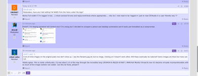
I see there's a difference but I'm getting a bit lost.. would you describe the problem?why do I now need to be 'logged in' just to view DIYAudio in a user friendly way ??
Previous to the upgrade one could visit the forum, view, and select in a format similar to the 2nd screenshot. It was consistent whether as guest or logged in.I see there's a difference but I'm getting a bit lost.. would you describe the problem?
Now, when visiting the forum to view it resolves in a format as the 1st screenshot.
1st is not user (or sight impaired ) friendly and I fail to see why I would have to expend time and clicks just to log in to get the 2nd to see if there were any posts or topics of interest.??
Quite a retrograde step.
Do you mean that the not logged in view doesn’t use the “classic” theme, while the logged in view does?
Why do you choose to not stay logged in?Previous to the upgrade one could visit the forum, view, and select in a format similar to the 2nd screenshot. It was consistent whether as guest or logged in.
Now, when visiting the forum to view it resolves in a format as the 1st screenshot.
1st is not user (or sight impaired ) friendly and I fail to see why I would have to expend time and clicks just to log in to get the 2nd to see if there were any posts or topics of interest.??
Quite a retrograde step.
Nodody would log on unless you a) want to post something or b) check notifications and such, at least nobody I know.Why do you choose to not stay logged in?
or c) see imagesa) want to post something or b) check notifications and such
edit: just saw that in the new forum images as also visible when not logged in - sorry ...
In my 16 or so years and I don't know how many 1000s of hours on this forum, it's very rare that I'm here and not logged on. Of course mod duties need a log in, but even just to read and browse I don't know why you would not be logged in.at least nobody I know.
Is it because you are using a non secure computer or device? Something shared perhaps?
- Status
- Not open for further replies.
- Home
- Site
- Forum Problems & Feedback
- Welcome to the new diyAudio platform - feedback wanted!