I'm a huge fan of low contrast user interfaces. I like nothing more than dark grey text on a yellow background for reading, personally. Expect to see the lower contrast in the future once the knobs are twirled.I have in the past found that changing the white background in light to 3% grey makes it easier on the eye, the same as the dark background is not fully black.
Pano wasn't dissing anyone, he was being funny, as well as factual. The older we all get the less plastic are brains are and the less we like change. That's just how it is 🙂have a look around before dissing regular contributors.
Bowing to "phone centered" Millenials may widen the user base, for sure.
Not really, they listen to music through earbuds and "DIY" nothing.
45% of the visits to diyAudio are now from mobile or tablet, the fact we have a mobile friendly version of the site now has nothing to do with their grumpy factor.
What appears in the desktop version is not beholden to the mobile version. We use @media queries and similar to change things depending on the technology being used to view the site.
Thank you for your feedback, which was asked for and wanted, and at least by me, very much appreciated. Keep it coming, though I think we're starting to see enough themes here repeating over and over that we and the dev team have plenty to get on with for the next couple of months.
I really appreciate everyone chiming in. As mentioned, we launched "early" to get us through migration, rather than waiting for "perfect". We're going for a iteration model of development from now on. Not waiting forever and one big change then nothing changing again for ages. From now on change will happen iteratively and regularly through the life of diyAudio.
Ditto.OMG Thank you so much.
So many years of pinching, zooming and scrolling around on my phone....finally no more
I actually preferred the desktop view on my phone. For me scrolling and zooming was faster to navigate the site. I miss it.
Trouble shooting:
Table inserting- I used a table off of google spreadsheets aprox 4x36
Used the copy and paste feature.
In the editing window it cop fine, when posted, the code shows instead of the table.
I tried to make a table from the tabs but it is still not an exact copy and paste, I would have to insert all the values and recreate the table
which… I am a little lazy and put enough effort in the first table
Table support is a unique post oriented format, similar to HTML. For what it is it works well and has support tools.
You can edit in code mode or wysiwyg.

You can edit in code mode or wysiwyg.
I just find out that you can switch to classical view mode.Yet i'm short sided and ASCII characters are still too thin.My eyes already hurt after half an hour on the site.Although I was invited to review the new interface before launch i only addresed the multiple colours problem there was at the time, yet i can't remember if the ASCII characters were as thin as they are now...Unfortunately i didn't have too much time to spare here lately. Too thin characters are clearly a problem for short sided people.And I'm watching it on a laptop...I am 50+. Having a bit difficulty reading this new site, compared with the old sire, because:
1) The font is (too) thin . It could be better to have more thickness.
2) space-wise :: less content are shown on the same CRT/LCD screen estate compared with the old site. It's particularly worse when reading on not-so-modern mobile screen which has < 6-inches screen size,
Last edited:
can I disable my avatar? I am neither interested in an image nor colored squares with a huge letter in it. that would be great. a nickname is enough.
Did you get a reply to this - there is a page chooser - are you on mobile or desktop?I am also finding it impossible to get to a specific thread page. It would be nice to have the page chooser back.
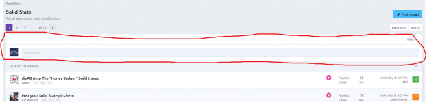
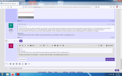
It might have been said already but... is there really a need to have this "new thread" feature at the top of the forums ? There is already a big "post thread" button and it would free up some vertical space.
It seems weird to make it easier to post new threads while the previous forum suggested a search before creating a new thread. ;-)
It seems weird to make it easier to post new threads while the previous forum suggested a search before creating a new thread. ;-)
Attachments
Thank you.I just find out that you can switch to classical view mode.Yet i'm short sided and ASCII characters are still too thin.My eyes already hurt after half an hour on the site.Although I was invited to review the new interface before launch i only addresed the multiple colours problem there was at the time, yet i can't remember if the ASCII characters were as thin as they are now...Unfortunately i didn't have too much time to spare here lately. Too thin characters are clearly a problem for short sided people.And I'm watching it on a laptop...
I found the Dark mode is more comfort to eyes and fonts are a bit thicker. That's my perferance now.
They're not thicker, it's an illusion ...it's just white on black...the problem stays with us ...Thank you.
I found the Dark mode is more comfort to eyes and fonts are a bit thicker. That's my perferance now.
Attachments
No, no, no!!I'm a huge fan of low contrast user interfaces.
How young are you??
No, he wasn't. Before the forum filled with YouToobe millennials, JM was just behind Pano in answering questions. I am distressed that these two are dissing each other.Pano wasn't dissing anyone, he was being funny...
It looks like the New Public font is 7.6% bigger than the private beta forum. 14 pixels high versus 13 pixels high. Line-width is unclear because CRT(LCD) GUI fonts are aliased, I see lines as 1 to 3 dots wide, mostly one dark and two light.can't remember if the ASCII characters were as thin as they are now...
We have lost the alternating background colors which forums have traditionally (since 1999) used to separate sequential posts.
Can you get new glasses? Simple near-sighted vision is easy to correct.
Last edited:
Hi, I liked the ability to scan 100 newest threads like before. This is OK, it is like what Microsoft did to my Site Web Mail....without asking.
Is this a joke? I chose one single post to comment out of 16 pages just because i have the exact same feeling, that the writing is too thin and SMALL and i am absolutely sure about that.Can you get new glasses? Simple near-sighted vision is easy to correct.
No!! I do not joke about my reading vision. Reading is very important to me.Is this a joke?
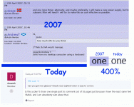
I just went back to 2007 (WayBack Machine does not have a lot of DIYAudio pages cached). I come up with the same answer: the stock font is a tiny bit taller and wider today. Like 7% taller and 2% wider. The old font may be darker; or it may be the darker background "bleeds" from the character.
I'm struggling to read also. And I notice there are very few l-o-n-g posts today, which may be a sign of read/write discomfort.
One more. A snip from another forum where the default font is bigger.
Attachments
Ah!! Username, Account, Preferences, Font Size. Extra Large. SAVE!

That is probably too big but there are other choices.
That is probably too big but there are other choices.
I see all date/time information contains day, month, year, AND ALSO hours, minutes 🙂
as in: "Joined 2014-12-21 4:38 pm". Very important and relevant...
Even my birthday in my profile shows minutes. I didn't even know I was born at 12:08pm..... How did you guys found out??
as in: "Joined 2014-12-21 4:38 pm". Very important and relevant...
Even my birthday in my profile shows minutes. I didn't even know I was born at 12:08pm..... How did you guys found out??
Last edited:
- Status
- Not open for further replies.
- Home
- Site
- Forum Problems & Feedback
- Welcome to the new diyAudio platform - feedback wanted!