I kind of miss the old school forum but that nostalgia probably will pass quickly.
Once set in full width, no sidebar mode, the overall forum is fine. Great job. But since I'm are to nitpick a bit...
But overall, I know how big a project this is and how it provides the foundation for the future. So... thank you to all involved.
Once set in full width, no sidebar mode, the overall forum is fine. Great job. But since I'm are to nitpick a bit...
- where has the quote button gone ?
- the way the user info on the left of a thread is structured isn't very helpful. Couldn't the star go next to the "member" or "moderator" tag or the down arrow, to free up a line for location, which is really useful info (unlike the member tag btw) ?
- I'm a bit perplexed on the use of different colors for different forums, on the forum home page. That doesn't really improve readability for me and kinda destroy the overall feel of visual unity.
- The way PMs are limited (or not ?) doesn't appear very clearly anywhere ?
But overall, I know how big a project this is and how it provides the foundation for the future. So... thank you to all involved.

This was raised with Audentio a while ago. Apparently XenForo has no way to change the default number of posts per page.Any way to set the number of posts per page? The default setting requires too much page flipping when reading through a thread.
Also, I would love to see a way to permanently disable mobile view.
Can you explain more about what you mean by disabling the mobile view? You mean you want to see the desktop version on mobile?
There is a dark mode, one of the 3 selectable themes. A lot of people have missed this option, and we'll work on making it more obvious. There are scheduled to be a few improvements to the navigation in the near future, but we decided to launch with where we were at currently to get things moving.Also, it would be good (for eyes and energy saving) to have "dark mode" display.
Can you provide a specific link that doesn't work? I tried a few from Google and they are all working ok so far.Just experienced.
Jumping from google's search results to particular page of the site is now incorrectly. It may take a while for google to update their indexing.
Classic theme makes the transition a bit easier but it requires a login
Good point, we'll make the theme choice available for not logged in members. I also sometimes browse my favourite sites without logging in.
1. Noted.Thanks for upgrade. Looks and functions good. (Have switched to classic theme though)
1) Not extremely important but how about little increase in Avatar pictures (In the thread not on front page). I suppose the use for avatar is when scrolling the thread the poster gets easily identified by picture than the name.
2) The clickable down arrow to show when joined; the time when joined gets truncated. (Again not important though) (Only date can be put which will look clutter free)
3) What does the star in circle represent ?
thanks and regards
2. Noted.
3. If you've donated and have a current paid membership group status upgrade in effect (12 months from the date of donation)
Firstly, you can access it right now with two clicks - the "kitchen sink" menu to the right of "members", then "watched threads".Getting to my Watched Threads is a bit cumbersome, as it is buried too deep in the UI. Too many clicks and too much scrolling on my small screen (smartphone). This was soooo much nicer in TapaTalk. Can you make it easier to access Watched Threads?
However it is (planned) to be coming to a second level sub-navigation (similar to the XenForo default second level sub-navigation) in the next few days.
I don't see any nationality flags which I found very useful. Especially in thr swap meet where it gave you an instant idea of shipping maybe viable or not.
Flags will be returning - couple of weeks.
Great to hear!I really like the new look of the site and the forum. Especially the feature to add photos directly to the posts..
Thanks guys..
Me again. Maybe this is more constructive. The readability is about the visual elements that compete for attention and the visual workload.
You are preaching to the converted. I absolutely understand your point and agree with you. 🙂
What we have launched with is not perfect, but we considered it enough to get us across the migration line and now we can start on the "getting it right" phase. We no longer have to worry about the old software stack falling apart or getting hacked and have a clean fresh modern framework we can build on.
What you are talking about is often termed "visual hierarchy" or used in the same kind of readability discussions. I'm well acquainted with the concept and a huge fan of it. There are (to your eye and mine) too many competing elements to let your eyes flow across what's important. We're going to improve this considerably. It might take a few weeks but I'm committed to getting it right. Your Klipsch examples are excellent and use the tried and tested trio of color, weight and size to create an excellent visual hierarchy. We're on to it!
XF seems to lean towards circles, or rounded squares, or squares, but not rectangle. But your comment is noted, and thanks for the feedback. I suspect that in a few weeks squares will feel normal and rectangles will feel strange.Good job, nice apparance. My only remark is also about the avatars. The old avatar shape was a rectangle with 5:4 ratio or so. The new shape is a square, and the left side of all avatars is cropped. Would it be possible to restore the old aspect ratio? And perhaps have an option to view the original avatar picture in full size by clicking on it.
- where has the quote button gone ?
- the way the user info on the left of a thread is structured isn't very helpful. Couldn't the star go next to the "member" or "moderator" tag or the down arrow, to free up a line for location, which is really useful info (unlike the member tag btw) ?
- I'm a bit perplexed on the use of different colors for different forums, on the forum home page. That doesn't really improve readability for me and kinda destroy the overall feel of visual unity.
- The way PMs are limited (or not ?) doesn't appear very clearly anywhere ?
But overall, I know how big a project this is and how it provides the foundation for the future. So... thank you to all involved.
If you click 'Reply' the post in question should appear for quoting. You can add multiple posts (multiquotes) in the same way.
PM's are found by that little envelope at the top right and are called 'Conversations'.
Ok, so quote has merged with reply... Good to know.Could anyone in this thread please click my signature line and check it works OK and that you do not see this message.
And sadly the link doesn't work for me either.
edit: I found the PM easily enough. The question is about limits ? Are we done with that ?
Thanks for checking the link. Bizarrely it works for me (Mooly) but seemingly not for standard accounts. One to investigate.
It seems like the 'Classic' theme is very popular -- any chance of making that the default one?
Quote button has been replaced by the reply button. Just click on each reply and it will perform the same action.I kind of miss the old school forum but that nostalgia probably will pass quickly.
Once set in full width, no sidebar mode, the overall forum is fine. Great job. But since I'm are to nitpick a bit...
- where has the quote button gone ?
Even better, you can now select some text and the option to reply to the text you have selected will pop up! Saves you having to cut and paste the quote.
Location and flags will be restored to more how they were, in a few weeks.
- the way the user info on the left of a thread is structured isn't very helpful. Couldn't the star go next to the "member" or "moderator" tag or the down arrow, to free up a line for location, which is really useful info (unlike the member tag btw) ?
What colors? Screenshot?
- I'm a bit perplexed on the use of different colors for different forums, on the forum home page. That doesn't really improve readability for me and kinda destroy the overall feel of visual unity.
Gerard will comment on this later, thanks for the feedback, we'll try to make it clearer. I'm not sure what limitations there are on PMs except group mail.
- The way PMs are limited (or not ?) doesn't appear very clearly anywhere ?
But overall, I know how big a project this is and how it provides the foundation for the future. So... thank you to all involved.
And thank you for the constructive feedback. Yes, this is just the start 🙂
Can we have the hazard sign on the valve pages rather smaller its taking up 1/3 rd every web page. Thanks.
This had been a good time to rename the "Full range" section to something that isn't mixed up with Multi-way. I see this misstake all the time (just now actually) and I have also made it myself. Suggestion:
Full Range -> One Way
Multi-way -> Multi way
These two has no bearing on how "full range" the speaker may be!? The original naming problem lies in that 2 different perspectives has been used to fornaming - "Full range" is driver specific but "Multi-way" is speaker-box oriented description. One could very well use a "Full range" driver in a Multi-way speaker....
//
Other thing....Quote is automatically included without the choice button like in the old forum versionThanks for checking the link. Bizarrely it works for me (Mooly) but seemingly not for standard accounts. One to investigate.

Home page has too much whitespace.
Thread titles are too big, and bold.
https://www.diyaudio.com/community/ only shows 9 threads without scrolling. Everything is too big (when comparing to another forum I frequent).
Thread titles are too big, and bold.
https://www.diyaudio.com/community/ only shows 9 threads without scrolling. Everything is too big (when comparing to another forum I frequent).
Test. 1st is new signature line and second is the old vB one. Only difference is HTTP and HTTPS
Installing and using LTspice IV. From beginner to advanced.
Installing and using LTspice IV. From beginner to advanced.
Installing and using LTspice IV. From beginner to advanced.
Installing and using LTspice IV. From beginner to advanced.
1) so far found changes more "cosmetic" ("empty/useless") than functional/practical.
Maybe later will find some advantage on the new format.
2) Annoying: on the opening page I have the full 33% of page width WASTED showing mostly irrelevant or at most of passing interest "members on line" (who cares about that??) and Forum Statistics (same thing).
 In the old format such data was unobtrusively at the bottom, today it always wastes 1/3 of the page no matter how down you go.
Site (like MANY others) seems to having been "dumbed down" (less data on screen) bowing to "Phone only" users.
Even if that is an "universal" trend, and most users worldwide have dumped PCs and Notebooks for Phones, or at least Tablets, that is fine for "Talk only" ones but not at all for Technical ones as DIY Audio, where schematics and detailed pictures are paramount.
3) this is most certainly a bug: I routinely leave "grammar correction" ON.
For some reason when it finds one wrong word or a couple, it now highlights the whole paragraph.
Screen capture attached.
 That does not happen elsewhere, as in MEForum where I typed errors on purpose.
4) that said, the ability of pasting pictures straight to Forum instead of forced linking to external sites is most welcome.
5) no matter what, THANKS FOR THIS FORUM 😀😀😀
Maybe later will find some advantage on the new format.
2) Annoying: on the opening page I have the full 33% of page width WASTED showing mostly irrelevant or at most of passing interest "members on line" (who cares about that??) and Forum Statistics (same thing).
Site (like MANY others) seems to having been "dumbed down" (less data on screen) bowing to "Phone only" users.
Even if that is an "universal" trend, and most users worldwide have dumped PCs and Notebooks for Phones, or at least Tablets, that is fine for "Talk only" ones but not at all for Technical ones as DIY Audio, where schematics and detailed pictures are paramount.
3) this is most certainly a bug: I routinely leave "grammar correction" ON.
For some reason when it finds one wrong word or a couple, it now highlights the whole paragraph.
Screen capture attached.
4) that said, the ability of pasting pictures straight to Forum instead of forced linking to external sites is most welcome.
5) no matter what, THANKS FOR THIS FORUM 😀😀😀
The classic theme is just for those who are used to what we've had for the last 22 years. We'll try over time to make it even closer to what was here before the changeover.It seems like the 'Classic' theme is very popular -- any chance of making that the default one?
The new light (and dark) themes are free from any limitations or restrictions on the past, and will be iteratively improved and modernized over time. These are the future. In a few months I hope that most of even the regulars will find the new themes more pleasing than the old one. Please allow us a few weeks to make some improvements and months to get things perfect.
Thanks for the answers. 🙂
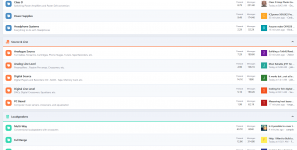
Sure. Amps in blue, source in orange, loudspeaker in green.What colors? Screenshot?
Attachments
Could any regular member please test the links. Does the second one work OK?Test. 1st is new signature line and second is the old vB one. Only difference is HTTP and HTTPS
Installing and using LTspice IV. From beginner to advanced.
Installing and using LTspice IV. From beginner to advanced.
There are options for full width, no sidebar. Works for me, I had the same initial reaction.2) Annoying: on the opening page I have the full 33% of page width WASTED showing mostly irrelevant or at most of passing interest "members on line" (who cares about that??) and Forum Statistics (same thing).
YesCould any regular member please test the links. Does the second one work OK?
- Status
- Not open for further replies.
- Home
- Site
- Forum Problems & Feedback
- Welcome to the new diyAudio platform - feedback wanted!