hey ..how about these...? (I abandoned the previous one..for my girlfriend remaked that it would better suite an airline company.. )
)
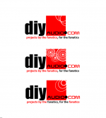
please excuse the quality...just tried a draft in MS word...!
Personally i liked the 2nd and 1st ...in taht order
Or is it more to do with "Experimenter Expetency syndrome"..
btw those disturbances in the red square represent sound waves...! point sources..Or atleast that is what i intended...!!
ajju
)please excuse the quality...just tried a draft in MS word...!
Personally i liked the 2nd and 1st ...in taht order
Or is it more to do with "Experimenter Expetency syndrome"..
btw those disturbances in the red square represent sound waves...! point sources..Or atleast that is what i intended...!!
ajju
Attachments
An externally hosted image should be here but it was not working when we last tested it.
I'm voting for the 1st...you may like to go further on the same theme thoughajju said:...Personally i liked the 2nd and 1st ...
Great work all

corbato said:
I'm voting for the 1st...you may like to go further on the same theme though
Great work all
I like the 1st one too.
But since the forum's color will use the same as the logo, red & black will be very flashy
How dare you even think about taking off my logo! You should all repent immediately!
Notes - You cant use that driver in any of the new logo designs, we only have website use, not merch from memory.
Any chance of you leaving this contest open for me for a few weeks, i have exams until the 18th of June, then I am free as a bird to do a new logo for Jason, but he will owe me a beer!
Notes - You cant use that driver in any of the new logo designs, we only have website use, not merch from memory.
Any chance of you leaving this contest open for me for a few weeks, i have exams until the 18th of June, then I am free as a bird to do a new logo for Jason, but he will owe me a beer!
One last time for me
And bigger scale:
An externally hosted image should be here but it was not working when we last tested it.
And bigger scale:
An externally hosted image should be here but it was not working when we last tested it.
griff said:Any chance of you leaving this contest open for me for a few weeks, i have exams until the 18th of June, then I am free as a bird to do a new logo for Jason, but he will owe me a beer!
No contest deadline... keep the ideas flying...
Here is the red one in blue (and a gif)
dave
Attachments

and here is one with the existing color scheme
An externally hosted image should be here but it was not working when we last tested it.
Thunau said:and here is one with the existing color scheme
That's better, and here with a transparent background
dave
Attachments

Here is one with transparent background generated in the original file (a bit less fuzz).
An externally hosted image should be here but it was not working when we last tested it.
Thunau said:Here is one with transparent background generated in the original file (a bit less fuzz).
An externally hosted image should be here but it was not working when we last tested it.
this one is nice
Very cool
I like both the posts from ajju and Thunau in the semi-current forum colors. I'm not sure what Thunau's elliptical 'pie chart' background has to do with audio, but the look is pretty cool.
Griff, if you're the guy responsible for the current logo, then . . . heck yeah, submit another good one. Looking forward to your take.
I am far from the artist and have little to no skills with graphics software, but I personally liked the idea Jeff Wong did with the soldering iron. I also like the current lower case 'diy' with 'Audio following. If somebody has a take on making something similar, using Jeff's soldering iron as the 'i' and adding some electronic background, such as a driver, speaker, volume knob or circuit element could be cool.
Anybody out there with the skills that thinks this is a good starting platform, run with it! And put me down for a hat or T-shirt when the dust settles!
Sandy.
Re: Very cool
Yes, I was shooting more for the cool T-shirt logo than something that screams "audio". That's why the first try was more of an earthy color scheme. It would look cool on a lot of T-shirts, from black through yellow and green to various khakis. The purple-ish colors look better on the web page. That said, it can be any color scheme, because all the elements are just shapes on their own layers. A few clicks is all it takes.
Sandy H. said:I like both the posts from ajju and Thunau in the semi-current forum colors. I'm not sure what Thunau's elliptical 'pie chart' background has to do with audio, but the look is pretty cool.
(...)
Sandy.
Yes, I was shooting more for the cool T-shirt logo than something that screams "audio". That's why the first try was more of an earthy color scheme. It would look cool on a lot of T-shirts, from black through yellow and green to various khakis. The purple-ish colors look better on the web page. That said, it can be any color scheme, because all the elements are just shapes on their own layers. A few clicks is all it takes.
many thanks e'one for the feedback..
Bricolo, If not red what other colours do u reccomend...?
I was thinking we were going for a complete makeover..where the existing schemes may or may not be carried forward..Yes as you say, its true that red and black filling a complete page will be lil too much for the eyes...replacing existing background colours with red and black is a strict no even from my side..personally I like white backgounds for text etc better...
if not white a shade of offwhite creams or mild yellow, lean mixes of oranges....greys are also good but they are not fit for online usage...they seem very bland..!
If I were to put down an explanation to my choice of colours on the logo...first thing is red black and white complement each other pretty well. secondly they are bold solid colours. and to put some philosophy into it (which can be classified as stupid) black signifies a bit of sophostication, elegance, surrealism, misticity ..red is a colour with a lot of character..has a lot of passion, its aggresive...its highly stimulating, activating and motivating..that was the reason i chose to include a dash of red..It was just an attempt to indicate the fellow diyers passion for music, and their highly motivated drive and never tiring attitude to perfect the best sounding equipment ever...white and black to accompany red..makes it realy fiery..! And the audio is put in black on the Red to make it to stand out..after all thats what our quest is all about..perfect audio..!
Over and above all these..red happens to be my favourite colour...so u would obviously see a bias towards it..! cant escape that...
ajju
Bricolo, If not red what other colours do u reccomend...?
I was thinking we were going for a complete makeover..where the existing schemes may or may not be carried forward..Yes as you say, its true that red and black filling a complete page will be lil too much for the eyes...replacing existing background colours with red and black is a strict no even from my side..personally I like white backgounds for text etc better...
if not white a shade of offwhite creams or mild yellow, lean mixes of oranges....greys are also good but they are not fit for online usage...they seem very bland..!
If I were to put down an explanation to my choice of colours on the logo...first thing is red black and white complement each other pretty well. secondly they are bold solid colours. and to put some philosophy into it (which can be classified as stupid
) black signifies a bit of sophostication, elegance, surrealism, misticity ..red is a colour with a lot of character..has a lot of passion, its aggresive...its highly stimulating, activating and motivating..that was the reason i chose to include a dash of red..It was just an attempt to indicate the fellow diyers passion for music, and their highly motivated drive and never tiring attitude to perfect the best sounding equipment ever...white and black to accompany red..makes it realy fiery..! And the audio is put in black on the Red to make it to stand out..after all thats what our quest is all about..perfect audio..! Over and above all these..red happens to be my favourite colour...so u would obviously see a bias towards it..!
cant escape that...ajju
Thanau,
This is nice...Taking ur idea a bit further can you stylize the background such that it reflects DIY very abstractly. I say this because there is a striking Y formed in the centre..so was thinking if you could accomodate/depict a DIY with the formations in the background...just a thought!
ajju
This is nice...Taking ur idea a bit further can you stylize the background such that it reflects DIY very abstractly. I say this because there is a striking Y formed in the centre..so was thinking if you could accomodate/depict a DIY with the formations in the background...just a thought!
ajju
ajju:
pastel colors, with some fadeout are nice IMO
http://www.diyaudio.com/forums/showthread.php?postid=399522#post399522
pastel colors, with some fadeout are nice IMO
http://www.diyaudio.com/forums/showthread.php?postid=399522#post399522
pastel colors, with some fadeout are nice IMO
Bricolo,
I would love to put in shades or fadeouts shadows etc. But when it comes to printing, it might be a bit difficult to reproduce. Where as block colours are cheap and easy to reproduce...one can use methods as simple as screen printing etc. Also in print it might be difficult to control any gradients precisely.
The fact that it is not just for the web, but it might as will also get into print is what forced me to use the block colours without any kind of gradients.
ajju
- Status
- Not open for further replies.
- Home
- Site
- Site Announcements
- diyAudio Logo Competition Draft Entries