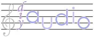
Good! Very good! The little 'd' does indeed work better in my eyes, so I'm glad its part of the rule.
I'm not sure if they are flexible on the "by the fanatics, for the fanatics" as you have dropped a pair of 'the' but its fine with me.
Your wave propagation is a great start on the diyAudio theme. Would some sort of 'point source' make it more about audio? And maybe the line turn into a graphic soldering iron (I just like the idea of a soldering iron. I promise, its the last time I'll suggest it. . . )
I think the competition is getting pretty good!
Sandy.
I am beginning to understand that one of the reasons why they need to change is to make the logo more iconic and printable.
Anytime you do fades, that makes that hard. You can make it look good pretty easy on a web page or a full-color printed page, but if you try to change the logo to black and white, or print it on a T-shirt, it looses it's oomph.
The logo needs to be simple. I may start completely over, I may be barking up the wrong tree.
A perfect example of a good logo is the AT&T world globe. When this logo was originally derived, it used a very fine-pitched number of lines.
Eventually later designers realized that this fine grid was a disaster when the logo was printed smaller, so the logo was made to have the 8 or so lines that it has now. It makes it into a more iconic object.
We need to have this iconic quality for the logo. My current designs aren't quite there yet.
Anyone want a diyAudio.com t-shirt? It would be an easy way to get people to contribute to the site. Make a contribution, get a t-shirt!
This one is getting more iconic. I think I need to look at it some more and adjust some slightly, but this is a completely object-oriented image, too. There are no fades, just shapes. In fact there are only 4 colors used in the image so it would be easy to make into embroidery or silkscreened onto a shirt.
The image was produced with CorelDraw verson 10; but I can export to a wide variety of editable formats, including Adobe Illustrator, Adobe PDF, Encapsulated EPS, and MacroMedia Freehand. CorelDraw has very robust export filters these days, I rarely have problems.
Which ever image the most people like I will submit in final form. I think I'm getting close to the best image I can create.
An externally hosted image should be here but it was not working when we last tested it.
The image was produced with CorelDraw verson 10; but I can export to a wide variety of editable formats, including Adobe Illustrator, Adobe PDF, Encapsulated EPS, and MacroMedia Freehand. CorelDraw has very robust export filters these days, I rarely have problems.
Which ever image the most people like I will submit in final form. I think I'm getting close to the best image I can create.
Here's the latest and greatest. The colors are specified by pantone selections now, too.
An externally hosted image should be here but it was not working when we last tested it.
An externally hosted image should be here but it was not working when we last tested it.
Now even simpler on the sound effect, and by letting it fade out on the right, the text moves closer to the eye candy.
The phrase "projects for fanatics by fanatics" has met with approval.
That is kewl, because it sounds better too along with being shorter and thus easier to design around.
An externally hosted image should be here but it was not working when we last tested it.
I have yet another idea. I am now using a font that is bolder, but in the same Family (Frutiger) as the current logo. I also lost the slash.
The circles are computer generated ellipses, but they are deliberately adjusted by eye to be slightly imperfectly placed and not around exactly the same center. The wave thus shimmers a little bit and seems to be moving. They also aren't circles, quite deliberately because fully circular shapes are a bit boring. Your brain is used to tranforming ellipses into circles anyway, so it still looks circular.
- Status
- Not open for further replies.
- Home
- Site
- Site Announcements
- diyAudio Logo Competition Draft Entries


 Wopo
Wopo
 Wopo
Wopo
 Wopo
Wopo


