Re: mine...
Post 59 (except for the transistor) is the most acceptable one so far (IMHO) -- it is very similar to what exists, which shows part of the challenge... games with fonts can be played until the right one is found, or a fundemental break that takes us in a new direction
dave
Neversaid said:Here another draft...
Post 59 (except for the transistor) is the most acceptable one so far (IMHO) -- it is very similar to what exists, which shows part of the challenge... games with fonts can be played until the right one is found, or a fundemental break that takes us in a new direction
dave
unknown scale......

Calm down Tim, it might be a TO92 triodeSch3mat1c said:NOOOOOOOoooooooooooooooooo!!!!!!!!!!!!!!!!!.........

Here's one..
Quick effort...
Ropie
Quick effort...
An externally hosted image should be here but it was not working when we last tested it.
Ropie
transparent background version...
An externally hosted image should be here but it was not working when we last tested it.
tweaked
and finally tonight...
and finally tonight...
An externally hosted image should be here but it was not working when we last tested it.
Update, smartened up
An externally hosted image should be here but it was not working when we last tested it.
Re: Update, smartened up
I prefer it with the un-bumped line at the top....
dave
Ropie said:An externally hosted image should be here but it was not working when we last tested it.
I prefer it with the un-bumped line at the top....
dave
OK, Dave...
An externally hosted image should be here but it was not working when we last tested it.
ok...
the idea behind this...
the font was attempted to be created..i dont know if anything similar exists..i wanted an identity for the font to make it unique to diyAudio...
i felt the font face should symbolise what diyAudio is all about in addition to providing a contemporary look..i chose the font face to be free flowing with a lot of interaction among characters...emphasising diyAudio to be a forum for free flow of information and a discussion forum for newer technologies pertaining to Audio and video....the dot signifies the web which is the primary source for gathering knowledge and the means of interaction among the diyAudio audiophile community... the form in red eminating from the dot..is a flame..in the colour red it signifies..strong energy..passion..how passionate the members are about their hobbies and about diyAudio..the letters are angled upwards with the two ends indicating a covergence somewhere above the logo..signifying the progression and concentration of ideas.!
purposefully the transitors, speakers or any representation of other components has been kept out...diyaudio treats each subject with equal importance...
However, i was thinkin of adding a band at the bottom which will carry our punchline(in a different font) along with line drawings signifying the components/topics on the forum...all to come..! but befor that i need to get some time and a machine with enough tools to create a neat looking piece... the current one was created with illustrator in about 2 hrs sitting on a machine at a net cafe which had a very naughty mouse..so please excuse the quality)
Actually i did a save for web and forgot to change the download speed setting to highest..which rendered a reallly ugly image..!! will try and make a neat gif today..!
btw ..what do u guys think...?
ajju
the idea behind this...
the font was attempted to be created..i dont know if anything similar exists..i wanted an identity for the font to make it unique to diyAudio...
i felt the font face should symbolise what diyAudio is all about in addition to providing a contemporary look..i chose the font face to be free flowing with a lot of interaction among characters...emphasising diyAudio to be a forum for free flow of information and a discussion forum for newer technologies pertaining to Audio and video....the dot signifies the web which is the primary source for gathering knowledge and the means of interaction among the diyAudio audiophile community... the form in red eminating from the dot..is a flame..in the colour red it signifies..strong energy..passion..how passionate the members are about their hobbies and about diyAudio..the letters are angled upwards with the two ends indicating a covergence somewhere above the logo..signifying the progression and concentration of ideas.!
purposefully the transitors, speakers or any representation of other components has been kept out...diyaudio treats each subject with equal importance...
However, i was thinkin of adding a band at the bottom which will carry our punchline(in a different font) along with line drawings signifying the components/topics on the forum...all to come..! but befor that i need to get some time and a machine with enough tools to create a neat looking piece... the current one was created with illustrator in about 2 hrs sitting on a machine at a net cafe which had a very naughty mouse..so please excuse the quality
)Actually i did a save for web and forgot to change the download speed setting to highest..which rendered a reallly ugly image..!! will try and make a neat gif today..!
btw ..what do u guys think...?
ajju
Attachments

?? Why the transparent GIF is necessary? Do you want change the logo only without changing the background color and general graphics concept? If background color is defined, then transparent GIF aren't necessary and any smart detail like shadows, gradients, will be possible.
I have been here at the forum on-and-off for some time now and never have much experience to say anything, but this time I thought I should do something for the forum.
I quite like the negative version myself
These are open to suggustions!
Version A
Version B
Version C
I quite like the negative version myself
These are open to suggustions!
Version A
An externally hosted image should be here but it was not working when we last tested it.
Version B
An externally hosted image should be here but it was not working when we last tested it.
Version C
An externally hosted image should be here but it was not working when we last tested it.
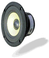
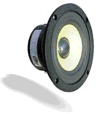
ajju said:purposefully the transitors, speakers or any representation of other components has been kept out...diyaudio treats each subject with equal importance...
Good point, but surely the only component guaranteed to be in an audio system of any kind is a speaker
- Status
- Not open for further replies.
- Home
- Site
- Site Announcements
- diyAudio Logo Competition Draft Entries