AudioFreak said:
No, just a single one that will serve all purposes. Jan's one could have any background in place of the white around the edges and would not be adversely effected.
By background I meant the blue thing in the back of Jan's logo

Bricolo said:Wardsweb, nice mascotBut isn't it copirighted? (it's an office clipart, no?)
And give him some headphones, and a soldering iron instead of the pen
You may use the images for illustrative or decorative purposes as long as the publication is not for sale or the main content, i.e. you can not sell a book showing the different characters. In another way, if you removed the charaters, would the site still stand on it's own. I guess to be on the safe side and to avoid any confusion, I'll scrape this idea.
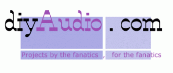
just getting to grips with Illustrator....
It can obviously be made transparent..but won't look good on the diyaudio background because of the same colours...
Edit : Not anywhere near competition quality. But the message or question is...how about using a lot of our current colours for instant recognition (look and feel)...ok I admit the font detracts again.
PS...I think it is time people got critical about the designs...everyone seems afraid to criticize the one design or the other...c'mon lets hammer each other like we do with each others diy projects. I mean I am sure there are objective standards, like recognition, font suitable for print and screen, colours...etc, etc.
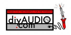
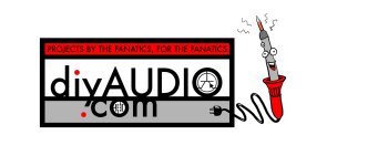
Personally I'm not to keen on red in the logo..I do like Jeff Wong's strong box enclosed logo though...HATE the transistor , but like the soldering iron...it is pretty much a standard tool, be you into tubes, speakers or chip amps.
Cheers,
Bas
It can obviously be made transparent..but won't look good on the diyaudio background because of the same colours...
Edit : Not anywhere near competition quality. But the message or question is...how about using a lot of our current colours for instant recognition (look and feel)...ok I admit the font detracts again.
PS...I think it is time people got critical about the designs...everyone seems afraid to criticize the one design or the other...c'mon lets hammer each other like we do with each others diy projects.
I mean I am sure there are objective standards, like recognition, font suitable for print and screen, colours...etc, etc. Personally I'm not to keen on red in the logo..I do like Jeff Wong's strong box enclosed logo though...HATE the transistor
, but like the soldering iron...it is pretty much a standard tool, be you into tubes, speakers or chip amps. Cheers,
Bas
Attachments
Perhaps of interest for a laugh anyway... the prior two logo designs...
2000 http://web.archive.org/web/20000229145057/http://www.diyaudio.com/
2002 http://web.archive.org/web/20020523020447/http://www.diyaudio.com/
2000 http://web.archive.org/web/20000229145057/http://www.diyaudio.com/
2002 http://web.archive.org/web/20020523020447/http://www.diyaudio.com/
Personally I'm not to keen on red in the logo..I do like Jeff Wong's strong box enclosed logo though...HATE the transistor , but like the soldering iron...it is pretty much a standard tool, be you into tubes, speakers or chip amps.
Just to make it clear...I have no say in what the logo should look like. Everything is purely my own opinion, as a diyAudio member.
Cheers,
Bas

ooer, I used to work in graphic design for quite prestigious companies before I turned my hand to making noise professionally. I see mentions of prizes, tell me more! Your new logo is on its way.
The law of karma states that you will get back 3 times what you give. I think that karma may be about to recieve a couple of thousand attachments of slight variations of the same logo. I have to say that from most of what I have seen you lot should stick to the soldering irons and leave photoshop and illustrator well alone. They're big, heavy programs and the results can be dangerous to those of a nervous disposition. If I showed one of those to my old boss... oh my word! I'd have been sent packing with a propelling pencil sticking out of my face. I like the stick man tangled up in the wire though.
The law of karma states that you will get back 3 times what you give. I think that karma may be about to recieve a couple of thousand attachments of slight variations of the same logo. I have to say that from most of what I have seen you lot should stick to the soldering irons and leave photoshop and illustrator well alone. They're big, heavy programs and the results can be dangerous to those of a nervous disposition. If I showed one of those to my old boss... oh my word! I'd have been sent packing with a propelling pencil sticking out of my face. I like the stick man tangled up in the wire though.
I have to say that from most of what I have seen you lot should stick to the soldering irons and leave photoshop and illustrator well alone.

Your new logo is on its way.
Yiiiiihaaaaa!!!! Can't wait.


- Status
- Not open for further replies.
- Home
- Site
- Site Announcements
- diyAudio Logo Competition Draft Entries