first of all, my appologies for stirring this up...that was not the intent though...
it was just a counter argument....so...cool...we are just experimenting...arent we..")
hmmm...does it mean that u have to do exactly what others are doing...
think different and may be we will get a better configuration..
who knows..!!
coming back to the logo....
it was just a counter argument....so...cool...we are just experimenting...arent we..
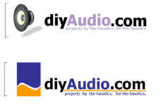
I have not seen any of these BBS boards that waste space on the left with a tall logo.
hmmm...does it mean that u have to do exactly what others are doing...
think different and may be we will get a better configuration..
who knows..!!
coming back to the logo....
So the waveform logo would be about 90 pixels tall and 40 pixels wide, and the text would be about six pixels tall, nearly unreadable. It would have to be enlarged to be halfway down many people's monitors to even be large enough to not have the text blurry and indistinct.[\quote]
I guess i wasnt clear on this...Let me explain...
the proposed form of the logo is intended more at usage on merchandise etc where space is a premium. The logo is "re-arranged" for better space utilization.
On a web page the logo will be with the normal lettering. the "diyAudio.com" and the punch line need NOT be at the bottom of the logo. The actual graphic will conventionally be placed at the left of the existig diyAudio.com. So the Ratio of text size to logo size changes in both cases..
in the web form the text below the logo wouldnt be there...as geewhizbang suggested...it doesnt make sense..!! so the two forms will be
._______
|..............|
|..............| _________________________________________
|..............|.|......................................................................|
|..............|.|......................................................................|
|..............|.|......................................................................|
|..............|...---------------------------------------------------------------------
|..............|................+++++++++++++++++++++++++++
.--------------
._________
|.................|
|.................|
|.................|
|.................|
|.................|
|.................|
|.................|
|.................|
.-----------------
||||||||||||||||||||||||
+++++++++
So there will basically be two forms..using same content..!!
imagine the first one on a web page and the second on the coffee mug, cap, tshirt.or even a lapel badge..(i would certainly like a button as against a placard..on the collar.
btw the aspect ratio of the three images shall remain the same individually...!!
now there might be argument that it is not allowed...the counter argument is.."It has nothing to do with what you WOULD do. It has to do with what you CAN do. Very often the hard limits are what drive good design. This is one of them, IMHO."
no pun intended...
ajju
hmmm...does it mean that u have to do exactly what others are doing...
think different and may be we will get a better configuration..
who knows..!!
It does suggest that you are trying to be smarter than everyone else. Sometimes, of course, that is possible.
I doubt that in this case. The spot for the logo on the web page is wide and short.
If you are submitting the logo in two forms, then let's see the other version, then so it can be evaluated for use on the web page, which t-shirts or not, is the main way that this logo is to be used.
I didn't intend for my original comment about the height of the logo to be taken so strongly. You seem to have not noticed that I liked the colors and the wave pattern itself. At the same time, dismissing my concerns about the height of the logo as if it didn't matter at all did not make much sense to me.
The fact is that they are not going to redesign the BBS software to accomodate your tall design.
I have already submitted a combination logo that has a different arrangement of the type for the purposes of the t-shirt/ coffee mug functions. I like my solution, but I do like the simplicity of the wave pattern you have suggested as well.
So let's see where it goes.
It does suggest that you are trying to be smarter than everyone else. Sometimes, of course, that is possible.
Well that was not the intend..I was just generalising. I was hoping ppl to think freely, and success would have been for zix or coolkhoa or TheNoodPoopler or mooseydoom or matjans or sch3mat1c or sandy or wopo or ropie or thunau or bricolo or martinay or DC dave or neversaid or paulspencer or IVX or HBarske or karma or wardsweb or jeff wong or Bas horneman or haoleb or denn!s or layberinthius or you or me..or to some one yet to submit...Everyone who has suggested something here is smart...for every one of them has been unique...can you find any two of them the same...atleast i couldnt..!!
well that is...I guess i dint communicate what i intended effecteively.I doubt that in this case. The spot for the logo on the web page is wide and short.
If you are submitting the logo in two forms, then let's see the other version, then so it can be evaluated for use on the web page, which t-shirts or not, is the main way that this logo is to be used.
Sure...!
An externally hosted image should be here but it was not working when we last tested it.
Well it is a discussion forum..I didn't intend for my original comment about the height of the logo to be taken so strongly.
wont you agree that the disussion that followed has now clearly set down some priorities..
You seem to have not noticed that I liked the colors and the wave pattern itself.
Frankly I dint...the reference I thought was to zix's...in any case I just presented my view point..
At the same time, dismissing my concerns about the height of the logo as if it didn't matter at all did not make much sense to me.
As u see i hadn't ignored it. Just tat I felt I hadnt put down what I intended to do concisely.
The fact is that they are not going to redesign the BBS software to accomodate your tall design.
how tall is tall
I have already submitted a combination logo that has a different arrangement of the type for the purposes of the t-shirt/ coffee mug functions. I like my solution, but I do like the simplicity of the wave pattern you have suggested as well.
Yes that is a nice design. But are we going to stop there.. I guess this thread is still alive. Is that not so.
ajju
Attachments
Message to Dave/Jason:
I observe that only images that are linked are displayed and not the ones which are attached. Is that so. In that case atleast for just this thread could you revert to the original form. Thought that it is easy making references , and much easier to browse that way.
Many thanks
ajju
I observe that only images that are linked are displayed and not the ones which are attached. Is that so. In that case atleast for just this thread could you revert to the original form. Thought that it is easy making references , and much easier to browse that way.
Many thanks
ajju
ajju said:I observe that only images that are linked are displayed and not the ones which are attached. Is that so. In that case atleast for just this thread could you revert to the original form. Thought that it is easy making references , and much easier to browse that way.
It is not possible to set this thread by thread... later this week i'm going to create a gallery of all the potentials done so far.
dave


It is not possible to set this thread by thread...
Ok.!
May i ask, why was the original form changed. Is it to allow the page to load faster..? Or is it to discourage huge attatchments and encourage ppl to sent in image links so as to save on disk space.?
ajju.
Read all about it in the other thread here. Basically, by changing to links, the amount of data transferred per page goes down. Don't have to load images. Saves on bandwidth and as an added bonus, loads faster.
Thanks Tim,
Well initially when I joined the forum this was one thing different
which attracted me. I felt a lot more interaction with the pictures being displayed and all, and easy to navigate or to pinpoint information, or say a quick reference on some previous project etc. But now i feel a bit handicapped. Anyways..!!
the amount of data transferred per page goes down
Sorry, dint quite understand this one. Correct me if i am wrong, for I've not understood the network very well yet.
I assume, even if you provide a link to the picture, it takes time to load, and may be more time as it is from a different source. Also If it doesnt load from the linked site, it looks ugly. Now as far as network bandwidth is concerned its the same traffic at the client..isnt it..? Only that the source, DIY audio server is not heavily loaded, but its distributed to some other servers. Am i correct in this assumption.?
Many thanks
ajju.


ajju, I like the eye candy.
A lot.
The boring/bland helvetica typeface and not-quite-right relationships between the text elements and the logo needs some work, however. The parts need to flow together more.
ALL CAPS is bad design most of the time BTW.
But you are on a very nice track.
A lot.
The boring/bland helvetica typeface and not-quite-right relationships between the text elements and the logo needs some work, however. The parts need to flow together more.
ALL CAPS is bad design most of the time BTW.
But you are on a very nice track.


- Status
- Not open for further replies.
- Home
- Site
- Site Announcements
- diyAudio Logo Competition Draft Entries