Naj, none of those designs would work on a t-shirt. Go back and read what I posted about using simple, solid shapes to make up a design. The textures you are using won't print well on a t-shirt.
It may sound like a limitation to the design, but boiling a logo down to a few simple shapes is actually a very good thing. It makes it very recognizable.
It may sound like a limitation to the design, but boiling a logo down to a few simple shapes is actually a very good thing. It makes it very recognizable.


ajju said:and this one for the web.!!
Many thanks
ajju
Not bad, but kinda (read: a bit too, IMHO) contemporary. That is to say, good but not on the right track.
But then, that could just be because I only bug the tubes forum

Tim
Naj, your graphics are good. Not to discourage you, I am afraid it wont fit exactly into the requirement here. I like diy7.jpg of all the ones you have posted. The crayon work looks good. It is most practical but might need some minor modifications. Especially the representation of texture might be possible, but the colour gradation and shadows might not be acceptable. If it still doesn’t loose its charm and looks neat after applying these constraints, it is a good candidate. A good one
To collect and put together all points, from the reactions on the forum and from general observation, a logo should ideally be:
Please feel free to add, if I’ve missed something.
ajju
To collect and put together all points, from the reactions on the forum and from general observation, a logo should ideally be:
- Simple in design.
- Clear forms and shapes. (no shadows and gradients)
- Size, aspect ratio limited by space availability on the medium used.
- Not intricate designs
- Minimal colours.
- Single transparency layer
- Should be contained, confined
- Elements of identity, Easily distinguishable,(meaning the logo alone should, at a later point of time represent the name. It should have a good association and ‘recollect ability’)
- Uses and mediums of usage. (Vs cost)
- Web (primary requirement here)
- screen printing,
- Iron on embroidery
- Etching on ceramic.
- Embossing and cut outs
Please feel free to add, if I’ve missed something.
ajju
Not bad, but kinda (read: a bit too, IMHO) contemporary. .
Many thanks for your comments. The idea was to keep it simple, and that might be one of the reasons, it looks contemporary.
It would be nice, if you could elaborate why you think that way.
It could be a possible lead to me and the remaining participants.
That is to say, good but not on the right track
Oh! seems like I am still not clear what the exact requirement is.

ajju.


geewhizbang said:How is it an improvement over the existing logo? It is just as unprintable on a t-shirt.
Try again.
How is it unprintable? It can be resized, you know.
It cannot have any shades of color in it.
The speakers are shaded. They are not solid colors. They are also NOT simple shapes.
You should be be thinking in terms of simple, identifiable shapes that can be printed in a single color for each shape.
You should keep the total number of colors used to two or perhaps three colors. Each different color adds additional cost to reproducing the logo, since it has to make a different pass through the equipment for each color. Each time you make a new pass for a color, it adds to the items that you have to destroy because of printing errors, and it adds to the setup work in the first place.
When you think of simple shapes, you can't get any more basic than, for example, the Chevrolet chevron logo. We don't need to get quite THAT simple, but the whole idea of a logo is to create a simple concept that you can repeat over and over so that you can show the logo without having any text next to it at all, and anybody that has seen it before quickly recognizes it.
On a silk-screened T-shirt, the resolution is very, very poor, especially when you are trying to mix colors together to get different shades using halftone screens.
You can use halftone screens only if the dot pitch per inch is about half of the silk screen thread density. Otherwise the dots either disappear or merge together into a solid mass.
Since the best silk screen thread density is about 100 per inch, this means that the best possible dot pitch is about 40-50 lines per inch. Newsprint is 80-100 lines per inch, and already has clearly visible dots. A glossy magazine photo is 150-200 lines per inch. The visibility of the dots goes up proportional to the inverse square of the resolution. So a 40-line screen is about 6 times more coarse in appearance than a 100-line newsprint screen.
For this reason, you will only see halftone screens on silkscreened t-shirts where the image covers nearly the ENTIRE front or back of the shirt. Even then, the best shirts use extremely clever methods to work the dot pattern into the design itself, but none of these things are possible with the DIYAudio logo.
*****
The logo has other issues, such as the unnecessary, fine-lined box around the logo. This would be almost impossible to print on a shirt. It is also distracting.
Less is more, especially with logos.


- Status
- Not open for further replies.
- Home
- Site
- Site Announcements
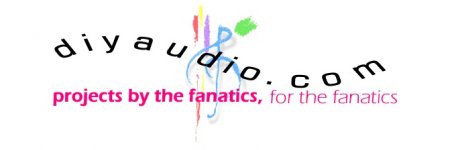
- diyAudio Logo Competition Draft Entries