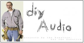
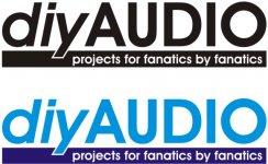
diy7revised and diy8 from Naj.
This is good. But to tell you what impressions i get...
1) The ratio between the chosen font size for the name and the punchline. In my opinion it is kind of distracting, as in, the observer tends to loose focus. However the background graphic in the centre still manages to hold it all together. Ideally it would be nice if the punchline is in a much lower font size than the name. Also it seems as if the name and the punchline are not tied together, and they follow different forms and you have tried to give equal importance to both. That could be a little distracting.
2) The element of motion you have introduced in the name coupled with the spacing between characters, creates an impression of a lot of space. It appears to be very carelessly knit. It would have been ideal for something that represents a lot of fun and leisure(it kind of indicates that there is very little seriousness involved with stuff, I presume we at diyAudio.com take matters very seriously although its something to do with a hobby. You might get a hint of this from the way people discuss topics on the forum )
)
3) Try not to overlay the graphic with the text. Once a logo is established, seperating them at a later stage becomes difficult.
4) Also Rt now, you have got 6 colours on diy7revised...imagine printing them..the cost would be very high. Try if you can reduce the colours..! The yellow stroke still has a bit of tecture in that ..It might not be good for print.
see if you look at diy8.gif its far easier to print..especially because there are no overlays and colours are solid..But you still might want to change the font..their relative sizes. Overall the logo is a bit big..i would say.
Btw, as you have rightly done, dont stick to just one design...Try and evolve from what you have got here...Who knows You might come up with a radically new concept..! Try experimenting with different fonts and orientations(as far as possible keep the name and the punchline less distracting...keep either of them in a straight line..easy on the eye.)
good luck..and do post your work here.....!
ajju.
Thanks, ajju for the advise....how is this?
This is good. But to tell you what impressions i get...
1) The ratio between the chosen font size for the name and the punchline. In my opinion it is kind of distracting, as in, the observer tends to loose focus. However the background graphic in the centre still manages to hold it all together. Ideally it would be nice if the punchline is in a much lower font size than the name. Also it seems as if the name and the punchline are not tied together, and they follow different forms and you have tried to give equal importance to both. That could be a little distracting.
2) The element of motion you have introduced in the name coupled with the spacing between characters, creates an impression of a lot of space. It appears to be very carelessly knit. It would have been ideal for something that represents a lot of fun and leisure(it kind of indicates that there is very little seriousness involved with stuff, I presume we at diyAudio.com take matters very seriously although its something to do with a hobby. You might get a hint of this from the way people discuss topics on the forum
3) Try not to overlay the graphic with the text. Once a logo is established, seperating them at a later stage becomes difficult.
4) Also Rt now, you have got 6 colours on diy7revised...imagine printing them..the cost would be very high. Try if you can reduce the colours..! The yellow stroke still has a bit of tecture in that ..It might not be good for print.
see if you look at diy8.gif its far easier to print..especially because there are no overlays and colours are solid..But you still might want to change the font..their relative sizes. Overall the logo is a bit big..i would say.
Btw, as you have rightly done, dont stick to just one design...Try and evolve from what you have got here...Who knows You might come up with a radically new concept..! Try experimenting with different fonts and orientations(as far as possible keep the name and the punchline less distracting...keep either of them in a straight line..easy on the eye.)
good luck..and do post your work here.....!
ajju.
Naj,
You'll get a good description of problems with colours shades and textures...and the difficulties associated with printing the same from Geewhizbang's description.
Adding further to this, printing on Cloth using dots of smaller sizes is extremely difficult....the returns are poor...due to smudging as well as the uneven surface....Small fibres will be sticking out of teh thread of the cloth which will impose further difficulties.. If you plan to use cotton T shirts..after the first wash some fibres on the outside will difenitely come loose ...and hence ruin the print.
Another thing is, it might not just be screens we are targetting. The most economical way to send these stuff to the members will be as iron-on fabric/embroidory. The advantages include, lower shipping costs and flexibility in what you want to do with the logo...Put it on a T or a POLO or a CAP...etc etc....
ajju
OT: I was of the opinion that Newsprint was a CMYK process and used etched plates(offset printing) than silk screens. Silk screens might not last that long for use on so many prints..
I didn't mean to imply that Newsprint used silk screens. It is offset lithography, the same as a magazine, except that the paper and the inks are cheaper. Newsprint is very absorbent and the fibers are rather coarse, so the smallest dot-pitch you can hold on newsprint is about 100 lines per inch.
On glossy magazine paper, because the paper is coated and extremely smooth, you can hold very fine screens.
Nevertheless you can use halftone screens on t-shirts, and the principles are the same whether you are using a silk screen or an offset press. There is one major difference, and that is that the silk screen thread count makes it difficult to hold a dot pattern smaller than 40-50 dots per inch, but it also adds some aliasing issues. So you can get really bad moire effects.
Dave...
Have you had a chance to start this yet, Dave? I think it's a good idea.
planet10 said:
It is not possible to set this thread by thread... later this week i'm going to create a gallery of all the potentials done so far.
dave
Have you had a chance to start this yet, Dave? I think it's a good idea.
by the way... that's not a serious entry... unless you want it to be...
here's the original diy guy.
http://www.hocoa.com/handyman.png
on this page i like your logo best naj... i might look at others another time.
later
here's the original diy guy.
http://www.hocoa.com/handyman.png
on this page i like your logo best naj... i might look at others another time.
later
Re: Dave...
It has almost risen to the top of the queue a couple times... i will also include the prize information -- there are some nice prizes....
dave
Ropie said:Have you had a chance to start this yet, Dave? I think it's a good idea.
It has almost risen to the top of the queue a couple times... i will also include the prize information -- there are some nice prizes....
dave
Ropie said:

Very nice, Benny - that'll have them begging for memership.
That is by far the best entry so far.
thanks for your complements... i hope it wins... i think something like that would look quite nice on a t-shirt! i know i'd be proud to wear one... and not only would any wearer be the coolest kid on the block, it might even get 'them' begging for more than just 'membership'...
- Status
- Not open for further replies.
- Home
- Site
- Site Announcements
- diyAudio Logo Competition Draft Entries
