You have my retouch in the attachment. It's for you. Nice product.
I like this much more. If you could remove all the roman characters and replace the brand name with a brand icon...
 There comes a point in a brand's development when it no longer needs its name to be recognised - imagine that already happened for your product. Something fibonacci?
Last edited:
Windforce85, I think I know the source of my anti-minimalistic nature. I was born in USSR where military-minimalism was everywhere. I hated that and I borrowed some german OTTO catalogs to dream about HiFi, it was like a porn for many soviet boys like me )) Of course I liked ampli-receivers Pioneer, and remember my feeling when they changed the logo. This is why I call it HiFiTOY because my toys were military-minimalistic and I didn't play enough. Windforce85, if you can help me about ID, you are welcome and I ready to pay for in case if the result will be nice. Let's talk?
doctormord, the logo width is 39mm (with 1.7+.3 = 2mm of thickness), if I'll make it 50% less that will look ugly fat. I had the idea to place there 1.5" IPS display with VU meter surrogate but finally I gave it up. I don't like OLED, at least what is available, always something greenish and low resolution.
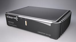
Probably it is maximal minimalism what I could acceptAny opinion are welcome

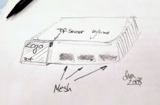
Freehand..

Attachments
Ohh, doc! That reminds me something from my soviet past as well(please don't forget about extrusion process limitations!) I think I need more symmetry in front. Actually I had the variant with deeper chamfer in the center and on the top also, however too deep bevel looked ugly and I gave it up.
I think I need more symmetry in front. Actually I had the variant with deeper chamfer in the center and on the top also, however too deep bevel looked ugly and I gave it up.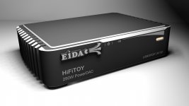
Just moved light-pipe and turn it 90dg, I think looks better, isn't it?
jop...i like this version more...
- Status
- This old topic is closed. If you want to reopen this topic, contact a moderator using the "Report Post" button.
- Home
- Amplifiers
- Class D
- Tiny TAS5558 +TAS5624 "Power_DAC"+SMPS