guess i'm not understanding your post. what the hell is *my* problem? nothing at all. i made a joke...and that joke was "rebutted". so...i told my view of things.
as for you doing something up in paint...that is how this all started...someone mentioning using a program that provides bitmapped (as opposed to vector) art, and geewhizbang saying it wasn't suitable for this application. so according to *him*...using paint isn't acceptable. realistically (in professional design)...he is right. you should *always* create logos in a vector-based program. then again...this is a diy audio board FOR FUN...so have at it!
i have seen a number of posts by geewhizbang ripping people's designs to shreds. it kind of peeved me, as this is all supposed to be on a casual level (and not held at a "professional" standard...just for fun). so...after his rebutting of my joke...i felt it was time to weigh in, as his word is not *the* definitive design point of view.
to his credit...the design he did was probably the best submitted thus far. i just don't like someone hacking on people that are in this for the fun of it. save that BS for work.
and actually...why does *any* of this concern you?! i'm out on this, and will reply no further. not trying to start some flame war. sh*t...for all i care...you can paint the thing on a canvas, and scan it in (as long as you enjoy doing it).
Paint programs produce BITMAPS. The picture is comprised of a grid of small dots. Each dot can be assigned a color or greyscale value.
Drawing programs produce what are called vector graphics. The objects in drawings are shapes, stacked on top of each other. The shapes can be filled, be used to cut out or draw on top of other shapes, can have line strokes drawn around them.
This sort of vector object is absolutely necessary if you are going to make embroidery or a silk screen master.
Bitmaps are very inconvienient for this because:
1. They don't scale very well. If you have a bitmap that looks good at a certain size, if you scale it up, the spacing of the dots gets large enough to see, and the image gets blurry or "dotty".
2. It is hard to determine the edge of a color object. In order to look good, a solid-color bitmap shape is not entirely one color. All along the edge of the object are pixels of intermediate color between the object and its background that trick the eye into making the shapes look smooth. This is called anti-aliasing, and it is absolutely necessary to do this in bitmap images or they look very ragged and awful. But it makes it very, very hard to detect the edges of the shape when making something like a silk screen or embroidery.
3. For objects made out of simple shapes, bitmaps can get very large in size. A vector object is the same file size, no matter how big you print it.
If you don't have a vector drawing program it is usually very easy to find legitimate copies of older versions of graphics programs, such as CorelDraw, Adobe Ilustrator or Freehand on sale for $35 bucks or so. You can get CorelDraw 10 for about that price, and that is what I used on my logo submittals. Version 12 is out already, but version 10 is still a very, very capable program.
geewhizbang said:Bitmaps are very inconvienient for this because:
They would have to be "illustrated" (generic term)... but if the best idea comes as a raster, i can live with that.
dave
I don't think I have been ripping other people's ideas to shreds. I have been discussing them; but there were plenty of compliments along with the critiques.
Logo design is always something that takes a lot of discussion if you are going to do it right. There are a lot of subtle details to nail down, and almost infinite possibilities to consider -- but you have to actually create it, visualize it in the first place.
My method is to talk about it a lot. It may be rather obsessive, but it could be misconstrued as criticism. If so, I'm sorry.
An eye opener early in my career was working with an award-winning designer. I was rather surprised at the way he worked; he was not fond of his own ideas at all. He would try something, then another, then another, deliberate about it a lot, and then try something else. It took a lot of time, but he went thru a lot of different ideas before he settled on something.
I really like the fontgraphy in the one with the accidental sperm aspect, and the wave pattern in someone else's.
Part of the reason why my submittal is OK is that I reacted to criticism and posted changes in response. I have done 16 different versions of my logo to arrive at the current version.
I did get a bit peeved when someone tried to explain that it didn't matter whether the logo was tall or wide; that the site could be redesigned around his design rather than the logo designed for the site.
Please do post other ideas here. My design is probably not the one that will win in the end; I have a gut feeling that there is a better answer that will eventually be so obvious when someone posts it here.
But I will try to be more polite when I try to talk about them.
Oh, it was a joke? Use more of these >>> ")


So.... what's the difference? All the images thus presented are in, uhhhhh let me see, .JPG or .GIF which is bitmapped as presented on screen. As drawn in Paint, I get no antialiasing, just hardassed jagged lines. But then, the jags go away if you use a lot of pixels in a high resolution. Personally I don't see why you can't silk screen just anything, vector or not, especially since I'm wearing (er, well I was yesterday) a shirt that's got a not too uncomplicated picture printed on it. (See www.swairfest.org.)
Tim
So.... what's the difference? All the images thus presented are in, uhhhhh let me see, .JPG or .GIF which is bitmapped as presented on screen. As drawn in Paint, I get no antialiasing, just hardassed jagged lines. But then, the jags go away if you use a lot of pixels in a high resolution.
Personally I don't see why you can't silk screen just anything, vector or not, especially since I'm wearing (er, well I was yesterday) a shirt that's got a not too uncomplicated picture printed on it. (See www.swairfest.org.)Tim
I'm not trying to argue with you. I just explained the technical reasons why vector is preferred for logos, especially ones that are to be reproduced somewhere other than on the Web.
If you submit a bitmap to a company that makes t-shirts, they will charge you a bunch of money for image conversion. What they are doing is redrawing your image in vector format, and even though there are autotrace programs, none of them work well, so the image has to be pretty much redrawn by a human.
That is just the way it is.
Planet10 said it is ok to make submittals in bitmap. But do understand that one of the judging criteria will have to be how well the logo can be converted to a vector object.
comments inline below,
>There was some truth to this in 1984. But by 1988, there were >graphics programs such as Ventura Publisher that could do far more >than Pagemaker. (Quark didn't even exist yet).
There was a pretty decent page layout program (IMSI Publisher) in the mid 80's that worked pretty well. By Mid '88 I was doing all of my layout on a NEXTcube, and the pc was forsaken for several years
>I tried to use the PC Version of Illustrator in 1988 or so, but it was >too slow and user hostile to be of any use. But CorelDraw 1.0 was a >breath of fresh air. Because it was written ENTIRELY in integer math, >it was about 4x-10x faster than Illustrator. It also had a deeply >elegant interface.
Still have my original boxes of ver 1 thru 4, and ver 12 does everything illustrator does, quicker too...
>Little-by-little Corel has been whittling away various minor >deficiencies, fixing issues with import / export filters, making >Postscript output more robust and reliable, and improving stablity. On >an adequately-configured XP/Win2K system coreldraw 10 and 12 are >very, very reliable and professional in both scope and robustness.
In fact, alot of times when I'm recreating logos ( I now own a sign shop and spend waaay too much time doing this) some aspects of a logo are quite a bit quicker than my $4000 sign software.
>Big design firms use now Illustrator because that is what they are >used to. But I can use CorelDraw to produce perfectly acceptable .AI >files for anyone that needs them.
In nearly 20 years of computer graphic design (man I'm getting old), I've seen more hacks with money (latest mac, adobe suite, etc...)
design logos that look good on the screen, and are totally unreproducable. As a general rule, I always design 1 color, 2 color and full color (cymk) versions for every logo.
erie
griff said:Hey Dan is the comp still running? I am free from uni exams and can submit some if you are still hunting.
EDIT - I dont know about the prize.... Jason still owes me a beer for the last one!
Contest still running...a good set of prizes (sitting in my email -- i want to create links and grab some pics -- stay tuned)
dave
Logo?
Can't seem to find a way to send you emails with attachments. Oh well... just wanted to say that if people like the look/feel of the site, you can keep the color scheme - just make the form support the words and make sure nothing is smaller than ~16p when the logo itself is max of 1" x 1"
maybe something like this?
Attachments
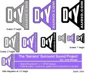
OK, rev 2.0 of the logo w/ some usage types
OK, I fooled with it a bit last night.
Bottom line, it's a print logo, so:
1.) It should embody the concept & communicate effectively within the first 7 seconds at maximum - world class is 1.5 seconds.
2.) It should not embody any culturally biased issues or images.
3.) It should read well at different sizes from billboard to 1" square - and also in multiple colors including Grayscale and Black & White.
4.) It should integrate well into multiple medias such as print & web.
5.) It should draw upon familiar images & concepts to be memorable and should not be so 'loud' as to distract from the content. IE< it creates context... it is the stage... not the show.
So, this is a bit rough - text size / font / border certainly could be reworked as currently its screen readability is not great at 1" (30mm) though it prints well at that size and some of the it needs tweaking I guess, but this is a decent first-round concept... not great, but decent. My assumption is that it's OK to use cheapie tools like Powerpoint etc.. and that somewhere in our midst we have a graphic artist to rework & clean up whichever concept we choose. I do branding and positioning but sure as heck am no artist. ...and granted, there is normally a lot more to creating a logo than pulling it out of one's backside - but hey - it's a lot more fun this way... fewer boring meetings... If you like it and we get a graphic artist to step up and rework it in Quark or some other "real" package - I'll gladly split the prize... we can each have half a beer ... or whatever...
Attachments

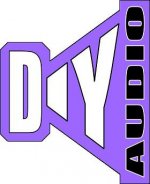
Sorry Bob, there are several issues with your logo. The speaker is a good idea, but the typography is extremely hard to read. It may be better to display the typography next to the image rather than on top of it.
The logo is also rather square, which is somewhat inconvenient for Web display. Something wider than it is tall is usually better for web work.
Don't worry about how you produce the logo; there are many here that know how to do this, including myself; so any logo that is selected can be easily redrawn in CorelDraw, Adobe Illustrator or Freehand to be reproduced properly.
I literally used Powerpoint - I have no art tools whatsoever (and many would say... no art skills... it's just not what I do)
- Yep, the text is hard to read - I don't think it absolutely needs to be moved off the speaker, but that is an option. I think the problem is more my ill-suited art software than text placement.
- Yep, long web logos are generally better than stubbies. If this is to be primarily a web logo, then elongation is a good option (and may provide an opportunity to pull some or all the text off the logo
- Yep, the speaker picture is squarish & crappy - it is made of 3 geometric shapes in powerpoint... very rough.
However, a couple of things should remain about this (or any other) concept:
- Simplicity: if the average person can't comfortably comprehend it and get the intended message in 2 to 7 seconds... it's not a logo, it's a piece of art
- Scalability/Flexibility: Needs to read well in color or mono or grayscale from small to large sizes (IE: You should be able to put it in the upper left hand corner of a business card and read it without a magnifying glass... what you want to put the logo on today may not be what you want to put it on tomorrow - if you can't put it on TV screens, billboards, business cards, webpages, beachballs, polo shirts etc... then it's not a good logo)
- Content: The current logo contains the "projects by fanatics..." statement. That's a visual voice and should probably not be in the logo. (though is very good to use in conjunction with the logo) Few logos embody the visual voice. For example: Microsoft "Where do you want to go today" or Nike "Just Do It" or McDonalds "We Make You Smile" or Coke "Have a Coke and a Smile" etc... That may be what the company wants you to *think* when you see their logo, but the logo is a simple visual representation and the visual voice is used seperately to influence the thought process of the customer to focus the meaning of the logo and boost memory retention. Even when a logo is textual, it is a stylized version of a very brief section of text and is considered to be a picture and is used differently than text (like Microsoft and Intel who use stylized text versions of their names as logos) Bottom line - It's just too much information and presents readability challenges as the moderateor had alluded.
TRUTH BE TOLD - I REALLY LIKE THE CURRENT LOOK AND FEEL OF THE SITE.
If it were mine to decide, I'd get someone on the board with a graphic art background to remove the visual voice from the current logo and do a little extra style work on it. Some may think that "diyAudio.com" is too much text to make a good logo... but hey... it looks pretty good now... I'd like to see it after a good graphic artist fine-tuned it.... maybe accent the nice diagonal play between the y & A and work the font over a bit for readability when small & call it done.
BobH said:TRUTH BE TOLD - I REALLY LIKE THE CURRENT LOOK AND FEEL OF THE SITE.
Too right!
But if my logo comes in the top 5, can I get a diyAudio.com T-Shirt or something?
When is the judging anyhoo?
Geek said:But if my logo comes in the top 5, can I get a diyAudio.com T-Shirt or something?
When is the judging anyhoo?
Nothing as mundain as a T-Shirt...
http://members.shaw.ca/planet10/diyAudio-logos/
As soon as i'm moved back into my house -- a month now we've been living in my parent's basement
-- i promise to start pushing this forward again.The contest lasts until it's over. We aren't setting an arbitrary time... artist's work needs time to gestate.
dave
- Status
- Not open for further replies.
- Home
- Site
- Site Announcements
- diyAudio Logo Competition