What causes colour clashes? Do we all perceive the same colours clashing?
Struggling with home decorating started me thinking about this! I'm seeking a more profound understanding so I can finish painting.
Why would certain colours on the spectrum from red to violet look discordant? Like orange and blue? And others not discordant like blue and green?
Is there a mathematical basis?
Is it evolutionary...some combos occur in nature and signify things to stay clear of?
Or does everything actually "clash" except we tolerate combos that we are used to seeing in nature, like blue sky against green grass?
Or something else?
Insights invited.

I'm also inclined to think it is somewhat arbitrary or "learned".
That colour wheel tool is very handy for exploring combinations. Thanks.
I have questions about the standard wheel representation too.
First, the spacing of the electromagnetic spectrum is not linear around the circumference. So of what significance are diametrically opposite complements on this layout?
Second, why a wheel? We don't do this for the audio spectrum to judge which notes will sound good or bad with one another.
Second, why a wheel? We don't do this for the audio spectrum to judge which notes will sound good or bad with one another.
Isn't there something like the "chromatic circle" and the "circle of fifths"?
I'm baffled by this, also. I'm color-blind, and I have literally no idea what it means for one color to "go with" or not to "go with" another color. This has led to some amusement among my friends and family members, and has led me to dress in gray t-shirts and blue jeans almost exclusively. At least I think they're gray and blue. 😉
And don't get me started on color-coded resistors.
And don't get me started on color-coded resistors.
At work we had "the magic wheel"; two bits of cardboard with the major scales on, but we also have a table.the audio spectrum to judge which notes will sound good or bad with one another
If the colours that clash are learned, would they change through time, much as is what is considered socially acceptable changes, or the purseption of beauty?
It seems to me that the effect of perceiving two colours as grey (white and black are extreme brightnesses of gray) is due to how our cones measure colour balance.
That is, if all 3 cones sense the same energy balance as they would for uniform white/gray light, the brain will assume gray. Even if the light isn't uniform at all. There must be an infinite number of combinations of discrete spectra and amplitudes that will cause a perception of gray.
So I suppose you could have several paints that appear identically gray under uniform light but then each deviate wildly in perceived hue from one another when the light source changes it's spectrum.
because every human not have same optical resolution
it just like resolution in monitor, if too low then there is walking ant in there
it just like resolution in monitor, if too low then there is walking ant in there
Both yellow and orange are cited as complements to blue. That's sort of weird. Presumably the relative intensities will have to differ in the two cases to both create a perception of gray when mixed.
There's some basics with illustrations of how we perceive colour clashes and harmonies here:
https://graphic-designer-richmond.co.uk/2021/06/clashing-or-harmonious-colours/
I'd like to add that when we're taking about the colour of walls that you have to live within, we tend towards light pastel shades which makes the colour choice all that much harder, given how diluted the colours and their differences then become.
Usual disclaimer: I have no connection with the above website's author, business etc.
Last edited:
It‘s a question of contrasts, generally.
Johannes Itten defined some of them afaik, the most important being
-the brightness contrast
-the complementary contrast
-the simultaneous contrast
-the color in color contrast
Color-clashes occur when they are opposing or too close to each other, but one always has to take some of the other contrasts in account.
Like, red and green is obvious. Make the green a bit darker/lighter, or reduce it’s intensity and it might work.
Same for, for example, red-blue, yellow-pink and many other combinations…
If you want to avoid this, you could add a wee tiny little bit of the opposing colors to bring them together. The clearlyness of a tone may get a bit reduced, but this can bring together two extremes… (think of it as, maybe, the H2 or H3 😉 )
Here‘s some info about itten, a bit down the page you‘ll find the contrasts listed. (I see that my translation isn’t very accurate…)
All very interesting.
In Georgian and Victorian stately homes they often used bold colours. Whole rooms in green, blue, gold, red, etc with various trim colours and friezes and ornamentations. And the result can be quite relaxing and serene. I regret my house is far from stately in proportions! It's just a regular 1960s house. But I am intrigued by how combining complex, bold and contrasting elements can, together, create a livable effect. How is that?
Some mid-century modern interior designs use primary colours, black, stones, steel and wood and these are highly contrasting, but together a livable effect is achieved. Almost as if successfully taming all those lively elements is serenity inducing in itself.
I guess you have to have a clear vision of the end result because, starting out, as you add each element it can look very wrong. In my case this can cause procrastination and then capitulation to "just paint it all white".
And perhaps this explains these videos I've watched recently. A dozen or so YouTubers meticulously describing different shades of white paint, by brands like Benjamin Moore and Sherwin Williams. Akin to wine tasters and hifi reviewers! So much emotive language and poetic waxing about various subtle undertones. I don't want to become this obsessive about white paint, lol.
I'd say it is not the colour, but the materials used. That is, back in time they obviously hadn't synthetic pigments, and color-schemes too were quite different than what we have today. (RAL represents industrial standards gooing back to the dark part of 20th century, while NCS and the likes are based purely on theoretical values (Hue, Saturation, Brightness). While this is somewhat fine for theoretic or digital stuff, you won't ever be able to achieve this with real (synthetic) pigments, they are always a compromise. So why not getting the real stuff from start and create rooms (or whatever) with those real pigments? (like, how many blue or red or ochre pigments exist, and how many pigments does the industry use to imitate all that? Answer: depending brand and quality, 8 - 16)...
The other thing is that back in the time, painters and artists always used wild combinations of pigments to get a good colour (red with that pinch of green etc.)...
to give you a comparable picture: Imagine a plate, filled+smoothed out with white wheat, and imagine another plate, filled+smoothed out with granulated sugar… see the difference?
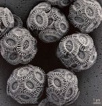
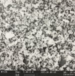
Here's some microscopic images, chalk (the skeletons of the little critters that became chalk), and industrial goop, titandioxid I believe…
If you like this stuff, try to find pictures of material analyses of classic houses, the cross-section of a paint is really fascinating…
(a propos whites and whine: My paint-pusher, a small business near zurich, regularly makes little events called wine + colour, where they and a sommelier create a pallette of 5-8 matching wines and its colours... both total freaks, they are able to talk an hour about a specific aspect of a wine/a colour and it does not become boring...)
[edit: https://www.boredpanda.com/artist-u...he-illusion-of-2d-drawings-anastasia-parmson/]
The other thing is that back in the time, painters and artists always used wild combinations of pigments to get a good colour (red with that pinch of green etc.)...
to give you a comparable picture: Imagine a plate, filled+smoothed out with white wheat, and imagine another plate, filled+smoothed out with granulated sugar… see the difference?
Here's some microscopic images, chalk (the skeletons of the little critters that became chalk), and industrial goop, titandioxid I believe…
If you like this stuff, try to find pictures of material analyses of classic houses, the cross-section of a paint is really fascinating…
(a propos whites and whine: My paint-pusher, a small business near zurich, regularly makes little events called wine + colour, where they and a sommelier create a pallette of 5-8 matching wines and its colours... both total freaks, they are able to talk an hour about a specific aspect of a wine/a colour and it does not become boring...)
[edit: https://www.boredpanda.com/artist-u...he-illusion-of-2d-drawings-anastasia-parmson/]
Attachments
Last edited:
Wine tends to render the most banal conversations Interesting, lol.
You are right about the materials. I think subconscious triggers play a big part. In a home we seek security. That entails things like warmth, cleanliness, solidity, privacy. Real wood flooring is warm and inviting but plain beige walls can seem dirty and depressing; both are beige. We don't consider wood to be dirty; that's how clean wood looks. But a beige surface could seem like a white surface that's muddy. And so-called greige seems to me like painting a dirty, rainy day on your walls! I suppose too many or too much high contrast colour can be stressful, in nature demanding attention: eat me (fruit) or avoid me (like venomous snakes).
I guess this is pretty obvious. I just haven't really thought about it before.
I recall a friend complaining that his landlord had painted his lounge English mustard yellow. He was quite upset about how depressing he found it. Perhaps the sense of dirtiness it evoked or perhaps the notion of encroaching hot mustard was a subconscious threat.
Thanks to everyone's inputs I am rethinking my approach. I've decided that my initial question of why colours clash is the wrong question. Now I'm thinking more about how materials and their colours trigger subconscious reactions. It may not matter about the colours as long as their deployment is mindful (is being mindful of the subconscious an oxymoron?).
Don't talk me about "white"! In a previous job we had meetings that lasted hours about white. "Is this white the same as that white?" "What if we use this white on that surface, will it be the same as that other white on that other surface?" "Is this ral 9002? The previous batch looked whiter." HOURS!... Imagine a plate, filled+smoothed out with white wheat, and imagine another plate, filled+smoothed out with granulated sugar… see the difference?
Here's some microscopic images, chalk (the skeletons of the little critters that became chalk), and industrial goop, titandioxid I believe…
Hilarious.Don't talk me about "white"! In a previous job we had meetings that lasted hours about white. "Is this white the same as that white?" "What if we use this white on that surface, will it be the same as that other white on that other surface?" "Is this ral 9002? The previous batch looked whiter." HOURS!
My lounge walls and sloped ceilings, drywall, are currently all painted with Kilz PVA primer. It's white. Sitting in the lounge, the surfaces appear many shades of white and colours reflected from adjacent objects (like the wood floor) and green from the forest and grass outside the main window, and so on. None of it is pure white. And it's constantly changing with the sun and weather and internal lights.
To agonize over tiny differences in white paint chips seems to literally be missing the big picture.
- Home
- Member Areas
- The Lounge
- Why do some colours clash?