Yeah - we found they were not meaningfully related to the value of the threads. We removed them to reduce clutter. This will be ongoing as we will remove more clutter progressively as we can.Thread ratings are missing? 🤔
Try the classic theme. We will tighten up the density over time too. Please be patient 🙂Immediate impression.
The old version homepage showed a lot more posts titles on the screen - easy to immediately scan the titles the last 20 odd posts. Now we have to scroll.
I will get used to it.
I did not find it 😕All ratings are reset to zero for now.
Hover the mouse pointer over the avatars.
For wider platforms there is enough space to leave the view/post counts in standard numbers instead of 17K or 1M.
Imagine that 135 can be seen more than 1M on the first sight 😵
Just got on - nice, clean looking space we have here! Thanks to those who worked marathon style to get DIYAudio up and running asap.
OMG Thank you so much.
So many years of pinching, zooming and scrolling around on my phone....finally no more
So many years of pinching, zooming and scrolling around on my phone....finally no more
Well spotted. There's a whole discussion back here about improving the "visual hierarchy" to make it more obvious as to what is important and what is less so. Items like those you mention are key.I did not find it 😕
For wider platforms there is enough space to leave the view/post counts in standard numbers instead of 17K or 1M.
Imagine that 135 can be seen more than 1M on the first sight 😵
We took the decision to go live with this current iteration as we had the cost and effort of maintaining two forums and vBulletin was close to collapse. From here we will interactively improve these things.
Thank you for your feedback. Please see my previous post for comment on this. Regular users have grown accustomed to using the site in the 12 years since I implemented the "information dense" front page listing in this way. A bird's eye view of what's going on, a measure of the heartbeat of the forum in a single glance.I agree with sthcoaster. Not really a fan of this new format. The old one showed a lot more information on the screen and allowed you to see the titles of many threads at the same time. This one is prettier, but has a lot of wasted, blank space. Not an improvement in my opinion.
Don't worry - this is noted and is planned to be addressed in the near future.
As Gerard touched on, this can be accomplished with better visual hierarchy, something that Discourse does well, in my opinion. We'll be moving towards some Discourse style UI patterns in the near future. Specifically bigger numbers having heavier weight, more vibrant colors, and larger fonts in order to tell you things are more important without actually having to read them, just glance at them.I did not find it 😕
For wider platforms there is enough space to leave the view/post counts in standard numbers instead of 17K or 1M.
Imagine that 135 can be seen more than 1M on the first sight 😵
thank you
in fact, I did tried it and somehow - meant that I see recent threads
well, not surprising, sorta sleepy
Conclusion - PMs are well and alive 🙂
I dig the drop-down Forums button up top. If the previous forum did that I don't recall seeing it. I think its a great feature, good job Audentio!
Once I set the look to Classic it no longer felt like I was on Sonos or Mustang Talk or a million other glowing Xenforo sites. Jason, if it continues along these lines I believe it'll be quite comfortable here.
Once I set the look to Classic it no longer felt like I was on Sonos or Mustang Talk or a million other glowing Xenforo sites. Jason, if it continues along these lines I believe it'll be quite comfortable here.
It is possible you can not hide your status from yourself. I don't see a way to test that, without a second member online at the same time.disabling online status doesn't seem to work?
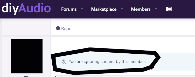
The repeating "report" can be moved to the right (remove the report text and let only the icon)
report icon
report icon
... then I clicked through to the main forum list. Its outstanding! Very nice looking in Classic mode. The transition team rocks. Finally, a team who knows how to make Xenforo livable.
Thanks Jason, Will, all. This couldn't have been easy or much fun. Get some sleep 🙂
As everybody noted, pretty unreadable. Emoji size is too-big--they're distracting. Ditto avatars. Dense and intense is good.
As everybody noted, pretty unreadable. Emoji size is too-big--they're distracting. Ditto avatars. Dense and intense is good.
List transferred over. Works. Thanks.
(But why is "Insert image" Ctrl-P, when that is universally PRINT, even unto MS-DOS?)
(Ah, OK: Print in whole-thread mode, Picture only when in the edit box.)

(But why is "Insert image" Ctrl-P, when that is universally PRINT, even unto MS-DOS?)
(Ah, OK: Print in whole-thread mode, Picture only when in the edit box.)
Thanks for the feedback. Noted about the new stock smily face sizes compared with the classic ones. I'll look into that.Thanks Jason, Will, all. This couldn't have been easy or much fun. Get some sleep 🙂
As everybody noted, pretty unreadable. Emoji size is too-big--they're distracting. Ditto avatars. Dense and intense is good.
Regards "unreadable" are you talking specifically about the front page or when viewing an actual thread?
- Status
- Not open for further replies.
- Home
- Site
- Forum Problems & Feedback
- Welcome to the new diyAudio platform - feedback wanted!