Just looks like an expo/hypex about the size of Erik's old trax midbass horns or the DuMoulins that inspired them.
Just looks like an expo/hypex about the size of Erik's old trax midbass horns or the DuMoulins that inspired them.
Other than the look of the Gamma's (finish quality), nothing new there at all.
The Alphas on the other hand are a bit different in their form factor. Look a bit closer.
")
First Question: I've sold my first pair of LO15's, and will sell the second pair as well. I custom-ordered four of them, and the project has taken a turn away from the OB concept due to my unwillingness to go down the path of active equalization.
The change in direction of the project is not a reflection on the drivers; from the feedback I've gotten, the drivers are sonically outstanding, with the hallmark TD15M sound in an OB driver. Many people like OB's, and I'm pleased that AESpeakers is offering these drivers as part of their product line. The attitude I have against equalization is my problem; many people are happy with digital or analog equalized OB systems.
Second question: The Ariel was a good design for its day, and I waited patiently for Scan-Speak/Vifa/Seas drivers that were more efficient and just as flat as the 5.5" Vifas that were an essential part of the Ariels. Well, that day never came.
The drivers that followed were no more efficient, and were less flat thanks to the fad of more rigid but also more resonant cone materials - which in turn demanded much more complex crossovers to remove the artifacts of the breakup region. The key concept in the Ariel - which is applied in the new project - are wideband drivers with well-controlled rolloff regions, thus simplifying the crossover and also allowing a higher level of parts quality. Bass and midbass drivers with well-controlled rolloff regions are still pretty rare, and more rare in the high-efficiency realm.
As for drivers that are closest in spirit to the 5.5" Vifas, and at a higher level of quality, I'd look at the Skaaning Flex-Units. I've heard these, and they are very, very good, although not as cheap as the original Vifas. But Skaaning has the right idea; drivers with very good self-damping that don't require elaborate crossovers.
QUOTE]
Have you seen these?-
http://www.jantzen-audio.com/download/ja8008-tw034-kit/PD_JA8008_Aug10_v3.pdf
Troels Gravesen designed, built by seas. Troels liked the vifa c17 drivers and made these to get a driver with the family sound I believe.
Expensive though.
Oh, wow, they're oval. Big deal.Look a bit closer.
Interesting and beautiful horns indeed, and....
it had been brought up several hundred pages back:http://www.diyaudio.com/forums/multi-way/100392-beyond-ariel-389.html#post1531353
This thread is indeed too long!
it had been brought up several hundred pages back:http://www.diyaudio.com/forums/multi-way/100392-beyond-ariel-389.html#post1531353
This thread is indeed too long!
Oh, wow, they're oval. Big deal.
You didn't look far enough.
It's a dual 18 inch design (likely BMS).
1 Driver on each side of the cabinet, segmented with opposing horns (top and bottom) and a compression partition that reveals only half of the driver.
Interesting and beautiful horns indeed, and....
it had been brought up several hundred pages back:http://www.diyaudio.com/forums/multi-way/100392-beyond-ariel-389.html#post1531353
This thread is indeed too long!
Bah, that was 2 years ago!
Hi,
It's a lengthy document !
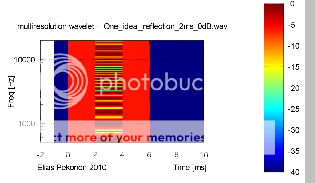
May I add a simple solution, a sort of an all-in-one picture showing time dependent comb filtering of a direct signal and a reflection:
- Elias
It's a lengthy document !
May I add a simple solution, a sort of an all-in-one picture showing time dependent comb filtering of a direct signal and a reflection:
- Elias
For what it is worth - enjoy !
http://www.kinotechnik.edis.at/pages/diyaudio/design_guideline/CMP_Behaviour–Bridging_Points_of_View.pdf
Michael
Hi,
It's a lengthy document !
May I add a simple solution, a sort of an all-in-one picture showing time dependent comb filtering of a direct signal and a reflection:
- Elias
Thanks a lot for sharing this pix Elias !
I was highly tempted to use it, but on the other hand, I dindn't want to stick *your* feathers at *my* hat - as they say.
It tells the whole CMP story I needed several pages for in a single plot.
Michael
Cool graphic Elias, thanks.
I do have one big problem with it, tho. Color. I think it might work better in black and white. Because yellow appears so bright, it makes the graph hard to read at a glance. The 0dB areas appear "lower" than the -15dB yellow areas. Do you see what I mean?
So either keep it monochrome or maybe have yellow as 0dB and drop into blue from there (no red). Just a suggestion.
Hello Panomaniac,
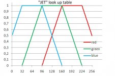
There is some convention for the choice of the colors in such wavelets graph or spectrograms, constant spectral decay graph...
The most used "look up table" (assignment of the red, green and blue component for a given pixel value) is called "Jet" (e.g. Matlab).
See attached graph for a 256 values look up table.
Best regards from Paris,
Jean-Michel Le Cléac'h
Cool graphic Elias, thanks.
I do have one big problem with it, tho. Color. I think it might work better in black and white. Because yellow appears so bright, it makes the graph hard to read at a glance. The 0dB areas appear "lower" than the -15dB yellow areas. Do you see what I mean?
So either keep it monochrome or maybe have yellow as 0dB and drop into blue from there (no red). Just a suggestion.
Attachments
Thanks Jean-Michel. I understand the principal of the JET color scale, but I don't like it!
Maybe it's just me, but it does not present a clear idea of levels at a glance. And shouldn't charts be clear and easy to read?
But this is an off topic quibble with look of the chart. I don't want derail this topic and discussion the measurement technique.
Maybe it's just me, but it does not present a clear idea of levels at a glance. And shouldn't charts be clear and easy to read?
But this is an off topic quibble with look of the chart. I don't want derail this topic and discussion the measurement technique.
Hello Panomaniac
The choice of such color maps or color LUTs as JET is mainly due to the fact that in a scale of grey the mean human cannot see more than something like 8 levels of luminosity.
But when it comes to colour the mean human can see more than 64 different colors.
So the mean human will visually retrieve much more information in a wavelet graph using a Jet LUT than witha grey scale.
See other color maps:
Set and get current colormap - MATLAB
Best regards from Paris, France
Jean-Michel Le Cléac'h
Thanks Jean-Michel. I understand the principal of the JET color scale, but I don't like it!
Maybe it's just me, but it does not present a clear idea of levels at a glance. And shouldn't charts be clear and easy to read?
But this is an off topic quibble with look of the chart. I don't want derail this topic and discussion the measurement technique.
Hey Jean-Michel. Thanks for the color map. Some of those would work better for me, no doubt!
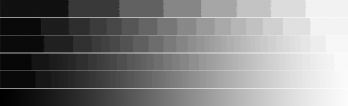
Perhaps you mean 8 bits? That's 256 levels. We can certainly see more than 8 shades of luminosity. About 200 levles is generally regarded as minimum needed for a smooth scale. Below is a little chart I made, it has strips with different values of black to white. From top to bottom there are 8, 16, 32, 64, 128 and 256 levels. Depending on you video card and monitor, all but the bottom strip should show steps.
The choice of such color maps or color LUTs as JET is mainly due to the fact that in a scale of grey the mean human cannot see more than something like 8 levels of luminosity.
Perhaps you mean 8 bits? That's 256 levels. We can certainly see more than 8 shades of luminosity. About 200 levles is generally regarded as minimum needed for a smooth scale. Below is a little chart I made, it has strips with different values of black to white. From top to bottom there are 8, 16, 32, 64, 128 and 256 levels. Depending on you video card and monitor, all but the bottom strip should show steps.
Attachments
Hello,
The visual test to see how much should be the difference between 2 grey shades to be perceived should not be done on such bar scales but on more complex pictures.
Here is a test:
http://ophtasurf.free.fr/illusions/illusion_adelson2.jpg
If you say the luminosity of cell A is different than cell B you are plain wrong. A and B have the exactly same intensity...
In that following example, the intensity is constant all along the horizontal bar:
http://upload.wikimedia.org/wikiped...n.svg/800px-Gradient-optical-illusion.svg.png
As you can see, our vision is very weak concerning its ability to perceive a diference between 2 grey shades.
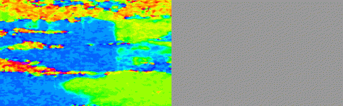
In an extreme case: look at the attached gif picture. On left the picture in RGB color table, on right the same picture shown in grey scale...
Best regards from Paris, France
Jean-Michel Le Cléac'h
The visual test to see how much should be the difference between 2 grey shades to be perceived should not be done on such bar scales but on more complex pictures.
Here is a test:
http://ophtasurf.free.fr/illusions/illusion_adelson2.jpg
If you say the luminosity of cell A is different than cell B you are plain wrong. A and B have the exactly same intensity...
In that following example, the intensity is constant all along the horizontal bar:
http://upload.wikimedia.org/wikiped...n.svg/800px-Gradient-optical-illusion.svg.png
As you can see, our vision is very weak concerning its ability to perceive a diference between 2 grey shades.
In an extreme case: look at the attached gif picture. On left the picture in RGB color table, on right the same picture shown in grey scale...
Best regards from Paris, France
Jean-Michel Le Cléac'h
Hey Jean-Michel. Thanks for the color map. Some of those would work better for me, no doubt!
Perhaps you mean 8 bits? That's 256 levels. We can certainly see more than 8 shades of luminosity. About 200 levles is generally regarded as minimum needed for a smooth scale. Below is a little chart I made, it has strips with different values of black to white. From top to bottom there are 8, 16, 32, 64, 128 and 256 levels. Depending on you video card and monitor, all but the bottom strip should show steps.
Attachments
Last edited:
These are old tricks, and they are just that - tricks. To say that the eye can not distinguish more than 8 shades of gray is just wrong. It can, very many more. Can it be tricked into thinking that 2 similar shades of gray are different? Or the same.? Sure! Your examples show this very well. But it's not relevant to the graphs at hand.
You'll get no argument from me that color carries much more information. My point, which I must not have made well, is that the color scheme in Elias's graph is visually misleading. As yellow appears brighter to the eye then any of the other colors, the yellow areas appear to have a "higher" value. They do not. In fact it's the dark red color that represents the highest values. Unfortunately for the sake of visual clarity they don't look "higher".
That's why I suggested that another color scheme might better represent the levels to the eye. Or grayscale, which would not suffer the misinterpretation of levels. Yes, the eye can be tricked in grayscale, but so can it be in color. That's the point. The eye of course has limits in distinguishing levels of gray. But it's far, far finer than 8 levels.
Anyway, this has nothing to do with the measurements or the techniques, just an amusing sideline about the graph itself.
You have to also take into consideration daily interpretations of severity. Yellow normally carries the meaning of less severity than red. For example, the traffic light; In day to day things that we use, yellow generally means "caution" and red means "warning". Further blinking of the color means a bit more severity than without blinking.
I concur with Panomaniac: the displayed gamut should range from bright yellow (adjacent to the -15 in the existing graph) to dark indigo. I'd reserve orange, red, and dark red for a fault-condition indication, or, as used in weather maps, a hazardous condition for the user. (We get that kind of weather around here on the radar maps, where red indicates truly dangerous thunderstorms - that can produce window-smashing 1" hailstones, crash airplanes, or start tornadoes. When the red elements flash on the weather maps, we get automated warnings on the cable-TV and radio stations.)
This complies with human-interface conventions for flight instruments, weather radar, patient-care devices, and other environments where reading instruments at a glance is based on internationally used color codes. These conventions have been around since WWII, and are standardized in the human-factors world.
A bit pedantic, I know, but dark red is hard to interpret on a continuous-tone graph, except as a fault-warning. In the flight deck of an aircraft or the control room of an atomic power station, the only red indicators should be the ones requiring immediate action; the failure to use these standardized human-factors conventions has resulted in serious accidents. The conventions are there for a reason.
In the recording studio, red is reserved for hard clipping; not threatening to the user, but clearly indicating to everyone in the room that the engineer is not paying attention and is screwing up the recording.
Last edited:
- Home
- Loudspeakers
- Multi-Way
- Beyond the Ariel