Front Panel Express just delivered me a quote for the panel I had posted earlier. I’m not sure what kind of interest we will have or what types of changes people would like to see.
Here is a representation
View image: Panel
Prices are without shipping, per panel. Prices are subject to slight adjustments for tax or variations in prices.
30-100: $10.71
100-200: $8.46
200-?: $7.98
Considering there are 750 O2s about to be made, we could theoretically do 3 orders at the 3rd pricing tier, and 1 at the second. That would be 4 orders and 4 different design choices. I'm guessing that the actual participation in this panel group buy will be much lower than 750, but my point is that we need a tally. That way we can at least know whether we can place two orders at the cheapest tier, and thus have the option of two different designs.
I hope everyone realizes that the price is likely to vary according to how complicated the design is. The initial prices Flynhawaiian got where for his original design, which was quite simple. Architect's design is closest to that one in complexity. I think jpg mentioned it earlier, reducing the tool size changes will keep the cost down.
Flynhawaiian, can you modify the poll on this thread to take a vote on the three versions that Atilla has mentioned, or do we need to start a new thread?
I can manage a O2 FrontPanel Spreadsheet on GoogleDocs where we can get a tally, have the prices quoted, and advise on shipping costs, etc, like Olli did for the Board GB (I've done the same for my build group).
I don't mind handling the distribution to Canadian buyers, since I'll be taking probably 25 myself. It also makes sense to combine the orders for the EU as well..
Last edited:
How about just O2 or a stately old English
An externally hosted image should be here but it was not working when we last tested it.
An externally hosted image should be here but it was not working when we last tested it.
Actually I kind of like flynhawaiian's original "Objective^2".
I also mostly like architect's design (post #122). (However I'm not sure about the "O/I" for "on/off," and I do think the gain switch should probably somehow indicate the high ("H") and low ("L") settings.)
Actually I kind of like flynhawaiian's original "Objective^2".
I also mostly like architect's design (post #122). (However I'm not sure about the "O/I" for "on/off," and I do think the gain switch should probably somehow indicate the high ("H") and low ("L") settings.)
1. The amp will work very well without texts
2. I don't like ugly text
3. It's nice to have some text to understand basic use
- ON/OFF instead of 0/1 is oke for me but it is more text and everybody will understand a pushbutton to be the on/off even without text
- for the gainknob i dislike "H" and "L" for they ask for much attention because they do not aline with the other texts. beside that, i think it's obvious that pushing a pushbutton that has text [gain] will make a change to the gain
i would also be happy with the [jpg] symbols-front
Last edited:
I’m going to be a noob, but how do I modify the poll? Maybe we should make an "official" thread at this point then? Ogwego, how much did the pricing show up when you hit pricing?
I almost kinda like the line design more, but lets get 3 designs we like together and then vote on them!
I had a company in china give me a quote on boxes and panels for a quantity of 500, but I’m not sure it's engraved or screened. They still haven't responded.
I kinda wanted to do a big shipment to mrslim and Olli as they are major country shipping points. Unless they aren't cool with that. Shipping things individually from the US out of country becomes quite expensive for everyone real fast. I believe that shipping / post in canada and the EU are WAY WAY cheaper!
To be honest, after I posted my "Let's vote" message, I started thinking more like, I'm going to pick architect's design and start a Group Buy with that. I don't mind driving it from my end, since I'm looking at a fairly large qty, and could then forward to distributors in the US and EU. The initial ship cost is a bit more to Canada, but spread over 100 or so units, it wouldn't matter.
Well do you want me to get a price on that? Just shoot me the file and I'll get some pricing and see what we can get for a giant order
hi, i like to help make a nice proper decent design
i think it is possible to make a very good and ageless
design that will fit more or less a very large group
it should have a ageless design with strong graphical
layout and possibly a clear logo/name on it, no jokes
is it possible to send me the pfd-file and can i get the
name of a program/website to change the layout?
The .fpd file without any lettering is here: https://docs.google.com/leaf?id=0B5...YTIxYy00ZWY0LTg5YWQtYzUyNTYwMTg1OTIz&hl=en_US
Despite the "untested" comment, NwAvGuy has confirmed the holes line up fine.
The Front Panel Express program can be downloaded here: Front Panel Express:*Customize Your Front Panel and Enclosure Design
Make us something nice..") like you already did..
like you already did..
I want to do one up for the B3(desktop) cases also, but will need to do some measurements first..
Despite the "untested" comment, NwAvGuy has confirmed the holes line up fine.
The Front Panel Express program can be downloaded here: Front Panel Express:*Customize Your Front Panel and Enclosure Design
Make us something nice..
like you already did..I want to do one up for the B3(desktop) cases also, but will need to do some measurements first..
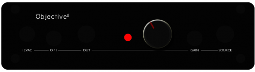
Okay I just made it real fast in FPE. Probably not a good thing at work, but oh well. Here it is.
I used stencil, 1 stroke no fill. if we want the white fill its fine, but it's really unnecessary, especially for the extra cost. White crayons work perfectly
View image: final o2
I used stencil, 1 stroke no fill. if we want the white fill its fine, but it's really unnecessary, especially for the extra cost. White crayons work perfectly
View image: final o2
Last edited:
1. The amp will work very well without texts
2. I don't like ugly text
3. It's nice to have some text to understand basic use
- ON/OFF instead of 0/1 is oke for me but it is more text and everybody will understand a pushbutton to be the on/off even without text
- for the gainknob i dislike "H" and "L" for they ask for much attention because they do not aline with the other texts. beside that, i think it's obvious that pushing a pushbutton that has text [gain] will make a change to the gain
i would also be happy with the [jpg] symbols-front
How about the power on/off symbol used in one of the previous examples? I think that's clearest of all.
Yes, it's obvious that pushing a button labeled "gain" will change the gain, but there should probably be a way to make it clear which setting is high and which is low. (Really this should probably have been an up/down toggle switch.)
rtos, no offense, but 0/1 has been used on international devices for a long time...
I prefer this power symbol:

Regardless of that preference though, I suspect using 0/1 will save on charges since it's just text.
Was the image I posted correct or are there any changes that need to be made? Else I will be sending the file to get quoted by FPE.
Is there any problems with not having them fill in the engraving with white? I figure this way people could fill it in with red or blue to white, depending on what their hearts desire. Actually might look neat with blue or purple lettering.
Also, I used O / I (not 0/1). If this is incorrect please let me know.
- Status
- This old topic is closed. If you want to reopen this topic, contact a moderator using the "Report Post" button.
- Home
- Group Buys
- O2 Front Panel GB Interest