I remember seeing some freeware that allowed one to load a gif of vacuum tube charateristic curves and overlay your own proposed load lines. It allowed you to set X/Y scales so that it would display the coordinates of the mouse pointer.
The problem is I can't remember what it was called. Does this ring a bell with anyone?
The problem is I can't remember what it was called. Does this ring a bell with anyone?
Now this was more basic. There was no tube database. You simply loaded a pic (say a screen shot of the curves from a data sheet) Then you would define the (0,0) X-Y point and the ends of the axes. Let's say your Y axis was from 0 to 500V and X was 0-300mA. as you moved your cursor around it would display the V and I you were pointing at. You could then place dots at certain points and draw lines using these coordinates to guide you.
It didn't do any calculations as I recall but did make it easier to draw load lines and manually identify points on the line from which you could calculate what ever you wanted.
It didn't do any calculations as I recall but did make it easier to draw load lines and manually identify points on the line from which you could calculate what ever you wanted.
hve to roll your own calcs but Geogebra is a free math sw that can deal
http://www.diyaudio.com/forums/the-lounge/236916-software-pick-optimal-load-lines.html#post3511175
http://www.diyaudio.com/forums/the-lounge/236916-software-pick-optimal-load-lines.html#post3511175
Attachments
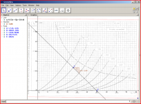
Downloaded then DEB for ver 5 and it installed without a hitch. I played with it a bit last night and figured out how to load a pic and anchor it to the axes, draw lines and points, and lable them. So I am to the point of doing what Libre Draw does. In order to use the advanced capabilities I now need to figure out how to adjust the axis scaling to reflect that of the curve pic.
Looks promising.
Looks promising.
Is there an easy way to "see" ballpark pentode load preferences?
What I mean is say you have a pentode that likes a load of 8K and you want to find one that is comfortable with relatively smaller (or greater) load impedance. Is there a characteristic like gm, rp or such that would roughly correlate to this or an easily recognized attribute of the curves that would allow you to identify likely suspects before doing a full on loadline analysis?
What I mean is say you have a pentode that likes a load of 8K and you want to find one that is comfortable with relatively smaller (or greater) load impedance. Is there a characteristic like gm, rp or such that would roughly correlate to this or an easily recognized attribute of the curves that would allow you to identify likely suspects before doing a full on loadline analysis?
Lower screen voltage and plate loads
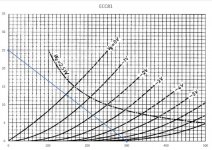
In just a brief look at the curves (12DT5) for screen voltages of 250 and 150 it appears that the lower screen voltage might better tolerate a lower anode load. Does that seem likely? It also looks like lower bias current is indicated with the lower screen voltage.
In just a brief look at the curves (12DT5) for screen voltages of 250 and 150 it appears that the lower screen voltage might better tolerate a lower anode load. Does that seem likely? It also looks like lower bias current is indicated with the lower screen voltage.
Perhaps a refresher on pentode operation is in order... the screen voltage shifts the family of curves up and down, exactly what it’s designed to do. The Valve Wizard -Small Signal Pentode
I just use Excel. You scan the curves from the datasheet, crop out everything except the plot area and save the file (or just use the windows snipping tool to do this directly from a pdf). Then create a chart in Excel with the same axis range that was used in the datasheet plot, format the plot area as "Picture or texture fill" then select the picture file you just saved. Loadline can then be plotted using data in Excel. See attached example.
Attachments
 The computer lets me "what if" things without chewing through printer ink.
- Status
- This old topic is closed. If you want to reopen this topic, contact a moderator using the "Report Post" button.
- Home
- Amplifiers
- Tubes / Valves
- Tool to overlay loadlines on characteristic curves.