I'm adding some new functionality into my Active Crossover Designer tools - an extension to allow the user to view the off-axis response (measurement based) of the loudspeaker, including the crossover. The idea is that the user needs to make tradeoffs or design choices based on both the on-axis response and the off axis responses. These are governed by the responses of each driver and the crossover, in terms of phase and amplitude. The extension permits all of this to be viewed during the design process.
There will be two types of views available. One view contains multiple line plots, one for each angle. The other is a directivity plot, and example of which is shown below. I am currently looking for input on the format of the plot. Sorry that this one looks a little strange - I just made up some data and it is "one sided" e.g. the off-axis angle begin at 0 (e.g. on axis) and goes up to 60 degrees off axis (angle is on the y-axis of the plot). Also the max SPL of the data is about -15dB and the min SPL is about -60dB. Again, just some made up data.
The angular span of the plot is completely determined by the data that the user supplies to the extension.
Thoughts?
-Charlie
OK, I updated the plot to look more like the familiar "symmetric about the on-axis position" directivity plot. What I am after is, compared to other directivity plots, does this one convey the typical information? Are the legends useful?
Did I mention that this is available as freeware?
Did I mention that this is available as freeware?
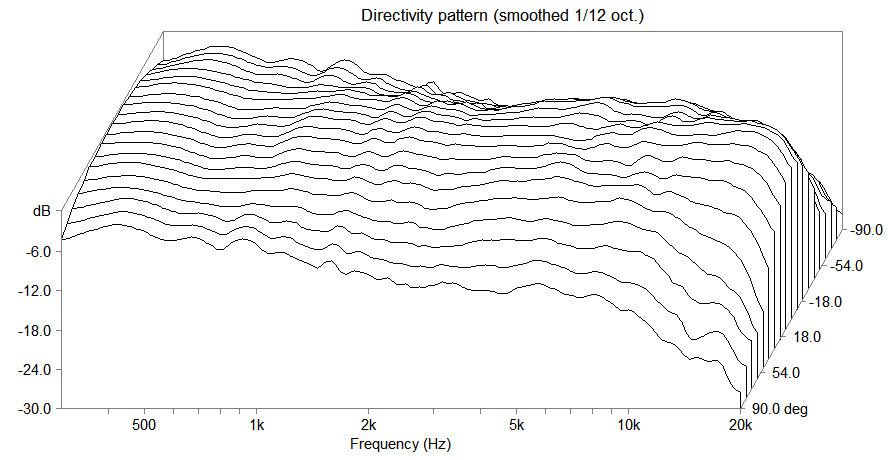
Here is an update on the multiple line plot (waterfall plot) presentation of the data, showing what I have been able to put together from some simulated data using my extension. Note that this is different data than what I showed in the first post.
There are two schools of thought:
1. Present the on- and off-axis data, as measured, as a surface.
2. Present the on- and off-axis data, as a surface, but normalized by the response at the on-axis position.
Examples of these are below, the as-measured plot (upper plot) and the normalized plot (lower plot):
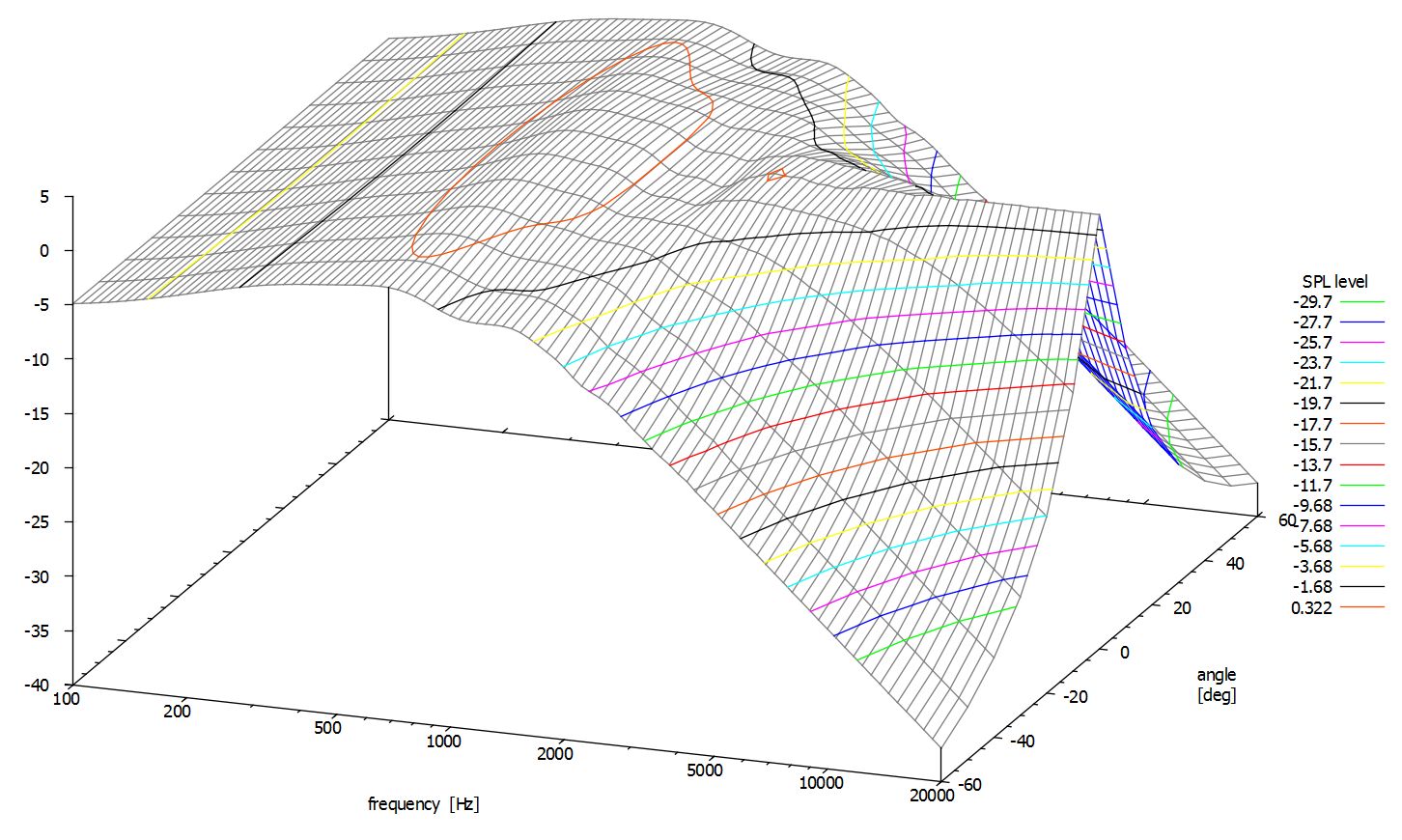
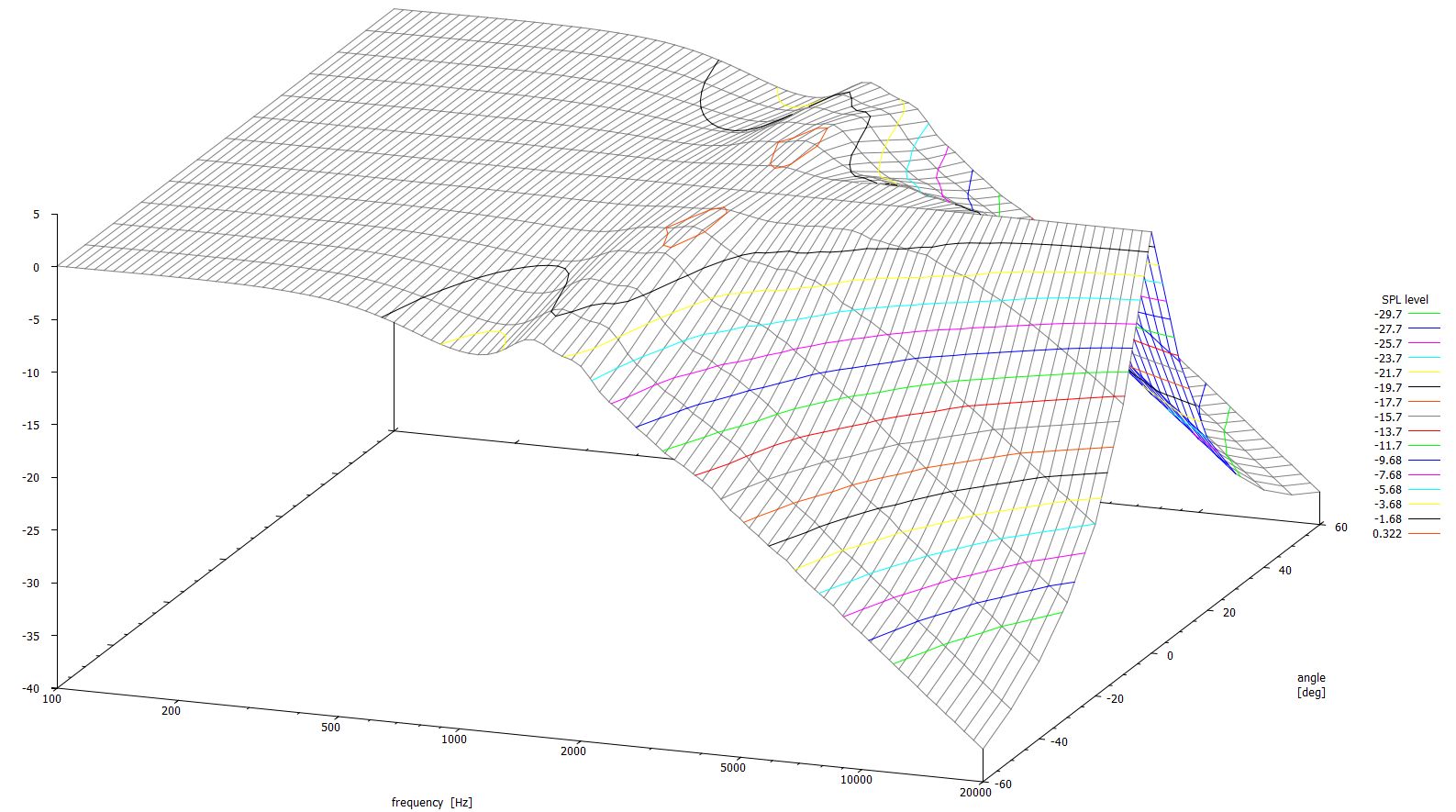
If you think that some things should be added, removed, or changed to make these plots more useful please let me know. Thanks,
-Charlie
There are two schools of thought:
1. Present the on- and off-axis data, as measured, as a surface.
2. Present the on- and off-axis data, as a surface, but normalized by the response at the on-axis position.
Examples of these are below, the as-measured plot (upper plot) and the normalized plot (lower plot):
If you think that some things should be added, removed, or changed to make these plots more useful please let me know. Thanks,
-Charlie
Update:
I've figured out how to make the 3D surface appear like a solid object. I can choose any RGB color for the surface mesh, and choose one of 16 colors for the contour lines. The lines intersect the z-axis now. Using gnuplot, you can rotate the 3D object to view it from any vantage point that you desire. This would be helpful, for instance, for looking at the "back side" of the surface, because not all off-axis responses will be symmetric about the on-axis response (angle = 0) like this one is.
New plot below:

-Charlie
I've figured out how to make the 3D surface appear like a solid object. I can choose any RGB color for the surface mesh, and choose one of 16 colors for the contour lines. The lines intersect the z-axis now. Using gnuplot, you can rotate the 3D object to view it from any vantage point that you desire. This would be helpful, for instance, for looking at the "back side" of the surface, because not all off-axis responses will be symmetric about the on-axis response (angle = 0) like this one is.
New plot below:
-Charlie
That would be nice, but GNUplot doesn't have this feature (hover and get value). I might be able to annotate each contour line in the plot using a text label containing the SPL level of the contour.I personally like the sonogram better. It would be a nice feature if I could hover over the sonogram and see what the level is at the cursor position.
I haven't been able to reproduce the Sterophile directivity plots exactly, but as you mentioned my 3D surface plot is a facsimile except it is "busier" with more lines. Honestly I think that my version shows the data in a way that allows you to see the SPL versus angle relationship more easily.The other way I like to see directivity is how Stereophile shows it. It's similar to your plots above, but cleaner.
Sterophile directivity plot:
On the plot above there is a z-axis scale, but it is difficult to discern the SPL for almost all combinations of frequency and angle. On my plot, the lines and contours make this relatively easy.
.
Last edited:
I am zeroing in on some useful plots. The following examples are from an MTM system that I am currently working on.
There are three types of plots currently available:
1. An Excel line plot within the ACD extension:

2. 3D surface plot, generated using a gnuplot script and a data file that is built by the ACD extension:

3. Sonogram, also generated using a different gnuplot script and the data file built by the ACD extension:

There are probably other types of plots that can be created from the data file using gnuplot (like the fence plot shown in a recent post in this thread) but I will stick with these for now.
There is an option to create the 3D plots with the off-axis responses normalized by the on-axis response if that is desired by the user. The normalization presents the data in a slightly different way that highlights the smoothness of the responses.
-Charlie
There are three types of plots currently available:
1. An Excel line plot within the ACD extension:
2. 3D surface plot, generated using a gnuplot script and a data file that is built by the ACD extension:
3. Sonogram, also generated using a different gnuplot script and the data file built by the ACD extension:
There are probably other types of plots that can be created from the data file using gnuplot (like the fence plot shown in a recent post in this thread) but I will stick with these for now.
There is an option to create the 3D plots with the off-axis responses normalized by the on-axis response if that is desired by the user. The normalization presents the data in a slightly different way that highlights the smoothness of the responses.
-Charlie
Hi,
I have just started dabbling with ACD and already have got quite good results with my first efforts ( using a miniDSP + 15" woofer + compression driver/waveguide).
I'll return to it being more careful with my measurement and blending of the FRD files and I should get even better results.
Thanks for your amazing work here with the spreadsheets!
As I'm also interested in the off axis directivity plots, this feature would be quite amazing to have. For comparison with the other directivity plots around, the sonogram heatmap would be the best graph format to support.
Hi Zog,
I just happened to see your post - glad ACD is working for you.
I have a bunch of new features that I am slowly gearing up to release in the next version. These will include the plots shown in post #8 as well as a new polar type that I developed with some input from Siegfried Linkwitz. The release is probably still a couple of months away, depending on how much I get prodded to work on it.
See attached for an example of the polar type.
Attachments
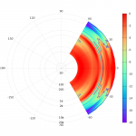
See attached for an example of the polar type.
Hi,
I like that graph as well, having the actual angle of the measurement used makes for readability.

I'll get around to it eventually. I have things more or less working. If you don't want/need to simulate the crossover, and just want to be able to plot multiple axis measurements into one of the plots shown in this thread, you can PM me and I can send you the beta version.
The real release the the directivity plot extension will come along with the next version of ACD, but I am working on some other things and am trying to figure out how to overcome some snag so that everything works nicely under both Excel and OpenOffice or LibreOffice Calc.
The real release the the directivity plot extension will come along with the next version of ACD, but I am working on some other things and am trying to figure out how to overcome some snag so that everything works nicely under both Excel and OpenOffice or LibreOffice Calc.
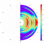
UPDATE:
I was contacted by someone about plotting some measurement data using my ACD directivity extension, so I have revisited this effort again after putting it down for almost a year. I've attached an example of the output from the latest incarnation.
Like many ways to present data, you can influence the overall impression that one gets from a plot by how you choose the scaling. For these polar-heatmap plots, the SPL range over which the colors are assigned is very influential.
In an attempt to come up with an objective way to define the SPL range, I have used the simple average of the "on axis" data plus the standard deviation of that data to set the limits of the colors as follows:
max SPL = average + 1*stdev
min SPL = average - 4*stdev
Above and below these min/max the data is just assigned the min/max color. This stats-based approach is totally empirical, but is based on the assumption that loudspeaker data (on- and off-axis) typically contains less above the on-axis-average data points than below the on-axis-average data points. Keep in mind that the average is for the "on-axis" data, and SPL in general falls below this on-axis level as you move off-axis.
I will need to look at a variety of different types of loudspeakers (closed box direct radiator, horn, open baffle, etc.) to get a feeling of how this would work in general, but I think that this is a good start towards objective plotting.
Attachments
I like the 3-d graph.
The human mind should be better at processing this graph.
Trying to represent 3 different variables on a 2-d graph is harder than representing the 3 variables on a 3-d graph.
Also if you have to use 2-d what is wrong with using the straight graphs?
You add an extra layer of complexity making it a polar graph.
UPDATE:
I was contacted by someone about plotting some measurement data using my ACD directivity extension, so I have revisited this effort again after putting it down for almost a year. I've attached an example of the output from the latest incarnation.
Like many ways to present data, you can influence the overall impression that one gets from a plot by how you choose the scaling. For these polar-heatmap plots, the SPL range over which the colors are assigned is very influential.
In an attempt to come up with an objective way to define the SPL range, I have used the simple average of the "on axis" data plus the standard deviation of that data to set the limits of the colors as follows:
max SPL = average + 1*stdev
min SPL = average - 4*stdev
Above and below these min/max the data is just assigned the min/max color. This stats-based approach is totally empirical, but is based on the assumption that loudspeaker data (on- and off-axis) typically contains less above the on-axis-average data points than below the on-axis-average data points. Keep in mind that the average is for the "on-axis" data, and SPL in general falls below this on-axis level as you move off-axis.
I will need to look at a variety of different types of loudspeakers (closed box direct radiator, horn, open baffle, etc.) to get a feeling of how this would work in general, but I think that this is a good start towards objective plotting.
The angular resolution decreases towards low frequencies in this plottin style.
Is this propriate, depends ?
The angular resolution decreases towards low frequencies in this plottin style.
Is this propriate, depends ?
Yes, that might be misleading to some but in my opinion a polar heatmap is clearer than a fence plot for example.
I'll get around to it eventually. I have things more or less working. If you don't want/need to simulate the crossover, and just want to be able to plot multiple axis measurements into one of the plots shown in this thread, you can PM me and I can send you the beta version.
The real release the the directivity plot extension will come along with the next version of ACD, but I am working on some other things and am trying to figure out how to overcome some snag so that everything works nicely under both Excel and OpenOffice or LibreOffice Calc.
Are you familiar with this?
Polar_map
- Status
- This old topic is closed. If you want to reopen this topic, contact a moderator using the "Report Post" button.
- Home
- Design & Build
- Software Tools
- opinions wanted on this directivity plot