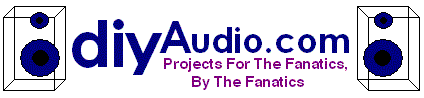
Here is my entry
This is fully scalable and printable in color and b/w (color logo shown). It is available in .ai, .pdf and .gif formats. If you need others, just ask.
(The GIF image is antialiased into the message cell background colour, a different one will be needed for white HTML background)
Three pictographic mental links are used: sine wave, soundwaves and needle.
In my view, this pretty much sums up diyaudio:s different forums without necessarily focusing at any particular one of them. I think a logo with an image should work both with and without text, so both options are included.
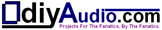
Here is another attempt. !!
A slight improvisation on the wave idea with a different treatment. A simple design. The font, capitalisation is retained exept that the colour has been changed but still confirms to the original tones. The logo is given prominance here. The name and punchline has been included for completeness as a part of the logo. I liked this representation quite much. The name, punchline may be used freely on the right side of the logo in adequate size still not upsetting the form.
ajju
An externally hosted image should be here but it was not working when we last tested it.
A slight improvisation on the wave idea with a different treatment. A simple design. The font, capitalisation is retained exept that the colour has been changed but still confirms to the original tones. The logo is given prominance here. The name and punchline has been included for completeness as a part of the logo. I liked this representation quite much. The name, punchline may be used freely on the right side of the logo in adequate size still not upsetting the form.
ajju
Attachments

Jason said:Yeah, I see sperm, zygote, and perhaps with the head missing and ripples - the moment of conception. Probably all rather apt metaphors for various things happening on this board (lol) (don't read too much into that")
Nice! Giving birth to audio gear... That association works nicely too.
The second version is good because it doesn't have the weird sperm aspect (though I thought the sperm version was VISUALLY OK)
However, you need to express the wave more compactly on the second version. A web page logo is preferable to be square or squat. A tall one wastes valuable header space unless it is made vanishingly small.
I do like the colors and the simplicity of the design. You may want to continue using the same fonts and colors for the logo title as the current one, and make the wave more flat.
A web page logo is preferable to be square or squat. A tall one wastes valuable header space unless it is made vanishingly small.
I choose to differ.
The requirement of the logo is not just for the website but for quite a few merchandise as well... And for those purposes a tall logo fits perfectly. (on a coffee mug, a T-shirt, or cap etc etc...!) It doesnt look good if the logo has to wrap around...does it...imagine it on a cup or a cap say..!!
Considering a website, we always prefer scrolling vertically on a webpage than horizontally, which means that the header space can be extended more freely vertically than horizontally. Its uncomfortable to scroll across a page than up or down. Also Considering that the existing "diyaudio.com" is more horizontal than vertical it makes sense to add a logo which is taller.
Generally the arrangement most frequently used in web pages is one with a menu on the left side. In that case the left topmost corner is best left without any interactive content. This space is generally occupied by a Logo. (though not in our case)
A logo with an aspect ratio of say 2:3 is perfectly viable...Generally fonts will choose to occupy such a ratio on an average...hence scalability is not an issue, and it need not be made vanishingly small to match rest of the stuff..! No rule says that the logo should always be the size of the Text you choose. You can always establish a balance bewteen the two such that no compromises are made.
We choose to highlight "diyAudio.com"
in the sense it will always use a bigger size font for readability. Considering that its a bit lengthy name, a logo with more height than width tries to balance the final geometry. Also from a human perspective, we are more comforatable seeing objects that are upright than lying. It catches ones attention.
Secondly, I dont buy the argument that a logo should be cramped into available space. In that case its better left unused. A logo must have its owns space so that it can express itself without distraction from rest of the stuff.
ajju
Zix,
I like #204! Just a quick thought:
What if you moved the sound wave to the right, around the 'om' in com kept the text above a square wave, converting to a sine wave from left to right. Kind of the square wave for testing becomes a sine wave which is closer to music? Just a guess.
Good work! I like the fact that you chose the needle as well. Simple, elegant and quite appropriate and I never even visit the analog forum :O
Sandy.
I will make my point again. The spot where the logo needs to go on this page is short and wide. I have not seen any of these BBS boards that waste space on the left with a tall logo.
Consequently, the vertical height of the logo is constrained to less than 100 pixels. It is just the way that it is.
It has nothing to do with what you WOULD do. It has to do with what you CAN do. Very often the hard limits are what drive good design. This is one of them, IMHO.
So the waveform logo would be about 90 pixels tall and 40 pixels wide, and the text would be about six pixels tall, nearly unreadable. It would have to be enlarged to be halfway down many people's monitors to even be large enough to not have the text blurry and indistinct. Meanwhile, the white space on the top right would be basically wasted. Even though they are just monitor pixels and not paper, it still would feel like a waste to people.
BTW, I like the appearance of the sperm one (and its vertical height) but it is too focused on a sexual connotation to be useful. It is not that I'm prudish but a logo shouldn't have any distracting connotations. I also like the serif font you chose for that one.
But the wave pattern is a good idea. There is no reason why it can't be rearranged more horizontally. Try it, you might like it. Others may too.
Sandy H. said:Zix,
I like #204! Just a quick thought:
What if you moved the sound wave to the right, around the 'om' in com kept the text above a square wave, converting to a sine wave from left to right. Kind of the square wave for testing becomes a sine wave which is closer to music? Just a guess.
Good work! I like the fact that you chose the needle as well. Simple, elegant and quite appropriate and I never even visit the analog forum :O
Sandy.
Thank you so much for your kind words, Sandy!
I think I understand how you envision it. I´ll give it a try tonight and see what gives.
/zix
geewhizbang said:
So the waveform logo would be about 90 pixels tall and 40 pixels wide, and the text would be about six pixels tall, nearly unreadable
BTW, I like the appearance of the sperm one (and its vertical height) but it is too focused on a sexual connotation to be useful. It is not that I'm prudish but a logo shouldn't have any distracting connotations. I also like the serif font you chose for that one.
I agree with geewhizbang on the implications of ajju´s current "tall" logo contribution, although I would hesitate to come with any too definite judgement in favour of the "wide" versus the "tall" logo. Both things can be made to work, it all depends on the context. Also, at this stage I would think it is better not to impale anyones creativity with what has been done here or elsewhere, or how things usually are done in a web forum. So go for it, ajju!
Also, something to keep in mind here is that the "sperm" is an association that sch3matic made, not me. I was not in any way focussing on that subject when making the logo. I still don´t. For me the focus lies in balancing shapes, sizes and readability and of course visualising diyaudio.com in an effective or interesting way.
I´ll keep using the same stylized type of logo for an alternative draft entry, so it will be interesting to see what kind of associations that come up this time...
And thanks, geewhizbang, for the font and appearance appreciation. We´ll see if the font survives in my next entry. Thanks for the input!


- Status
- Not open for further replies.
- Home
- Site
- Site Announcements
- diyAudio Logo Competition Draft Entries