ajju said:Thanau,
This is nice...Taking ur idea a bit further can you stylize the background such that it reflects DIY very abstractly. I say this because there is a striking Y formed in the centre..so was thinking if you could accomodate/depict a DIY with the formations in the background...just a thought!
ajju
Yes, originally I wanted to put some background on the logo, but it gets busy very quickly, especially if you're dealing with an area of 300 pixels or so. Aleph X scematics elements are very appropriate, so I tried to just extract the essence of it. See below:

In general interest.
Dan, Jason, Dave,
Do we plan to keep the existing colour scheme for the page..or are we looking at some alternatives, If so, can you please provide us all with some colour preferences, it would be a good guide. Also probably a bit more detail on the merchandise that we propose to do..like if its a Tshirt/cap etc what colour are we going to use. That too will have a important role to play in the selection of colours for the logo.
Secondly, Are gifs (for transparent background fills) mandatory. What i've observed is that whenever the logo doesnt fit into an environment a boundary is added to confine it so that the logo stands out in its original intended form. There is a strict boundary between the logo space and the background. And the logo is used without this boundary in cases where it blends seamlessly with the background. (that is in cases where the actual logo background is same as the background on which its used)
just some thoughts though..!!
ajju
Re: In general interest.
Jason spent a lot of time getting to the existing color scheme... it won't be changed for the sake of change, but only if something that is better can be found.
dave
ajju said:Do we plan to keep the existing colour scheme for the page
Jason spent a lot of time getting to the existing color scheme... it won't be changed for the sake of change, but only if something that is better can be found.
dave
A question about transparency.
This is for the webmaster types. When I preview my logos in the browser, there is no white fuzz around the edges (regardless of background color. After the logo gets uploaded to my web server and viewed in a browser from there, the fuzz appears. Apparently some bits get lost or ignored in the process of uploading and serving. Any idea where to look for the cause?
This is for the webmaster types. When I preview my logos in the browser, there is no white fuzz around the edges (regardless of background color. After the logo gets uploaded to my web server and viewed in a browser from there, the fuzz appears. Apparently some bits get lost or ignored in the process of uploading and serving. Any idea where to look for the cause?
Please disregard that last question. I was previewing before exporting. The exporting settings are very important. Here is the same logo crunched to 10k and with almost no fuzz.
An externally hosted image should be here but it was not working when we last tested it.
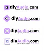
I have the following one. It borrows the type arrangement from the current logo but with a different, but still-similar font.
BTW, as I was browsing thru here there were a couple I liked quite a bit.
I also like this one, but there are some aspects of a couple others that I like better than my own. I probably have a few other ideas in me; I'm not done yet.
I hope the other contributors won't mind if I take one of their ideas and tweak it a little bit?
BTW, as I was browsing thru here there were a couple I liked quite a bit.
An externally hosted image should be here but it was not working when we last tested it.
I also like this one, but there are some aspects of a couple others that I like better than my own. I probably have a few other ideas in me; I'm not done yet.
I hope the other contributors won't mind if I take one of their ideas and tweak it a little bit?
geewhizbang said:I have the following one. It borrows the type arrangement from the current logo but with a different, but still-similar font.
the diyAudio.com capitalization scheme should be kept, but i think we have another runner...
dave
Fixed the capitalization on this one.
I like the eye candy on this, but I'm still hoping for something that says more about the DIY aspect, but the right idea has not happened for me yet.
An externally hosted image should be here but it was not working when we last tested it.
I like the eye candy on this, but I'm still hoping for something that says more about the DIY aspect, but the right idea has not happened for me yet.
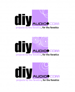
here is one another concept...I've been thinking on this for a while..
borrowed the existing fontface and capitilisation
the logo is a representation of DIY audio..
Its kind of abstract...combining the theme from what Ropie had commented sometime back..
"Good point, but surely the only component guaranteed to be in an audio system of any kind is a speaker") - Ropie"
- Ropie"
the logo is an abstraction of the side view of 4 speakers juxtaposed with their magnets towards the centre. The regular geometric shapes and the white spaces between them have been added to resemble an assembled jigsaw puzzle (the ones like make a square from 10 pieces etc etc)
The puzzle, i thought, would be a symbolic representation of the do-it-yourself nature of this hobby, experimentations and finding alternatives etc. At the same time it signifies leisure, interests, thought process, need for perfection and challenges associated with this hobby, as is with a puzzle.
I thought i'll preserve the old logo almost as it is.
One: everybody is happy with it, and two: it would serve as continuity, rather than the site looking alien altogether suddenly.
My favourite among these is 1 and 4 followed by 2, 3..
bouquets and brickbats please..!!
ajju
(the draft may have some deficiencies..for i use the most advanced and most powerful graphics software ever..ms word
 )
)
borrowed the existing fontface and capitilisation
the logo is a representation of DIY audio..
Its kind of abstract...combining the theme from what Ropie had commented sometime back..
"Good point, but surely the only component guaranteed to be in an audio system of any kind is a speaker
- Ropie" the logo is an abstraction of the side view of 4 speakers juxtaposed with their magnets towards the centre. The regular geometric shapes and the white spaces between them have been added to resemble an assembled jigsaw puzzle (the ones like make a square from 10 pieces etc etc)
The puzzle, i thought, would be a symbolic representation of the do-it-yourself nature of this hobby, experimentations and finding alternatives etc. At the same time it signifies leisure, interests, thought process, need for perfection and challenges associated with this hobby, as is with a puzzle.
I thought i'll preserve the old logo almost as it is.
One: everybody is happy with it, and two: it would serve as continuity, rather than the site looking alien altogether suddenly.
My favourite among these is 1 and 4 followed by 2, 3..
bouquets and brickbats please..!!
ajju
(the draft may have some deficiencies..for i use the most advanced and most powerful graphics software ever..ms word
)Attachments
Wow I like that one a lot, all I'd suggest is moving things around a little. Maybe make it a little less tall too. This is sorta what I mean, you could extend the wave pattern above and to the right.
(Unfortunately I saved as 16 color, not knowing Paint would screw it up... but you get the placement idea.)
Tim
(Unfortunately I saved as 16 color, not knowing Paint would screw it up... but you get the placement idea.)
Tim
Attachments

another idea
An externally hosted image should be here but it was not working when we last tested it.
then of course there's...
An externally hosted image should be here but it was not working when we last tested it.
An externally hosted image should be here but it was not working when we last tested it.
This is the latest based on the prior suggestion. I liked the way the image looked without the solid color, so I did that. I couldn't make the suggested placement of the slogan work.
I tried the top right for it but it looked wonky no matter how I formatted it.
now it has a small d, and I fixed some issues with the rather stiff line I added to version 4 to make the position of the text make sense.
Now it just fades off subtly. However, such a design may not be desirable if you want a printable logo. I may have to make it more iconic, solid colors and still work as a logo.
I also think I can simplify the eye candy somehow.
Now it just fades off subtly. However, such a design may not be desirable if you want a printable logo. I may have to make it more iconic, solid colors and still work as a logo.
An externally hosted image should be here but it was not working when we last tested it.
I also think I can simplify the eye candy somehow.
- Status
- Not open for further replies.
- Home
- Site
- Site Announcements
- diyAudio Logo Competition Draft Entries