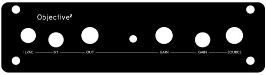
Not sure how you guys might like this version, but I was a little bored and playing with autocad so let me know. It needs a bit more tweaking but you get the idea.
View image: O2
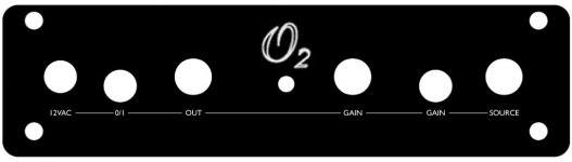
This one looks great (my group wants something more conservative). Can you change "IN" to "input" in the same size as the high/low font, and loose the "off" label, and I think you have a design that everyone can buy into.
Once you've revised it I'd like a copy of your fpd file so I can tweak it for the desktop version.
I have a few suggestions for this panel design...
First though, is the 2 in O2 a subscript or superscript?
Since there is a headphone symbol for output, I'd like a ♫ music symbol for input.
For volume, I agree to lose the off label, but would like a + & - at 5 and 7 o'clock, or one of those right triangles that symbolize less and more.
I'd like to see "gain" or "Av" added to the high/low selector.
Last edited:
How do you like them symbols? Cool enough for ya?
An externally hosted image should be here but it was not working when we last tested it.
I used arrows for Audio In and Out and a (stylized) sine wave for AC In, like you've proposed. I didn't use a lightning bolt for Power On (I think I've never seen it on a power switch, only as a warning of high voltage; it might, in fact, better befit the AC jack), but went with the common Power On symbol. For the Gain switch, I used a G.
The design of the symbols, including the O2 logo in the middle, started out with the in and out arrows; they symbols use a common grid, making for a consistent, simple, readable, stylish, robust-to-mill design, with the placement of the wave and the arrows adjusted vertically so that they are visually in line with the full-height (full-square) symbols.
They all use the same line width, requiring no (chargeable) tool change.
The size of the screw heads have been taken into account.
So much for the pitch talk.Anybody like it?
I really like this design, very clean, minimalistic.
Practically speaking though, the input voltage specs need to be on the panel, and the in/out symbols are a little confusing.
It seems to me that none of the jacks really need much by way of labels/explanation except the input voltage ranges (just in case) and the in/out jacks (since they are the same socket).
Just my 2c
If you can get the ♫ work in FPE let me know, else I’m going to have to make one and don't have time right this second. I believe we are still waiting on the exact measurements, that's why I’m not in a super rush.
Unless I'm mistaken, and you can confirm it with him, but I think RocketScientist already confirmed that the measurements where fine. The issue he was having with one of the jacks was due to the fact that it wasn't quite seated in the board completely.
I have to disagree about the musical note though.. I don't think it conveys enough information. I'd say stick with "input"
I don't know about you guys but I'd prefer something a little more traditional kinda like this:
An externally hosted image should be here but it was not working when we last tested it.
Why are the "G" and "O2" tilted, while everything else is straight?
An externally hosted image should be here but it was not working when we last tested it.
I don't know about you guys but I'd prefer something a little more traditional kinda like this:
An externally hosted image should be here but it was not working when we last tested it.
This is basically what I had in mind as well. (I'm not too crazy about the stylized "O2" as pictured, but that's just my opinion.)
I'm going to be building a couple of these amps for some friends who are just average music listeners (not audiophile/DIY types), so I'm looking for something that's as functional and easy to use as possible.
Last edited:
This is basically what I had in mind as well. (I'm not too crazy about the stylized "O2" as pictured, but that's just my opinion.)
I'm going to be building a couple of these amps for some friends who are just average music listeners (not audiophile/DIY types), so I'm looking for something that's as functional and easy to use as possible.
How about just O2 or a stately old English
An externally hosted image should be here but it was not working when we last tested it.
An externally hosted image should be here but it was not working when we last tested it.
Upstateguy,
some thoughts:
The "L" and "H" are a nice idea. One might argue (I don't, actually), that they, like the "Volume" label, are expendable information. I guess that you just want to have every element labeled, needed or not, which is a valid design decision.
You have to take the screw heads into account. The "200" in the lower left will touch the screw head or even be partly covered by it; both would look ugly. Could be remedied by moving the label up.
The same is true for the "Volume" label, unless everyone uses a knob with the same diameter. Could be remedied by moving the label down, but then you'd have one label (AC) above the common baseline and one below (Volume), looking a bit untidy.
I'd hence suggest that you try moving all labels down a bit, making more room for the volume knob. Then move the AC label up a bit so that the lower line aligns with the other labels. Two birds with one stone.
The use of many letters, especially when set in a typeface that can't be milled in one go (as well as possibly necessary tool changes) increases the cost. Many potential buyers might not care, though.
Not sure if the tool that you chose for the "Headphone Amplifier" is big enough for the letter size. The inside of the letters looks a bit untidy, but I don't know whether this would show up in the final product (it will if the software gives a 100% precise preview, but that's iffy).
You have to be aware that 1 mm tall text (like your labels seem to be) is very, very tiny. Those lowercase letters are about 0.7 mm (or 0.027") high. The line width is 0.2 mm (0,0078") or 1.5 times the thickness of a human hair. If you have calipers handy, set them to these values. The space between letters is even significantly smaller. If the engraving turns out to be true to the software preview, the text will be almost microscopic, but readable (if under a loupe, for some of us). If it doesn't and the line width is very slightly greater than it should be, the text is likely to become quite a mess. One would have to see a prototype.
Is it possible that you've used a different software to add the text for all but the leftmost label? The typeface seems to be different (looks like Arial). My Front Panel Designer (downloaded from the German Schaeffler website) doesn't have this font. Adding the text with another software would, of course, render the preview pointless, as it wouldn't reflect the limitations of the engraving process.
Arrow pointing away from the jack: Output.
some thoughts:
The "L" and "H" are a nice idea. One might argue (I don't, actually), that they, like the "Volume" label, are expendable information. I guess that you just want to have every element labeled, needed or not, which is a valid design decision.
You have to take the screw heads into account. The "200" in the lower left will touch the screw head or even be partly covered by it; both would look ugly. Could be remedied by moving the label up.
The same is true for the "Volume" label, unless everyone uses a knob with the same diameter. Could be remedied by moving the label down, but then you'd have one label (AC) above the common baseline and one below (Volume), looking a bit untidy.
I'd hence suggest that you try moving all labels down a bit, making more room for the volume knob. Then move the AC label up a bit so that the lower line aligns with the other labels. Two birds with one stone.
The use of many letters, especially when set in a typeface that can't be milled in one go (as well as possibly necessary tool changes) increases the cost. Many potential buyers might not care, though.
Not sure if the tool that you chose for the "Headphone Amplifier" is big enough for the letter size. The inside of the letters looks a bit untidy, but I don't know whether this would show up in the final product (it will if the software gives a 100% precise preview, but that's iffy).
You have to be aware that 1 mm tall text (like your labels seem to be) is very, very tiny. Those lowercase letters are about 0.7 mm (or 0.027") high. The line width is 0.2 mm (0,0078") or 1.5 times the thickness of a human hair. If you have calipers handy, set them to these values. The space between letters is even significantly smaller. If the engraving turns out to be true to the software preview, the text will be almost microscopic, but readable (if under a loupe, for some of us). If it doesn't and the line width is very slightly greater than it should be, the text is likely to become quite a mess. One would have to see a prototype.
Is it possible that you've used a different software to add the text for all but the leftmost label? The typeface seems to be different (looks like Arial). My Front Panel Designer (downloaded from the German Schaeffler website) doesn't have this font. Adding the text with another software would, of course, render the preview pointless, as it wouldn't reflect the limitations of the engraving process.
Arrow pointing in the direction of the jack: Input.Originally Posted by barihunk
the in/out symbols are a little confusing
Arrow pointing away from the jack: Output.
Upstateguy,
some thoughts:
The "L" and "H" are a nice idea. One might argue (I don't, actually), that they, like the "Volume" label, are expendable information. I guess that you just want to have every element labeled, needed or not, which is a valid design decision.
You have to take the screw heads into account. The "200" in the lower left will touch the screw head or even be partly covered by it; both would look ugly. Could be remedied by moving the label up.
The same is true for the "Volume" label, unless everyone uses a knob with the same diameter. Could be remedied by moving the label down, but then you'd have one label (AC) above the common baseline and one below (Volume), looking a bit untidy.
I'd hence suggest that you try moving all labels down a bit, making more room for the volume knob. Then move the AC label up a bit so that the lower line aligns with the other labels. Two birds with one stone.
The use of many letters, especially when set in a typeface that can't be milled in one go (as well as possibly necessary tool changes) increases the cost. Many potential buyers might not care, though.
Not sure if the tool that you chose for the "Headphone Amplifier" is big enough for the letter size. The inside of the letters looks a bit untidy, but I don't know whether this would show up in the final product (it will if the software gives a 100% precise preview, but that's iffy).
You have to be aware that 1 mm tall text (like your labels seem to be) is very, very tiny. Those lowercase letters are about 0.7 mm (or 0.027") high. The line width is 0.2 mm (0,0078") or 1.5 times the thickness of a human hair. If you have calipers handy, set them to these values. The space between letters is even significantly smaller. If the engraving turns out to be true to the software preview, the text will be almost microscopic, but readable (if under a loupe, for some of us). If it doesn't and the line width is very slightly greater than it should be, the text is likely to become quite a mess. One would have to see a prototype.
Is it possible that you've used a different software to add the text for all but the leftmost label? The typeface seems to be different (looks like Arial). My Front Panel Designer (downloaded from the German Schaeffler website) doesn't have this font. Adding the text with another software would, of course, render the preview pointless, as it wouldn't reflect the limitations of the engraving process.
Arrow pointing in the direction of the jack: Input.
Arrow pointing away from the jack: Output.
All valid points.
I altered the pics in photoshop just to present some ideas for a more traditional look.
The idea was to keep all the text on the same line for continuity.
USG
Front
Hi all,
I would like to join and take 1x front
But i also want a decent design
I hope I can help
jokes
- No jokes for me, old english is nice for today but I will have my amp longer on my desk so i dont like jokes for too long, no jokes for me
texttype
- the small text information is not relevant for everyday use, so i want it only visible when i really need to know the first time of use. capitals will form more of a graphical line and are at least as easy to read.
logo
- the name centered is nice, but i wonder what it looks like with the bigger volumeknob close to it.
- only O2 would be a better choice when the name will be in the middle, because of the compactness we could even make it of bigger size
- i would choose same fonttype als small text or a proper nice different font like the handwriten style of post 04:18 AM by Upstateguy
i didnt have the right font so i choose the one that looked most similar.
Attachments
Last edited:
Hi all,
I would like to join and take 1x front
But i also want a decent design
I hope I can help
<snip>
Nice concepts.
Agreeing on design is a never-ending story, especially with this amount of people. Boards and parts are already being ordered so we shouldn't spend way too much time on this.
The important thing for me is to have a machined panel, not the eye-candy on it.
(Though, seriously, 'gain' on the volume pot is just damn weird)
The important thing for me is to have a machined panel, not the eye-candy on it.
(Though, seriously, 'gain' on the volume pot is just damn weird)
- Status
- This old topic is closed. If you want to reopen this topic, contact a moderator using the "Report Post" button.
- Home
- Group Buys
- O2 Front Panel GB Interest