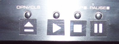
I bet I am not the only one who can't see microscopic button icons in grey on black in a dark room. Other than silks screening my own front panels, I found a reasonably attractive solution. My P-Touch label machine has all of the standard transport symbols with a little creativity. ( Had to overlay pictures to get the "eject" button.) Black tape, white symbols.
Until we can beat up the 20-something "artists" who do this to us, I think this is viable.
P.S. I tip my hat to Akai. Back in the 70's they made a tape deck where the symbols were the buttons and they were about 1 x 2 inches each and colored. Excellent ergonomics and added some actual style. The flip side is on on my new oppo 103, they were very smart to illuminate the eject button, but it is tiny and flush with the panel. You have to be slow and deliberate to push it. Worse is my Pioneer BDP-120. Buttons are part of a horizontal bar so you can't see the buttons, and then light grey 2 point font for the symbols means the only time anyone will see the buttons is in the spotlight of the store shelf.
A machine should be a pleasure to use. THEN it should be a pleasure to look at.
Attachments
It's not just the dark. People also sometimes need reading glasses to read labels, and machines are sometimes located on a rack too low to conveniently get up close and read the labels.
But the sheer, unspoiled pristine look stands out in the store, so functionality takes a back seat. Sigh....
But the sheer, unspoiled pristine look stands out in the store, so functionality takes a back seat. Sigh....
Yea I hate that, especially professional kit that is often used in dark places like say venues during shows.
Grey labelling on black does not show up real well, and there are colours that just do not work in the traditional blue bloking lights seen backstage.
The answer is to make labels out of 'GLOW TAPE' a photoluminesent tape used for marking spots on stage. Easily cut into the usual sorts of symbols and applied to the existing buttons. It glows more then brightly enough for an hour or so after exposure to light to make it very visable, and works even better if you rig a couple of those hateful blue leds to pump it from a location where they will not dazzle you.
While we are on the subject, LEDS, especially blue ones, once upon a time you needed 20mA to get a reasonable indication, these days, please people, tone it down a bit, a mA or so is quite sufficient (Mackie mixers with the 'solo/pfl' light of doom, looking at you, also phone chargers).
Regards, Dan.
Most of us are not 20 any more. I have three zones in my glasses. Not right, wrong and don't ask. The Dr. says when she does my cateracs in a year or so it will be be bettwer.
When you get older, your contrast decreases and the minimum light to see gets higher. Blue gets even more blinding as we can't adjust to flashes as well as we did. I wear yellow glasses to drive at night so I can stand those horrible HID headlights. These are a few points missed by the "artists" who do the panel designs. Well, my Furman sequencer has large white print on black. Real pro. My Behringer crossover has small silver peaking through a black mask. Pretend pro.
Hey, at least we don't have to put up with the "power meter" light shows that every amp seemed to need in the 70's.
I have Sony Bluray player that must have been designed by the team that designed the black on black on black spaceship for inter-galactic rock star Hotblack Desiato (Hitchhicker's Guide). All the tiny buttons are black, on a black background with black lettering. Very sleek. Impossible to see. 
- Status
- This old topic is closed. If you want to reopen this topic, contact a moderator using the "Report Post" button.
- Home
- General Interest
- Everything Else
- High visiablity buttons