I'm starting a new thread to cover this topic raised in the other HP 339A thread.
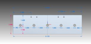
My idea is to eliminate the original style HP 339A knobs altogether by making a custom faceplate to layover the stock faceplate. I have drawn up a replacement panel that will fit over the upper 5 knobs in the "Meter" and "Frequency" sections. I've attached a couple of representations.
I'm looking at amplates.com and two options that they offer which are a base material of .040" aluminum and gold with black lettering OR black with silver lettering option. My preference is to get the highest contrast possible out of the numbers. So color really doesn't matter to me. I measured the original text on the stock knobs to be ~.100 in size. The numbers on the plate I designed are .120" in height to help with visibility. The larger text size really limits where you can place it. This is especially true when you add in the designations on a few of the text locations, i.e. dBV, %, etc.
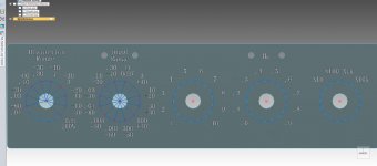
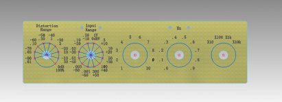
The gold plate depiction came out with much better contrast on the computer. The black plate I show in the picture didn't show up well and I'm sure that's due more to the computer than how it would be in actuality. The blue circles shown inside of the lettering is 1" in diameter. I put these in the picture to give you an idea of how large of a knob you could use. My plans are to use a pointer type knob.
Let me know what you think!
My idea is to eliminate the original style HP 339A knobs altogether by making a custom faceplate to layover the stock faceplate. I have drawn up a replacement panel that will fit over the upper 5 knobs in the "Meter" and "Frequency" sections. I've attached a couple of representations.
I'm looking at amplates.com and two options that they offer which are a base material of .040" aluminum and gold with black lettering OR black with silver lettering option. My preference is to get the highest contrast possible out of the numbers. So color really doesn't matter to me. I measured the original text on the stock knobs to be ~.100 in size. The numbers on the plate I designed are .120" in height to help with visibility. The larger text size really limits where you can place it. This is especially true when you add in the designations on a few of the text locations, i.e. dBV, %, etc.
The gold plate depiction came out with much better contrast on the computer. The black plate I show in the picture didn't show up well and I'm sure that's due more to the computer than how it would be in actuality. The blue circles shown inside of the lettering is 1" in diameter. I put these in the picture to give you an idea of how large of a knob you could use. My plans are to use a pointer type knob.
Let me know what you think!
Attachments
Well I already found a problem. I went out to use my 339 tonight and I noticed that my Input range has 14 positions. My meter also has .3 and .1mV ranges. The one that I modeled my plate after was on the net and had 12 input positions and stopped at 1mV. Arrggg! I didn't realize there were two different versions of this meter. That is going to make it tougher as I have to squeeze two more positions into the plate and make two different plates. I'll probably have to shrink the font a bit for the plate on the models with 14 input positions as I don't think it'll all fit in the current size.
Are you making you face plate numbers the same as HP?
If so, they won't work, you have to reverse all the numbers.
From what I recall most rotate to 90 degree through out.
So it would be clock positions 9-12, 12-3, 3-6, 6-9.
Never mind, I see some of them are! Good Job.
I'd also note the trick to this is to make them relative
to the center point of the dial, it has a nice elegance about it
that placing them vertically oriented does not.
Making them all vertical ends up kind of looking funny.
Our departed colleague, Dick Moore, hit the nail on the head when he
described HPs use of these polystryene knobs as not
one of HPs finest moments. The broke virtually new right
out of the box.
Good luck,
Last edited:
You should use a sans serif font for this. They work better and are easier to read. I believe some locations have more than one number for a position and use different colors.
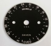
This is always difficult to get right. The Daven dial is a good execution of the graphics with lots of history. Its consistent with how HP did it in older instruments. It also suggests you could just make round dial plates for each control.
This is always difficult to get right. The Daven dial is a good execution of the graphics with lots of history. Its consistent with how HP did it in older instruments. It also suggests you could just make round dial plates for each control.
Attachments
Sync - For the text locations I placed a circle around the knob and then placed the center of the text position at 30 degree intervals along the circle. This essentially does what you're referring to which is placing them equidistant radially from the center. Its harder to see in the stacked numbers, but the single digits for the freq selection show it quite well.
Demian - I'll try Sans Serif when I redraw the Input dial for 14 positions. I tried probably 30 different fonts when I was drawing the plates and settled on the ones shown. I've used some of the dial back plates similar to the Daven dial you displayed for a project at work. Thats where my idea for the new face plate came from. I thought that the single overlay would be more robust than the individual dials.
I could shrink the size of the single plate down to where it doesn't extend as high. Basically I could make it where it only covers the area in height and width needed for the dial numbers. This would mean the range LED's and text directly above the dials would be above the plate and not covered by it.
I don't even have a 339 in my collection so I don't have a real perspective on implementation or scale. I do know from experience that laying out panels can be really challenging.
Another thought using modern materials that could make sense- use a vinyl overlay. They have the ability to print to vinyl at high resolution and it sticks quite well and can be easily removed. (P.S. I get paid to come up with ideas so nothing ever gets done.)
Another thought using modern materials that could make sense- use a vinyl overlay. They have the ability to print to vinyl at high resolution and it sticks quite well and can be easily removed. (P.S. I get paid to come up with ideas so nothing ever gets done.)
I do laser cutting and engraving at a local makers' shop for various personal projects. I could do something like this in thin acrylic very easily and inexpensively. Do you think that would work?
Hi Bob, How thick would the acrylic material be? This plate will be held in place by the shaft nuts and due to limited threads on the shafts it will have to replace the washers under them. I think .050" is about the max material thickness that will work. The aluminum plate material I'm looking at is .040" thick.
There would also be issues with the acrylic cracking if the shaft nuts are overtightened. I think that acrylic would have to be attached in a different manner than the way I envisioned with the shaft nuts.
Thanks for the offer!
Another thought using modern materials that could make sense- use a vinyl overlay. They have the ability to print to vinyl at high resolution and it sticks quite well and can be easily removed. (P.S. I get paid to come up with ideas so nothing ever gets done.)
I thought of the one piece vinyl sticker as well. It would certainly be a cheap option. My primary worry with vinyl is about the durability of it, scratching or peeling up on the edges and the resistance to fading over time. A lot of the equipment I work around has faded plastic and/or graphics. Although the fading takes many years to happen it'd be nice to avoid.
Idea's? Hey its good to have a professional idea man on the team! Keep 'em coming...
I'm redrawing the plate now. It'll only be the height needed to fit the dial graphics on it, so it will not extend as high as my prior images. I'll repost a picture of it in a few days once I get another completed design.
FYI, I had to ditch the prior plate. I made some associations in the CAD software (Siemens Solid Edge) that I cannot get rid of for some reason. Those aasociations keep blocking me from going back and altering my prior part. Needless to say I'm no CAD expert by any means.") I've created several mechanical assemblies in the past to send to the machine shop but this is my first part to have text on it which means I had to watch many tutorial videos on You Tube.
I've created several mechanical assemblies in the past to send to the machine shop but this is my first part to have text on it which means I had to watch many tutorial videos on You Tube.
FYI, I had to ditch the prior plate. I made some associations in the CAD software (Siemens Solid Edge) that I cannot get rid of for some reason. Those aasociations keep blocking me from going back and altering my prior part. Needless to say I'm no CAD expert by any means.
I've created several mechanical assemblies in the past to send to the machine shop but this is my first part to have text on it which means I had to watch many tutorial videos on You Tube.I'm very interested in this. I'm going to bet all owners of the HP 339A would be extremely grateful! I have two instruments and a parts unit, so I'd need a couple at least.
What might be cool is a knob with a skirt that had a notch cut out large enough to see the number on the plate. It would be easier to read maybe. I think that I'd be using a knob with a skirt, maybe with a high contrast pointer line.
Another problem I've been having was that the set screws (allen key) will not break free on some of the knobs. I would like to try and save the knobs from damage if at all possible.
-Chris
I'm very interested in this. I'm going to bet all owners of the HP 339A would be extremely grateful! I have two instruments and a parts unit, so I'd need a couple at least.
What might be cool is a knob with a skirt that had a notch cut out large enough to see the number on the plate. It would be easier to read maybe. I think that I'd be using a knob with a skirt, maybe with a high contrast pointer line.
Another problem I've been having was that the set screws (allen key) will not break free on some of the knobs. I would like to try and save the knobs from damage if at all possible.
-Chris
Chris,
That's sort of what I have in mind for this replacement plate. I planned to use a knob with a .75 - .875" diameter and a lower skirt of 1 - 1.125" diameter and a high visibility pointer line down low on the skirt right where the face plate numbers are. The stock knobs are about .50" diameter (without the skirt of course) and minus the wings they are rather hard to rotate. So I want to get a larger knob in there.
I think the faceplate's stacked number pairs for the input dials might be hard to get fully lined up with a skirt cutout.
I'm very interested in this. I'm going to bet all owners of the HP 339A would be extremely grateful! I have two instruments and a parts unit, so I'd need a couple at least.
What might be cool is a knob with a skirt that had a notch cut out large enough to see the number on the plate. It would be easier to read maybe. I think that I'd be using a knob with a skirt, maybe with a high contrast pointer line.
Another problem I've been having was that the set screws (allen key) will not break free on some of the knobs. I would like to try and save the knobs from damage if at all possible.
-Chris
I'm also very interested in this topic as I've recently acquired an HP 339A (001 Option) with the entire top row of knobs missing. The instrument otherwise functions properly - although needs some work to bring it up to spec.
I had been looking at a less ambitious solution which involves using 14.5mm Elma classic collet knobs (with optional skirt). These are a similar size and shape to the original HP items, but the colour is different. I have had acrylic discs laser cut (2mm thickness, outside diameter 42mm, centre cutout 13mm) to replace the HP originals and plan on using decal transfers for the lettering. These would be glued (with Loctite 406) to the knob skirt. I've done a trial fit and it looks like this would work.
I was planning on using the word files posted previously (by TerrySt, I think) for the Distortion range and frequency multiplier lettering. I've prepared my own file ( after much trial and error) for the other three knobs (including the 14 position output range switch). Happy to share this if anyone is interested - the file format is Print Shop 3, but PDF is also possible.
I'll let you know if it all works.
KB
What I found when I re did some of mine is that HP with their
implementation are fairly well optimized for space.
They are shown over on the HP 339A calibration thread.
I ended up fooling around for about a month to make some
re-do lettering for skirts. It involved two different fonts,
I can't tell you which because something changed in the
'puter and that font is "grandfathered" in from what I
can tell.
With HP skirts, you always have the number on the top at
the 12 O'Clock position, there is something to be said for that.
KB, those are the ones that I started with from Terry St.
I found that was the simplest and most frustrating to work
to get them right.
Please post pics so we can see them.
I used clear labels and printed, then tube to size and
stuck them on. once they stick it's hard to move.
Also, after printing and before cutting I sprayed them
with a clear lacquer very lightly then set them out
into the Texas sun to dry out.
Having the numbers concentric around the knob makes
it very clean and close to the knob for plenty of space
and a clean looking man/machine interface.
When I find it I'll post a link to it.
Cheers,
Sync
Last edited:
Thanks Sync
I've attached a PDF with the numbering for the input range and frequency first and second digits. The numbers line up pretty well on the test print with the 12 O'clock position for each of the switch positions. A sans serif font would probably look better, but I'm not sure that I want to go through repositioning all the numbers again. Note that the notation for the four smallest ranges on the input range has been changed to mV so there is a better fit.
The print quality is better from the original Print Shop 3 file (.psf) than the PDF but I'm not sure that many people have this program.
Regards
KB
Attachments
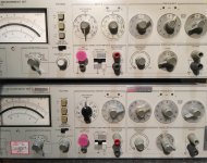
Here was my solution.
It's not pretty but it worked almost.
A better printer and ink would yield better results.
Better cutting on my part too. Printed then trimmed
with self stick labels.
Also note the difference in direction on the top distortion
knobs. they are different looking but the function is correct.
On the left we are turning the knob and pointer
on the right we are rotating the knob and label.
Cheers,
Attachments
- Status
- This old topic is closed. If you want to reopen this topic, contact a moderator using the "Report Post" button.
- Home
- Design & Build
- Equipment & Tools
- HP 339A Knob solution